Bento Daylight
A sunlit bento box of product tiles: soft grey canvas, white cells, one confident blue.
Free style · full files
Includes DESIGN.md, theme.css, tokens.json and the preview page. Want the other 99? All-Access $19
The idea
The whole page is built from rounded white tiles of different sizes, packed into a tidy grid on a soft dotted canvas. Each tile shows one real piece of the product. Bright, organised and easy to scan, like a well-packed lunch.
Bento Daylight organises a product story into a box of rounded tiles, the way a bento organises a meal. The canvas is a soft daylight grey with a fine dot grid; tiles are pure white with hairline borders, each holding one slice of real UI or one stat. It borrows from contemporary product-led SaaS pages and from Japanese packaging: everything has a compartment, nothing spills. One saturated blue drives action, a green confirms success. It should feel bright, competent and effortless to scan.
Principles
- One idea per tile: a single UI moment, number or claim.
- Vary tile sizes on a strict grid — 1×1, 2×1, 1×2, 2×2 — never freeform.
- Show the real product inside tiles instead of icons or illustrations.
- Blue is for action, green is for success; never swap them.
- Keep the canvas grey so white tiles always read as objects.
Motion
Bento tiles pop in from 96% scale in a diagonal stagger, top-left to bottom-right, 60ms apart. Inside each tile, the product mock animates one small action — a number ticking, a toggle flipping — on first view.
Do & don't
Do
- ✓ Size tiles on the grid: 1×1, 2×1, 1×2, 2×2.
- ✓ Put a real UI mock or a big number in every tile.
- ✓ Use a 1px dot grid at 24px spacing on the canvas.
- ✓ Keep tile titles to five words.
- ✓ Animate one micro-interaction per tile on first view.
- ✓ Use tabular numerals for all amounts.
Don't
- ✕ Don't use stock photography or 3D illustrations.
- ✕ Don't let tiles have different radii.
- ✕ Don't put more than one CTA inside a tile.
- ✕ Don't use colour backgrounds on tiles except one blue hero tile.
- ✕ Don't nest tiles inside tiles.
- ✕ Don't exceed 12 tiles in one bento.
What's in the DESIGN.md
- 01Overview & principles
- 02Colors (tokens + proportions)
- 03Typography (families + 12-role scale)
- 04Layout & spacing scale
- 05Elevation & depth
- 06Shapes & radii
- 07Motion (easing, durations, signature)
- 08Imagery + generation prompt
- 09Components (button, card, nav, input, badge)
- 10Do's and don'ts
- 11Responsive behaviour
- 12Iteration guide + agent checklist
Plus theme.css (Tailwind v4 @theme), tokens.json (W3C) and the preview page source — 361 lines of DESIGN.md in total.
More like this
All SaaS & Bento →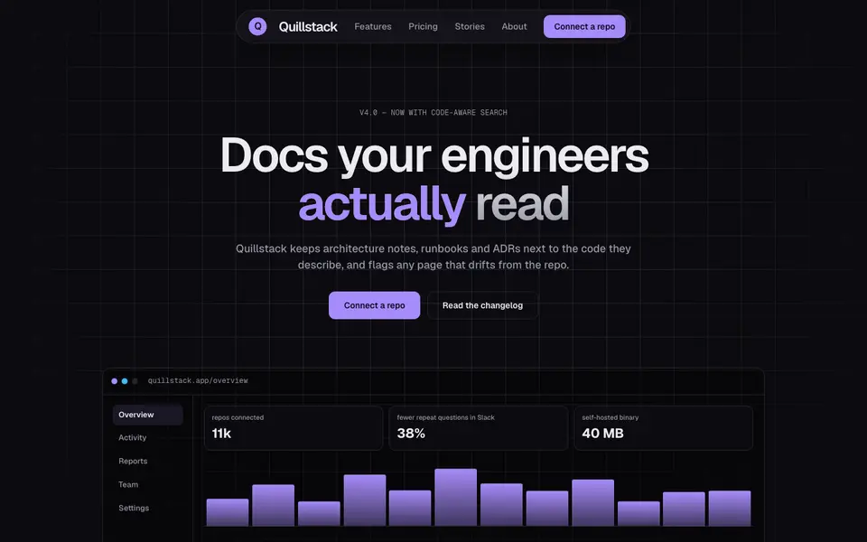
Bento Midnight
No. 040Charcoal tiles on a blueprint grid, lit from inside by a single violet glow.
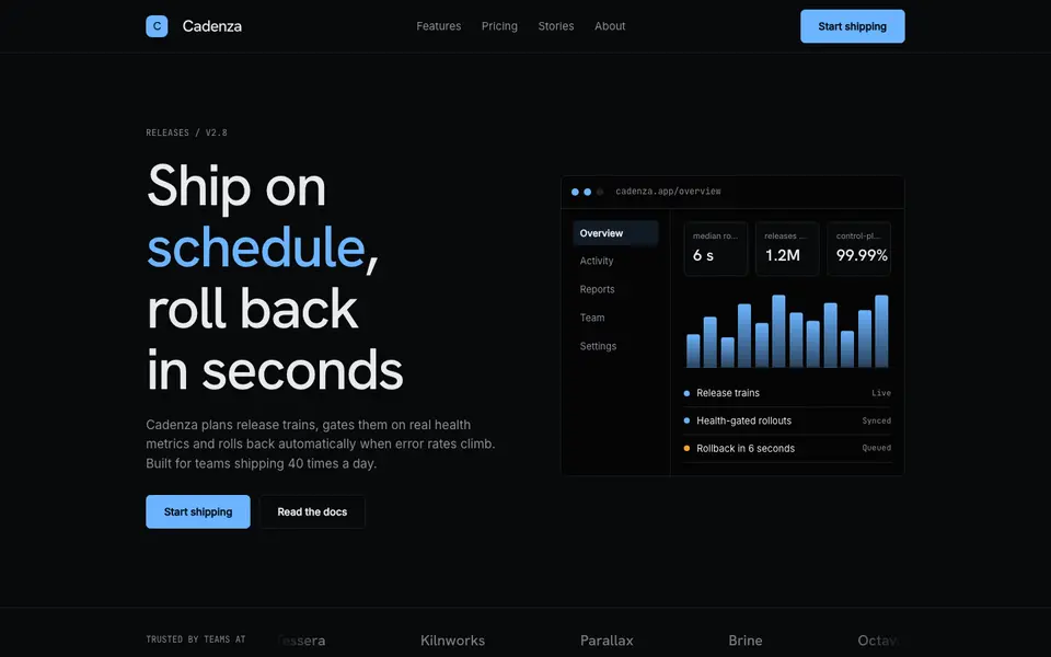
Hairline Noir
No. 041Near-black, one ice-blue accent and hairlines drawn with a 0.5mm technical pen.
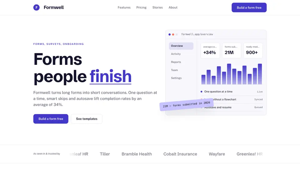
Indigo Clarity
No. 042White space, deep indigo and crisp product screenshots that explain themselves.
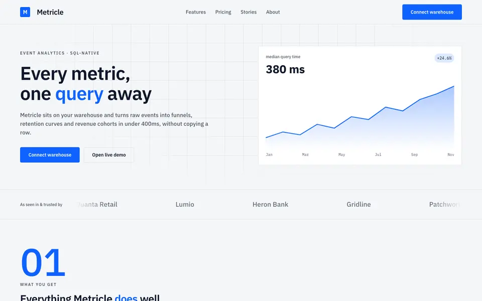
Signal Grid
No. 043A dense analytics cockpit: tight grids, tabular numbers and charts that do the talking.
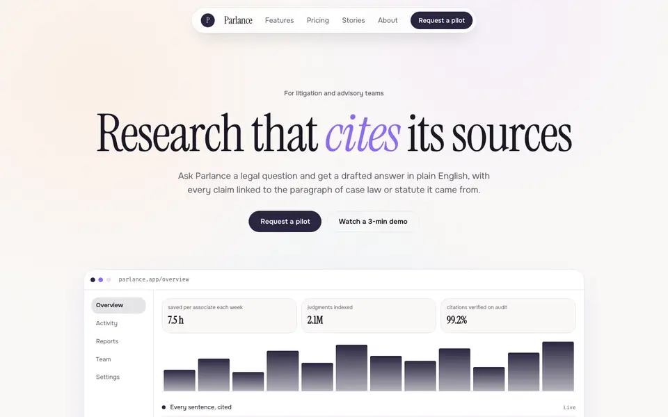
Soft Intelligence
No. 044Calm AI product pages: pearly gradients, a literary serif and a chat window as the hero.
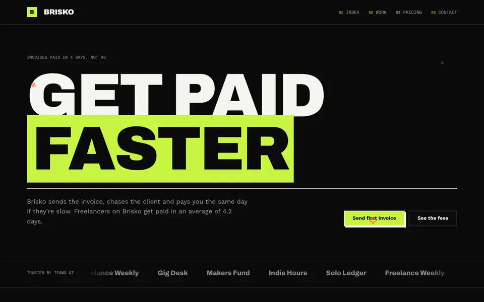
Lime Voltage
No. 067Black, electric lime and huge condensed caps. A startup that wants you to notice.