Indigo Clarity
White space, deep indigo and crisp product screenshots that explain themselves.
This style
$9$19
One-time, no subscription · instant download · client use · 7-day refund before download
The idea
A bright white product page with one deep indigo, tidy grey type and screenshots set at a slight angle against soft lavender panels. Clear headings, short sentences, obvious buttons. The visual equivalent of a well-written help article.
Indigo Clarity is the classic modern product page done with care. White canvas, one deep indigo, warm grey type and product screenshots presented on soft lavender panels with a slight tilt. It borrows from good technical writing and from the tidy, explanatory product pages of the last decade, minus the clichés. The goal is comprehension: every section answers one question a buyer would ask. It should feel trustworthy, friendly and obviously easy to use.
Principles
- Every section answers one buyer question in its heading.
- Show the product in every section; explain with screenshots, not icons.
- Indigo is action; coral is a small human touch.
- Short sentences, concrete numbers, no jargon.
- White space is structure — never fill it with decoration.
Motion
The hero screenshot slides in from 24px right with a 2-degree tilt that settles flat. Feature cards slide in from the left in sequence, and the indigo underline under the accent word draws in after the headline lands.
Do & don't
Do
- ✓ Phrase section headings as answers ('Forms people finish').
- ✓ Use one screenshot per feature card.
- ✓ Put a coral cursor in screenshots to guide the eye.
Don't
- ✕ Don't use gradients or glass effects.
- ✕ Don't use icons as the only visual in a card.
- ✕ Don't use coral for buttons or links.
+ 3 more of each, and component rules, in the full DESIGN.md.
What's in the DESIGN.md
- 01Overview & principles
- 02Colors (tokens + proportions)
- 03Typography (families + 12-role scale)
- 04Layout & spacing scale
- 05Elevation & depth
- 06Shapes & radii
- 07Motion (easing, durations, signature)
- 08Imagery + generation prompt
- 09Components (button, card, nav, input, badge)
- 10Do's and don'ts
- 11Responsive behaviour
- 12Iteration guide + agent checklist
Plus theme.css (Tailwind v4 @theme), tokens.json (W3C) and the preview page source — 360 lines of DESIGN.md in total.
More like this
All SaaS & Bento →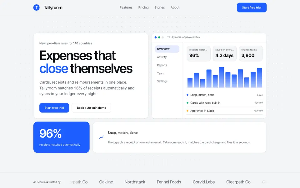 Free
FreeBento Daylight
No. 039A sunlit bento box of product tiles: soft grey canvas, white cells, one confident blue.
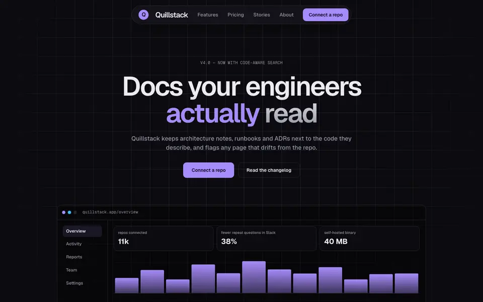
Bento Midnight
No. 040Charcoal tiles on a blueprint grid, lit from inside by a single violet glow.
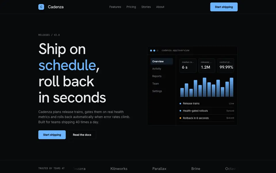
Hairline Noir
No. 041Near-black, one ice-blue accent and hairlines drawn with a 0.5mm technical pen.
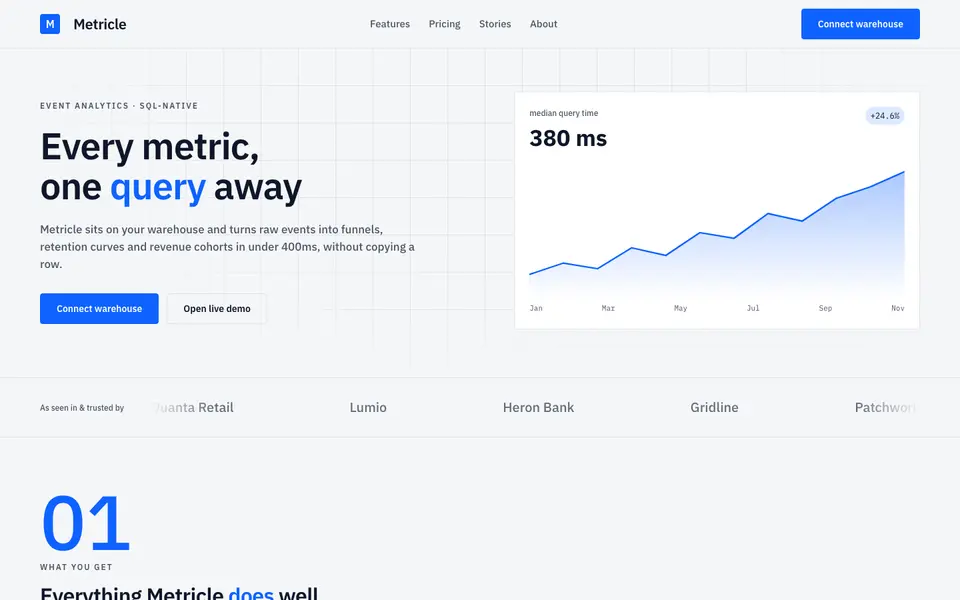
Signal Grid
No. 043A dense analytics cockpit: tight grids, tabular numbers and charts that do the talking.
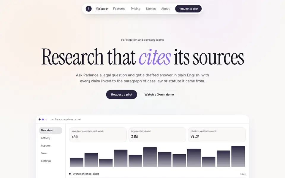
Soft Intelligence
No. 044Calm AI product pages: pearly gradients, a literary serif and a chat window as the hero.
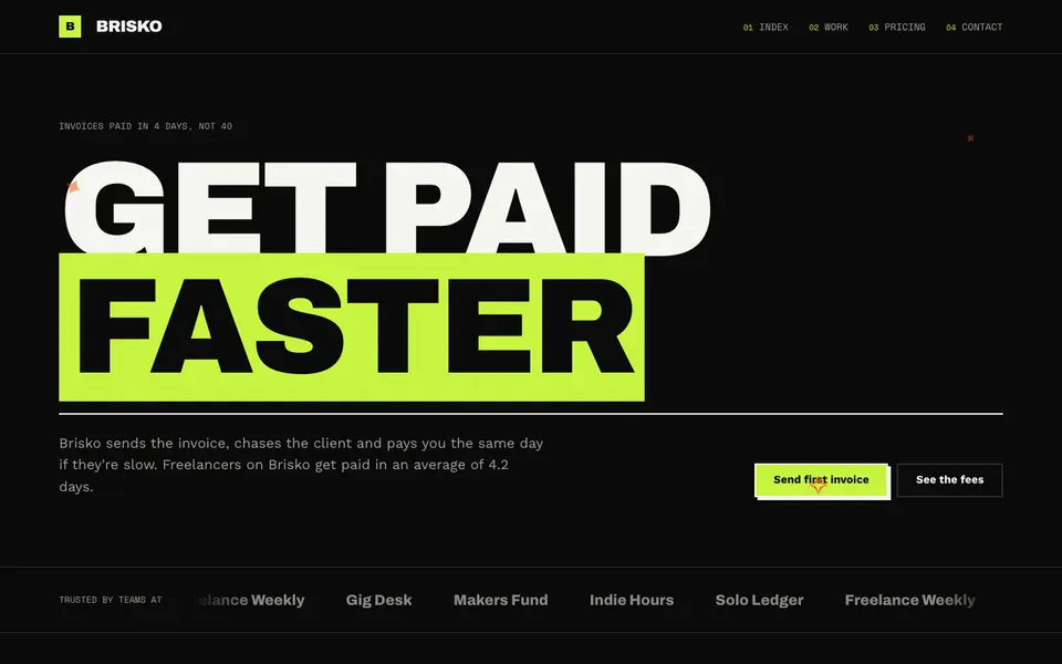
Lime Voltage
No. 067Black, electric lime and huge condensed caps. A startup that wants you to notice.