Tabular Ledger
Numbers first: cell borders, column letters, tabular figures and green-ink totals.
This style
$9$19
One-time, no subscription · instant download · client use · 7-day refund before download
The idea
A page that thinks in cells. Content sits in a visible spreadsheet grid with column letters and row numbers in the margins, figures are always tabular and right-aligned, and the only accent is the green of a ledger total. Precise, dry and quietly satisfying, like a balanced sheet.
Tabular Ledger treats a marketing page like a well-kept workbook. A faint cell grid runs behind everything, column letters and row numbers sit in the margins, and content is aligned to cells. It borrows from accountants' ledgers, early spreadsheet software and the Swiss love of tables. Figures are always tabular and right-aligned; the only accent is the green ink of a reconciled total. It should feel dry, exact and deeply reassuring to anyone who has ever chased a broken formula.
Principles
- Align everything to cells; the grid is visible on purpose.
- Numbers are the heroes: tabular, right-aligned, with units.
- Green means balanced; blue means a link or selection.
- No radius on content; only buttons get 4px.
- Use cell references and formulas as texture, sparingly.
Motion
Sections reveal like a selection range being dragged: a clip mask expands from the top-left cell to the bottom-right in six discrete steps. Hovered cells invert to ink with white text, like a selected cell.
Do & don't
Do
- ✓ Show column letters and row numbers in the margins.
- ✓ Right-align and tabular-align every number.
- ✓ Use one blue selection outline per section to guide the eye.
Don't
- ✕ Don't round cards or images.
- ✕ Don't use proportional figures in tables.
- ✕ Don't use shadows or gradients.
+ 3 more of each, and component rules, in the full DESIGN.md.
What's in the DESIGN.md
- 01Overview & principles
- 02Colors (tokens + proportions)
- 03Typography (families + 12-role scale)
- 04Layout & spacing scale
- 05Elevation & depth
- 06Shapes & radii
- 07Motion (easing, durations, signature)
- 08Imagery + generation prompt
- 09Components (button, card, nav, input, badge)
- 10Do's and don'ts
- 11Responsive behaviour
- 12Iteration guide + agent checklist
Plus theme.css (Tailwind v4 @theme), tokens.json (W3C) and the preview page source — 359 lines of DESIGN.md in total.
More like this
All SaaS & Bento →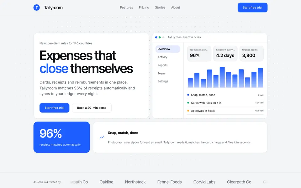 Free
FreeBento Daylight
No. 039A sunlit bento box of product tiles: soft grey canvas, white cells, one confident blue.
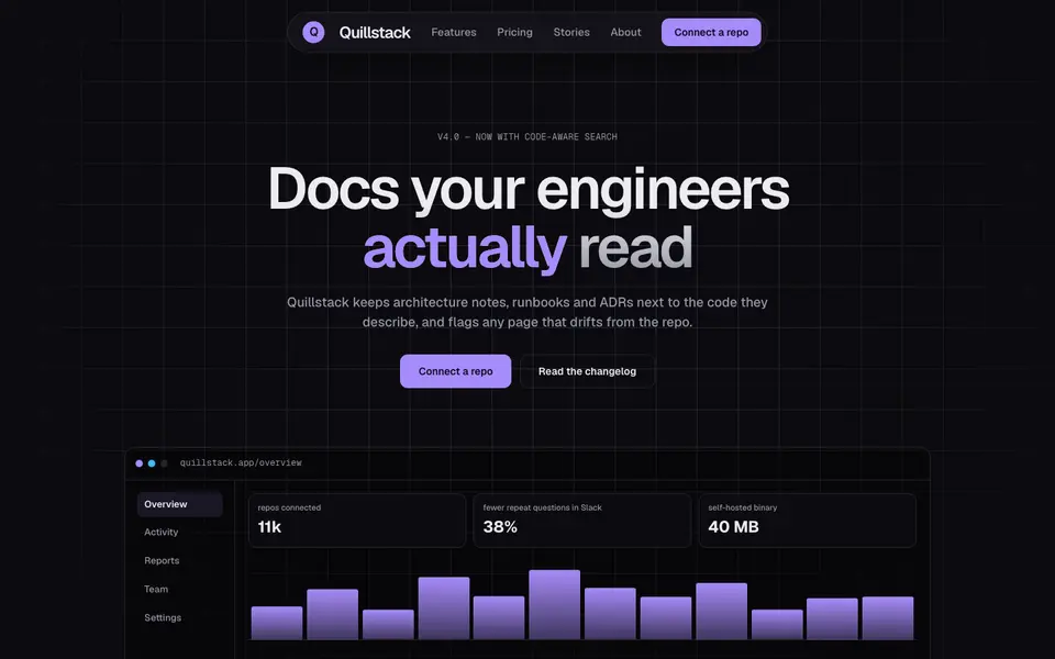
Bento Midnight
No. 040Charcoal tiles on a blueprint grid, lit from inside by a single violet glow.
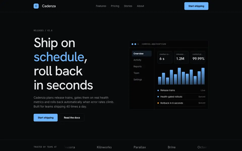
Hairline Noir
No. 041Near-black, one ice-blue accent and hairlines drawn with a 0.5mm technical pen.
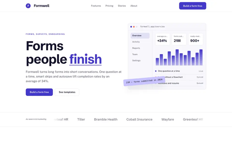
Indigo Clarity
No. 042White space, deep indigo and crisp product screenshots that explain themselves.
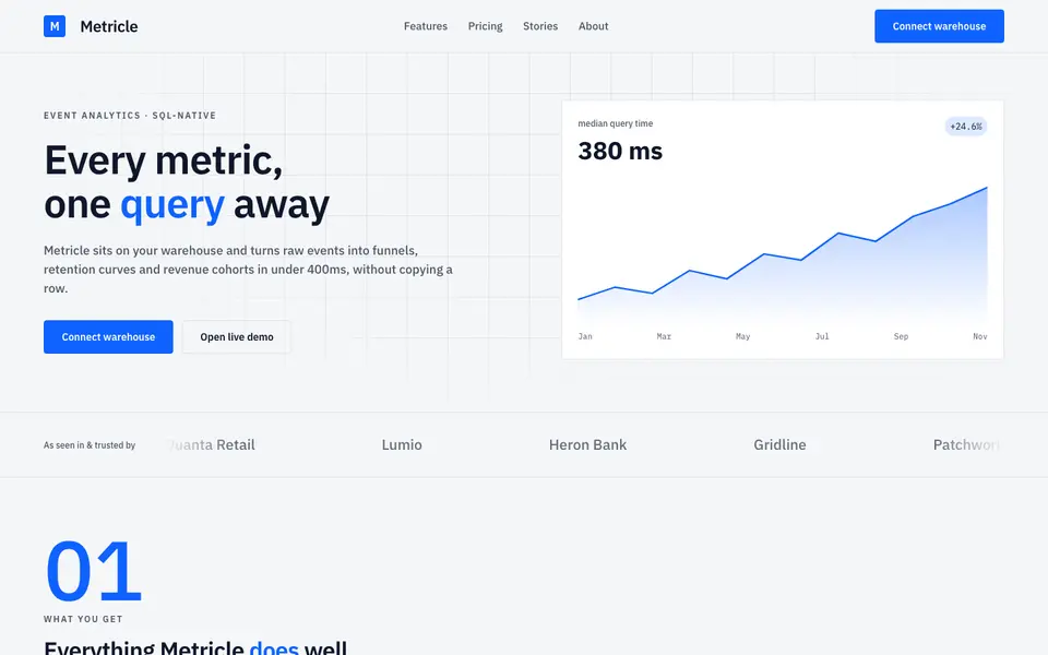
Signal Grid
No. 043A dense analytics cockpit: tight grids, tabular numbers and charts that do the talking.
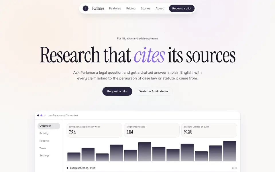
Soft Intelligence
No. 044Calm AI product pages: pearly gradients, a literary serif and a chat window as the hero.