Moody Forest
Pine-dark greens, a sturdy old serif and mist hanging between the trunks.
This style
$9$19
One-time, no subscription · instant download · client use · 7-day refund before download
The idea
The colour of a spruce wood at dusk: layered greens from moss to near-black, a chunky Victorian-flavoured serif, and photographs drenched in fog. Pale lichen text and a copper accent glow like a lantern through the trees. Brooding, earthy and grown-up.
Moody Forest is a dark system grown from the woods. It borrows from Victorian botanical plates, Scottish estate signage and contemporary atmospheric landscape photography: layered greens from moss to almost-black, a sturdy, slightly quirky old-style serif, and a copper accent that glows like lamplight. Unlike cold dark themes, every colour here is organic — nothing is grey, nothing is blue. Mist and depth do the decorating. It should feel quiet, earthy and slightly mysterious, like walking in after dark.
Principles
- Use greens in layers to build depth, never a single flat black.
- Copper is the lantern: one warm light per screen.
- Let fog in photography act as negative space.
- Keep type sturdy and unfussy — no hairline weights.
- Speak like a forager: places, seasons, quantities.
Motion
Sections emerge from a soft 10px blur like shapes stepping out of fog; the hero photograph drifts upward 3% on scroll for a slow parallax between canopy and text.
Do & don't
Do
- ✓ Layer at least two green tones in every section.
- ✓ Use foggy photography with soft gradients into the canvas.
- ✓ Keep copper to one element per viewport.
Don't
- ✕ Don't use neutral greys or pure black.
- ✕ Don't use bright, sunny photography.
- ✕ Don't use copper for body text.
+ 3 more of each, and component rules, in the full DESIGN.md.
What's in the DESIGN.md
- 01Overview & principles
- 02Colors (tokens + proportions)
- 03Typography (families + 12-role scale)
- 04Layout & spacing scale
- 05Elevation & depth
- 06Shapes & radii
- 07Motion (easing, durations, signature)
- 08Imagery + generation prompt
- 09Components (button, card, nav, input, badge)
- 10Do's and don'ts
- 11Responsive behaviour
- 12Iteration guide + agent checklist
Plus theme.css (Tailwind v4 @theme), tokens.json (W3C) and the preview page source — 364 lines of DESIGN.md in total.
More like this
All Dark & Cinematic →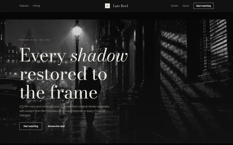
Noir Cinema
No. 028Letterboxed, grainy and lit from one side, like a 1947 crime picture.
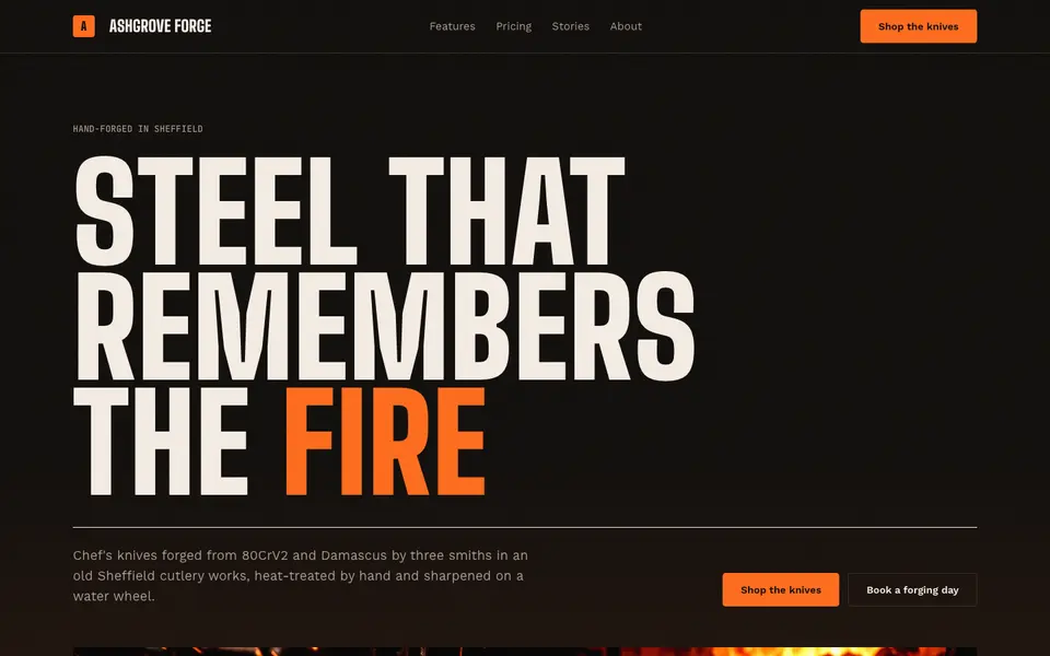
Ember Forge
No. 045Coal black, molten orange and condensed capitals hammered out of the fire.
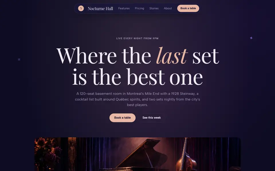
Midnight Velvet
No. 046Indigo velvet, a lush italic serif and the glow of a stage at 11pm.
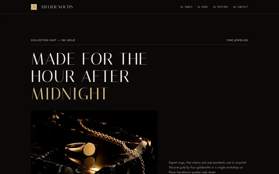
Obsidian Champagne
No. 048Polished black stone, champagne gold hairlines and a whisper-thin roman.
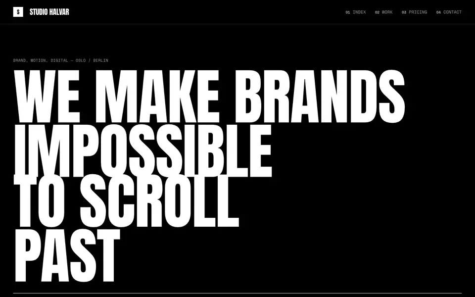
Studio Black
No. 049Black page, white capitals the height of the screen, and nothing else.
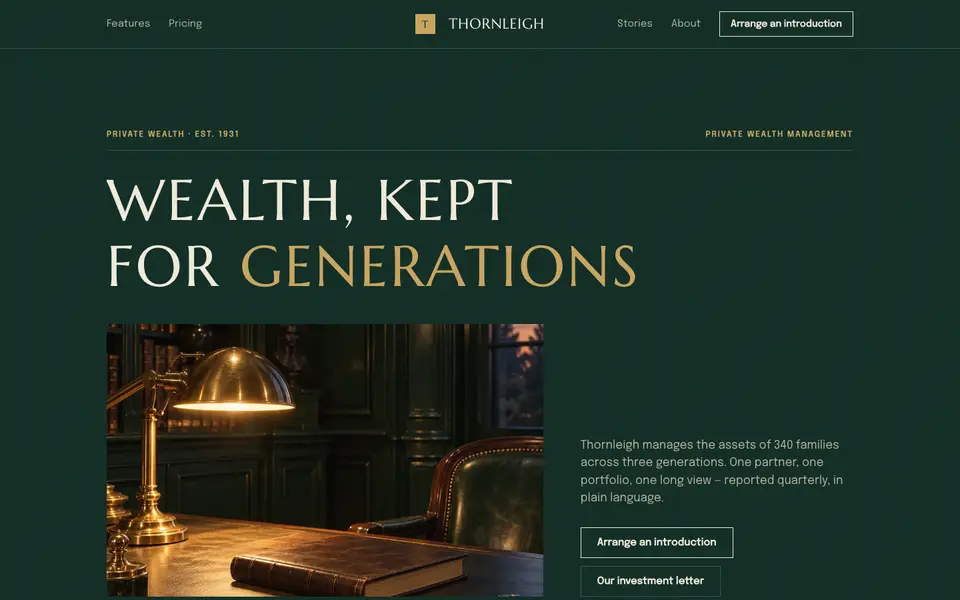
Verdant Reserve
No. 100Private wealth in bottle green and gilt: engraved capitals, quiet numbers, old money.