Noir Cinema
Letterboxed, grainy and lit from one side, like a 1947 crime picture.
This style
$9$19
One-time, no subscription · instant download · client use · 7-day refund before download
The idea
A black-and-silver system shot through a projector. Black letterbox bars frame a grainy monochrome hero, a razor-contrast didone carries the titles, and a single blood-red rule marks the plot point. Moody, literate and deliberately slow.
Noir Cinema treats the browser like a darkened theatre. It borrows from 1940s American crime pictures, Saul-era title cards and the European art-house restorations that followed: a near-black canvas under constant film grain, letterbox bars that frame the hero at 2.39:1, a hairline-contrast didone for titles and a disciplined condensed sans for reading. Colour is almost absent — warm silver on black — with one blood-red rule reserved for the moment that matters. It should feel tense, expensive and unhurried.
Principles
- Keep it monochrome; red is a single plot point, not a palette.
- Frame the hero in letterbox bars at a 2.39:1 ratio.
- Let grain run over everything, including text.
- Light from one side — gradients only as vignettes.
- Reveal, don't fade: wipes, irises and clip masks.
Motion
Letterbox bars close in from top and bottom on load, then the headline is revealed by a horizontal wipe like an iris transition; grain flickers at 12fps across the whole page.
Do & don't
Do
- ✓ Keep the letterbox bars on the hero at every breakpoint.
- ✓ Run grain at 7–9% opacity over everything.
- ✓ Use mono reel numbers as section labels.
Don't
- ✕ Don't use colour photography.
- ✕ Don't round any corners.
- ✕ Don't use shadows or glows.
+ 3 more of each, and component rules, in the full DESIGN.md.
What's in the DESIGN.md
- 01Overview & principles
- 02Colors (tokens + proportions)
- 03Typography (families + 12-role scale)
- 04Layout & spacing scale
- 05Elevation & depth
- 06Shapes & radii
- 07Motion (easing, durations, signature)
- 08Imagery + generation prompt
- 09Components (button, card, nav, input, badge)
- 10Do's and don'ts
- 11Responsive behaviour
- 12Iteration guide + agent checklist
Plus theme.css (Tailwind v4 @theme), tokens.json (W3C) and the preview page source — 364 lines of DESIGN.md in total.
More like this
All Dark & Cinematic →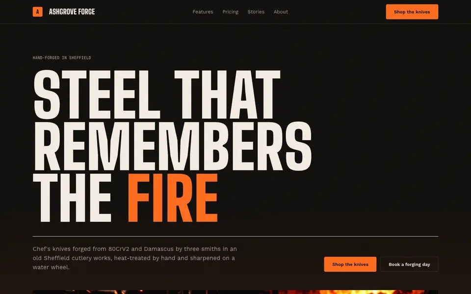
Ember Forge
No. 045Coal black, molten orange and condensed capitals hammered out of the fire.
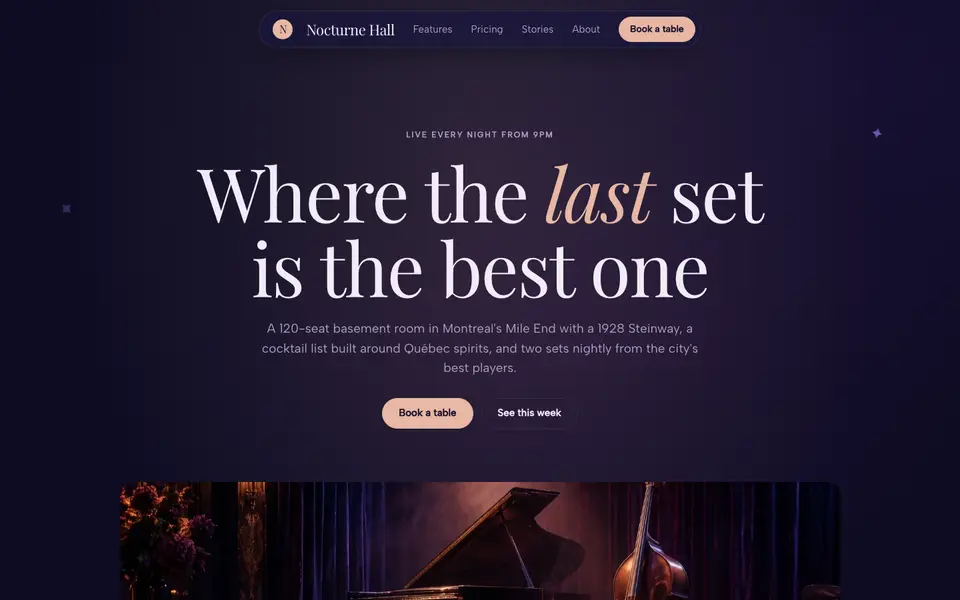
Midnight Velvet
No. 046Indigo velvet, a lush italic serif and the glow of a stage at 11pm.
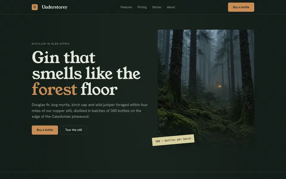
Moody Forest
No. 047Pine-dark greens, a sturdy old serif and mist hanging between the trunks.
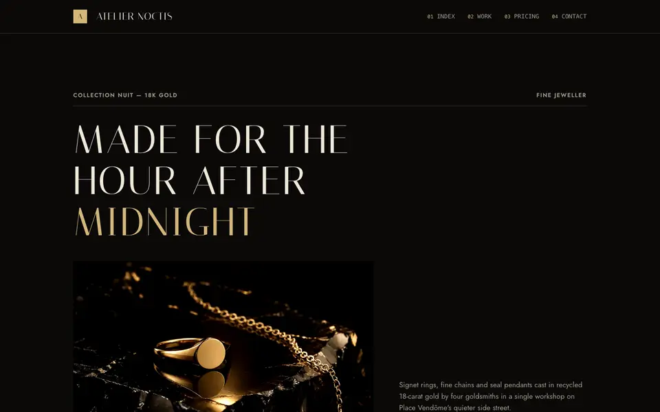
Obsidian Champagne
No. 048Polished black stone, champagne gold hairlines and a whisper-thin roman.
Studio Black
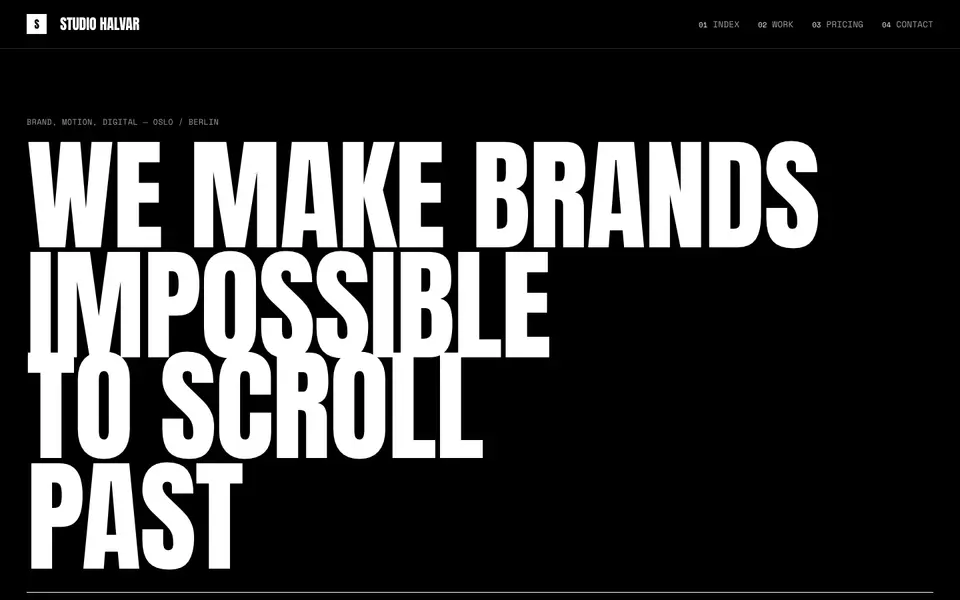
No. 049Black page, white capitals the height of the screen, and nothing else.
Velvet Noir
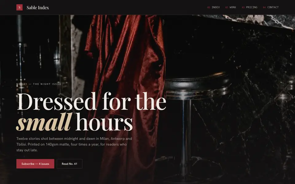
No. 009A fashion monthly after midnight: lacquer black, oxblood ink, flash-lit photography.