Velvet Noir
A fashion monthly after midnight: lacquer black, oxblood ink, flash-lit photography.
This style
$9$19
One-time, no subscription · instant download · client use · 7-day refund before download
The idea
The back half of a fashion monthly shot at two in the morning. Near-black pages, a heavy italic serif that leans into the frame, and on-camera-flash photography with hard shadows. One oxblood ink, one champagne highlight, and everything else is darkness.
Velvet Noir is a fashion magazine read by streetlight. It draws on 1990s flash fashion photography, late-night club flyers printed on good paper, and the black-page sections of European style monthlies. The page is almost black and the type is pale bone, so every photograph glows like a slide on a lightbox. Hierarchy comes from scale and a heavy italic serif, not from colour. Oxblood is the single brand ink and it should feel like lipstick on a napkin: rare, deliberate, unforgettable.
Principles
- Darkness is the canvas — let photographs be the only bright thing on the page.
- Lean headlines into italic and let them overlap images by up to 80px.
- One oxblood mark per viewport, never two.
- Number everything like a contents page: stories, features, prices.
- Cut hard: no rounded corners, no fades between sections, only black and grain.
Motion
Sections surface out of a 12px blur like a print emerging in the developer tray. The hero photograph sits 6% oversized and drifts upward against the scroll; a slow marquee of contributor names crawls under the fold.
Do & don't
Do
- ✓ Overlap the headline onto the hero photograph by at least one line.
- ✓ Credit photographers and stylists in tiny vertical caps beside images.
- ✓ Use champagne italic numerals (01–06) to order features.
Don't
- ✕ Don't use pure #000000 or pure white — they flatten the print feel.
- ✕ Don't use oxblood for small body text on black.
- ✕ Don't round corners on images, buttons or inputs.
+ 3 more of each, and component rules, in the full DESIGN.md.
What's in the DESIGN.md
- 01Overview & principles
- 02Colors (tokens + proportions)
- 03Typography (families + 12-role scale)
- 04Layout & spacing scale
- 05Elevation & depth
- 06Shapes & radii
- 07Motion (easing, durations, signature)
- 08Imagery + generation prompt
- 09Components (button, card, nav, input, badge)
- 10Do's and don'ts
- 11Responsive behaviour
- 12Iteration guide + agent checklist
Plus theme.css (Tailwind v4 @theme), tokens.json (W3C) and the preview page source — 364 lines of DESIGN.md in total.
More like this
All Editorial & Luxury →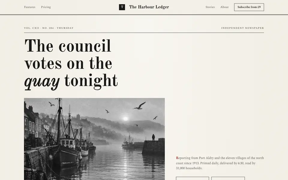
Broadsheet Press
No. 001A morning broadsheet: masthead, column rules, datelines and a grey halftone photograph.
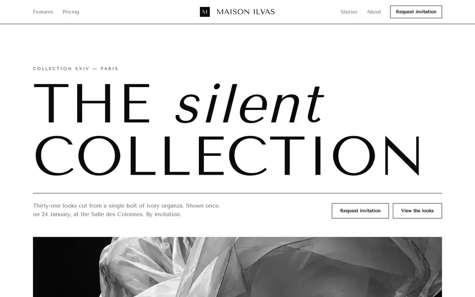
Didone Couture
No. 002Haute couture in two inks: a hairline Didone, paper white and absolute black.
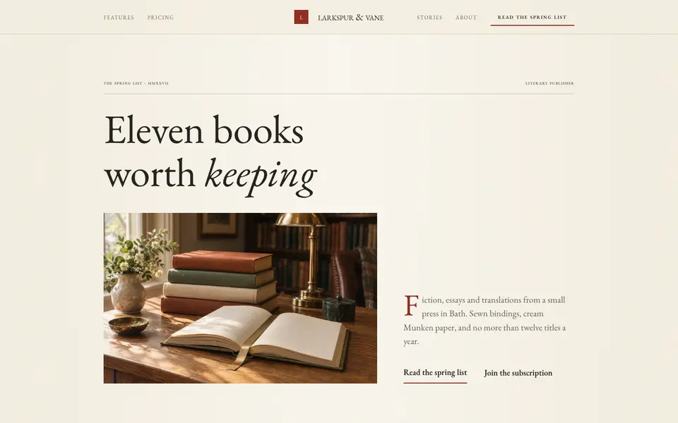
Folio Press
No. 003A literary publisher's catalogue: Garamond, small caps, cream paper and a printer's red.
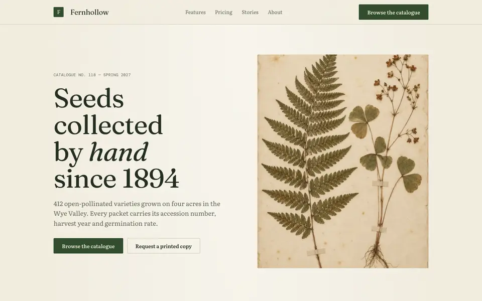
Herbarium Journal
No. 004A naturalist's field journal: specimen plates, Latin names, moss green and foxed paper.
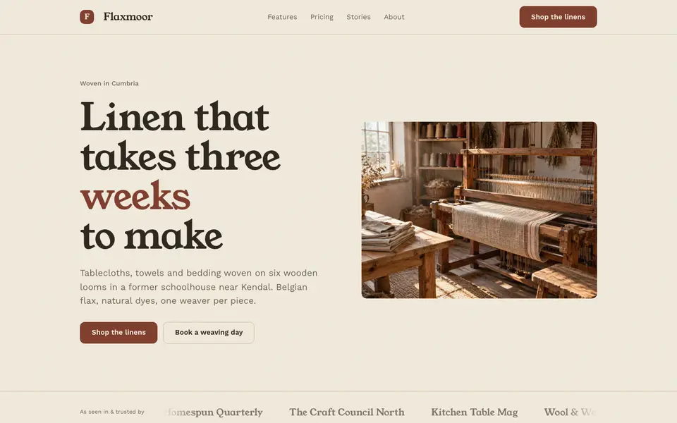
Linen Atelier
No. 005An artisan workshop journal: flax tones, soft serif, stitched details and daylight.
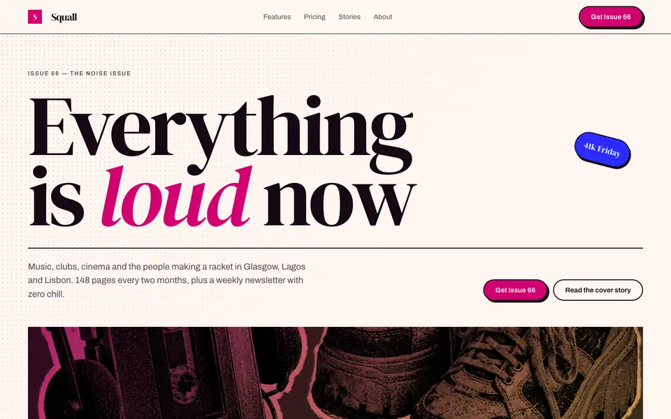
Magenta Shout
No. 006A pop-culture magazine at full volume: towering italics, hot magenta, cut-out photos.