Didone Couture
Haute couture in two inks: a hairline Didone, paper white and absolute black.
This style
$9$19
One-time, no subscription · instant download · client use · 7-day refund before download
The idea
A couture house invitation set in a razor-thin Didone. Pure black and white, enormous uppercase headlines whose hairlines almost disappear, and silver-gelatin photography of fabric in motion. Severe, theatrical and unmistakably expensive.
Didone Couture is a couture house rendered in two inks. It takes its cues from 1950s fashion-house invitations, the high-contrast mastheads of mid-century fashion monthlies and silver-gelatin runway photography. A Didone with near-invisible hairlines is set enormous and uppercase, so its thick and thin strokes become the decoration. There is no colour at all; drama comes from the cut between paper white and pure black, and from emptiness used like fabric.
Principles
- Two inks only: white and black. Grey is permitted for captions and nothing else.
- Set the Didone huge — the hairlines need size to read.
- Cut sections hard between white and black bands, never fade.
- Give each photograph a full column of emptiness beside it.
- Be terse: three-word headlines, one-sentence captions.
Motion
The poster headline is unveiled by a curtain that wipes left to right in 1.2s with an expo in-out ease, like a runway light snapping on. Buttons invert black to white instantly on hover — no fade.
Do & don't
Do
- ✓ Set the hero headline at 160px uppercase so the hairlines read as ornament.
- ✓ Alternate white and black bands down the page.
- ✓ Write prices as 'From €2,400' or 'On request'.
Don't
- ✕ Don't introduce any colour, including in links or focus states.
- ✕ Don't bold the Didone or set it smaller than 28px.
- ✕ Don't round corners or add shadows.
+ 3 more of each, and component rules, in the full DESIGN.md.
What's in the DESIGN.md
- 01Overview & principles
- 02Colors (tokens + proportions)
- 03Typography (families + 12-role scale)
- 04Layout & spacing scale
- 05Elevation & depth
- 06Shapes & radii
- 07Motion (easing, durations, signature)
- 08Imagery + generation prompt
- 09Components (button, card, nav, input, badge)
- 10Do's and don'ts
- 11Responsive behaviour
- 12Iteration guide + agent checklist
Plus theme.css (Tailwind v4 @theme), tokens.json (W3C) and the preview page source — 363 lines of DESIGN.md in total.
More like this
All Editorial & Luxury →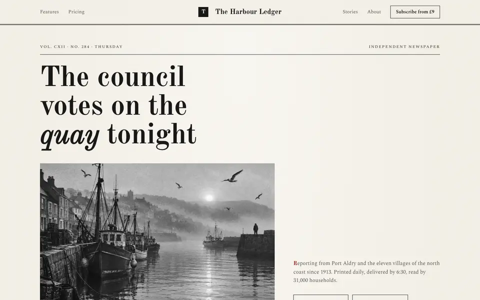
Broadsheet Press
No. 001A morning broadsheet: masthead, column rules, datelines and a grey halftone photograph.
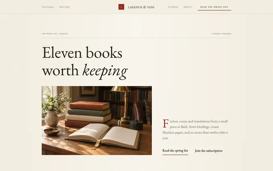
Folio Press
No. 003A literary publisher's catalogue: Garamond, small caps, cream paper and a printer's red.
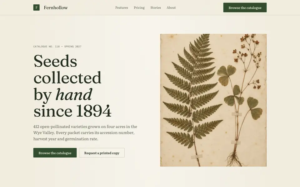
Herbarium Journal
No. 004A naturalist's field journal: specimen plates, Latin names, moss green and foxed paper.
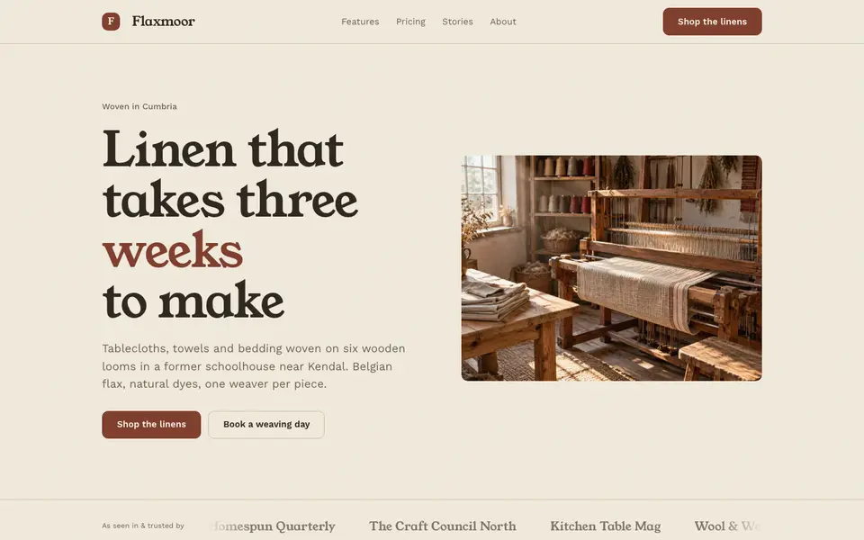
Linen Atelier
No. 005An artisan workshop journal: flax tones, soft serif, stitched details and daylight.
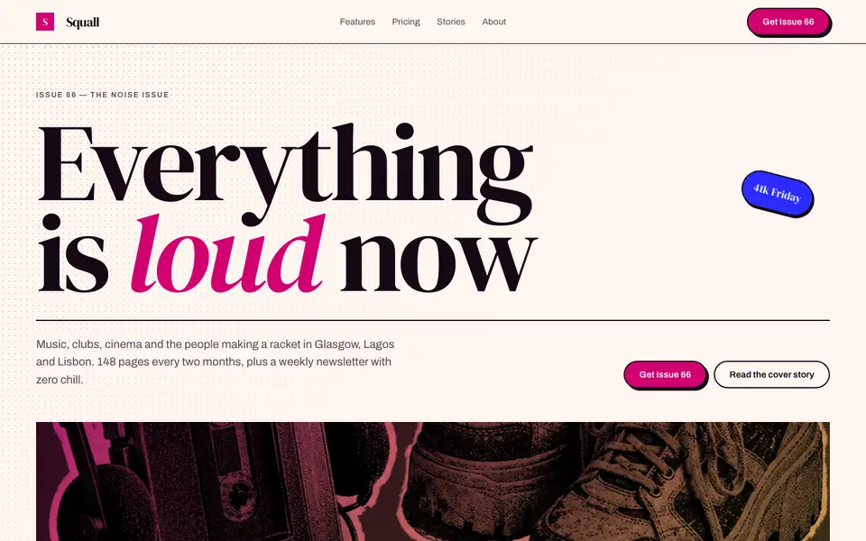
Magenta Shout
No. 006A pop-culture magazine at full volume: towering italics, hot magenta, cut-out photos.
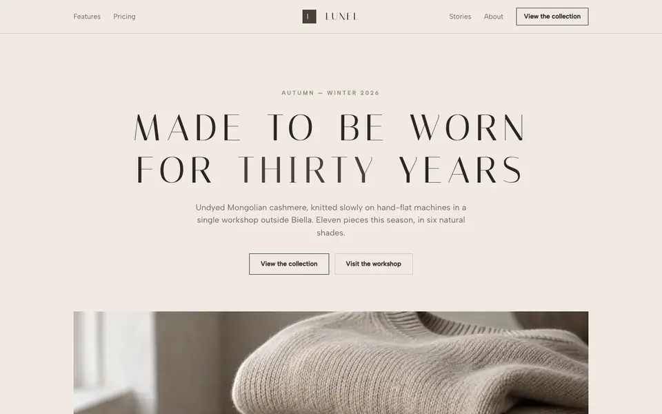
Quiet Stone
No. 007Quiet luxury in taupe and limestone: wide-tracked capitals, no logo, nothing to prove.