Magenta Shout
A pop-culture magazine at full volume: towering italics, hot magenta, cut-out photos.
This style
$9$19
One-time, no subscription · instant download · client use · 7-day refund before download
The idea
The cover of a culture magazine designed to be seen from across the newsstand. Giant italic serif headlines tumble over each other, hot magenta fills whole sections, and duotone photographs are cut out and stuck on like collage. Loud, funny and very sure of itself.
Magenta Shout is a culture magazine cover that never stops talking. It borrows from 1980s pop-art collage, photocopied music zines and the bold cover lines of newsstand weeklies. Headlines are set huge in a fat italic serif with negative tracking so letters nearly collide; magenta floods whole sections; duotone photographs are cut out and slapped on at angles. Everything is a little bit too big, on purpose — this style trades calm for energy and makes no apology.
Principles
- Go too big: the hero headline should crop or nearly touch the viewport edge.
- Italic is the default voice, not the exception.
- Flood entire bands with magenta — colour as volume.
- Stick things on: rotated stickers, cut-outs, badges at odd angles.
- Keep body copy disciplined so the shouting stays readable.
Motion
Headlines punch in from 92% scale with an overshoot spring; stickers tilt 4 degrees on hover. A yellow-on-magenta marquee of cover lines races across at 120px per second.
Do & don't
Do
- ✓ Let the hero headline run to the edges and overlap the image.
- ✓ Rotate cards and stickers slightly, never more than ±4 degrees.
- ✓ Use halftone dots on photographs and backgrounds.
Don't
- ✕ Don't use soft shadows or blur — shadows are hard and offset.
- ✕ Don't use pastel or muted tones.
- ✕ Don't centre-align every block; stagger them.
+ 3 more of each, and component rules, in the full DESIGN.md.
What's in the DESIGN.md
- 01Overview & principles
- 02Colors (tokens + proportions)
- 03Typography (families + 12-role scale)
- 04Layout & spacing scale
- 05Elevation & depth
- 06Shapes & radii
- 07Motion (easing, durations, signature)
- 08Imagery + generation prompt
- 09Components (button, card, nav, input, badge)
- 10Do's and don'ts
- 11Responsive behaviour
- 12Iteration guide + agent checklist
Plus theme.css (Tailwind v4 @theme), tokens.json (W3C) and the preview page source — 365 lines of DESIGN.md in total.
More like this
All Editorial & Luxury →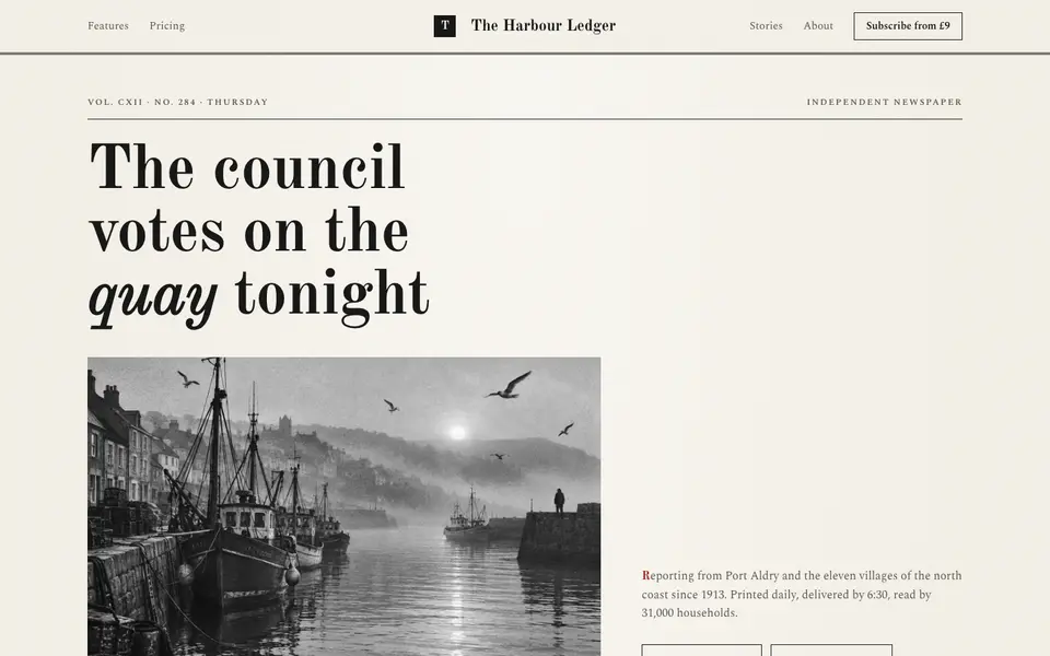
Broadsheet Press
No. 001A morning broadsheet: masthead, column rules, datelines and a grey halftone photograph.
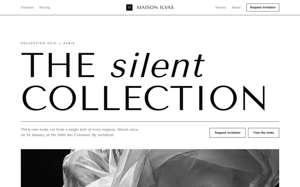
Didone Couture
No. 002Haute couture in two inks: a hairline Didone, paper white and absolute black.
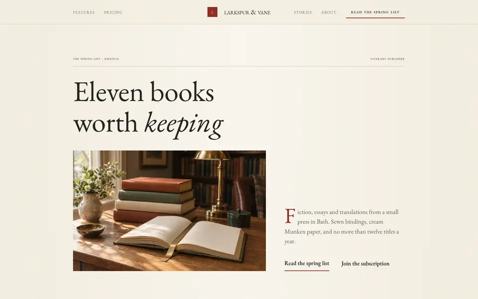
Folio Press
No. 003A literary publisher's catalogue: Garamond, small caps, cream paper and a printer's red.
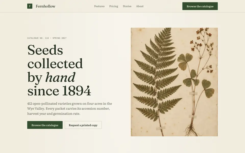
Herbarium Journal
No. 004A naturalist's field journal: specimen plates, Latin names, moss green and foxed paper.
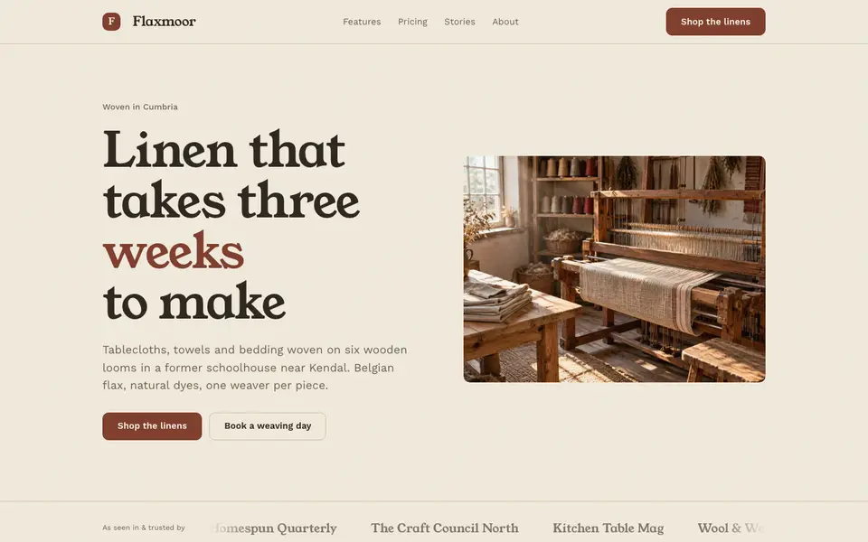
Linen Atelier
No. 005An artisan workshop journal: flax tones, soft serif, stitched details and daylight.
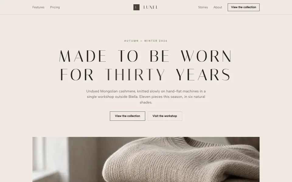
Quiet Stone
No. 007Quiet luxury in taupe and limestone: wide-tracked capitals, no logo, nothing to prove.