Riso Overprint
Fluorescent pink and riso blue, overprinted slightly out of register on cream stock.
This style
$9$19
One-time, no subscription · instant download · client use · 7-day refund before download
The idea
Two drums of ink and nothing else. Fluorescent pink and deep riso blue overlap into purple where they meet, edges drift a millimetre out of register, and grain shows through every flat area. It looks like a print-shop poster made at an art school open day.
Riso Overprint reproduces the look of risograph printing as practised by small presses, art schools and zine fairs from the 2010s onward: two flat spot inks, fluorescent pink and deep blue, laid on cream recycled stock. Where they overlap they multiply into purple; where the drums drift they leave a millimetre of misregistration. Grain and uneven coverage are part of the charm. Type is a tight contemporary grotesk printed in blue with a pink ghost behind it. It should feel crafted, tactile and joyfully imperfect.
Principles
- Two inks only: pink and blue. Purple happens where they overlap.
- Misregister on purpose — offset the pink layer 3–4px from the blue.
- Flat areas need grain; nothing is perfectly smooth.
- Use multiply blending so colours overprint, never cover.
- Blue is the 'black': all text prints in riso blue.
Motion
On load the pink layer of the headline slides into place 4px behind the blue, like the second drum pass landing slightly off. Cards shift 3px on hover, revealing more of their pink offset shadow.
Do & don't
Do
- ✓ Offset the pink layer of the h1 by 4px.
- ✓ Use mix-blend-mode: multiply on pink shapes.
- ✓ Name inks and paper weights in labels.
Don't
- ✕ Don't introduce a third colour beyond the yellow dot.
- ✕ Don't use pure black or grey.
- ✕ Don't use soft shadows or glows.
+ 3 more of each, and component rules, in the full DESIGN.md.
What's in the DESIGN.md
- 01Overview & principles
- 02Colors (tokens + proportions)
- 03Typography (families + 12-role scale)
- 04Layout & spacing scale
- 05Elevation & depth
- 06Shapes & radii
- 07Motion (easing, durations, signature)
- 08Imagery + generation prompt
- 09Components (button, card, nav, input, badge)
- 10Do's and don'ts
- 11Responsive behaviour
- 12Iteration guide + agent checklist
Plus theme.css (Tailwind v4 @theme), tokens.json (W3C) and the preview page source — 365 lines of DESIGN.md in total.
More like this
All Neo-Retro →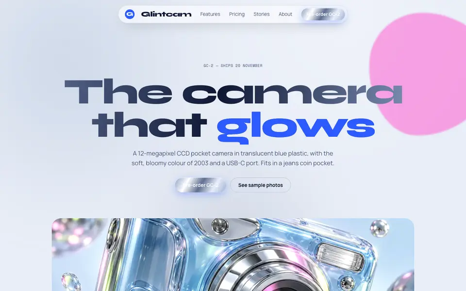
Y2K Chrome
No. 038Liquid chrome, bubble shapes and frosted-blue gadgets from the year 2000.
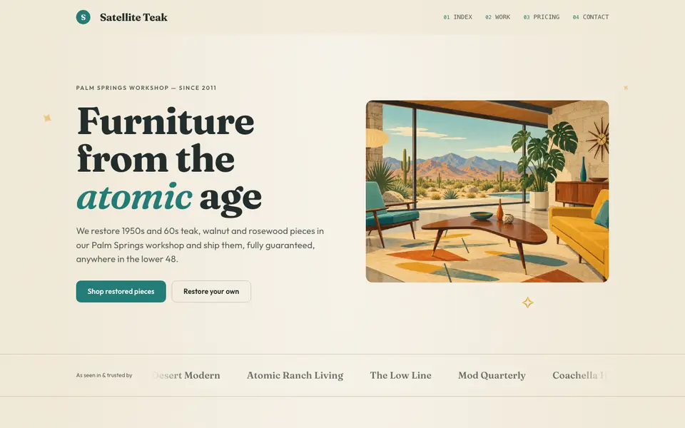
Atomic Modern
No. 058Teal, mustard and teak with starbursts and boomerangs: 1956 at its most optimistic.
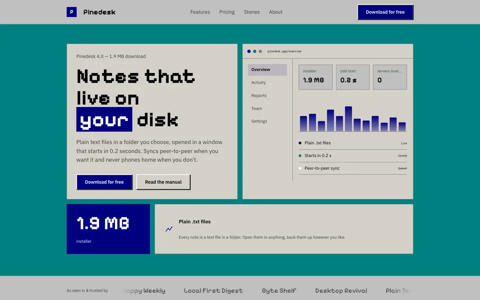
Beige Desktop
No. 059Bevelled grey windows, navy title bars and a pixel font: the 90s desktop as a website.
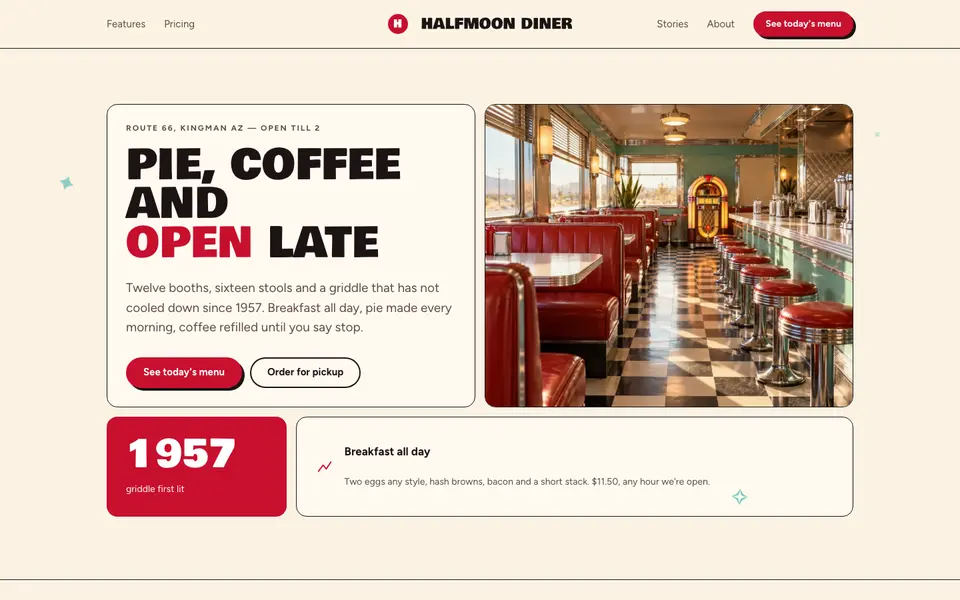
Checker Diner
No. 060Cherry red, cream vinyl and a checkerboard floor: a roadside diner menu, open late.
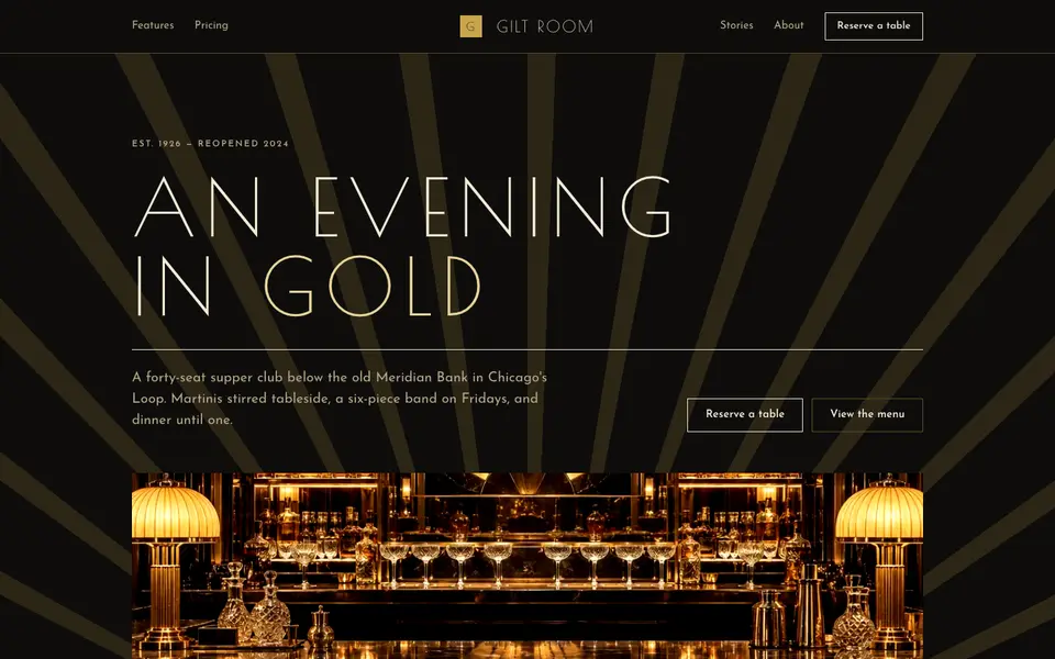
Gilded Deco
No. 061Black lacquer, gold leaf and sunburst geometry from a 1920s grand hotel lobby.
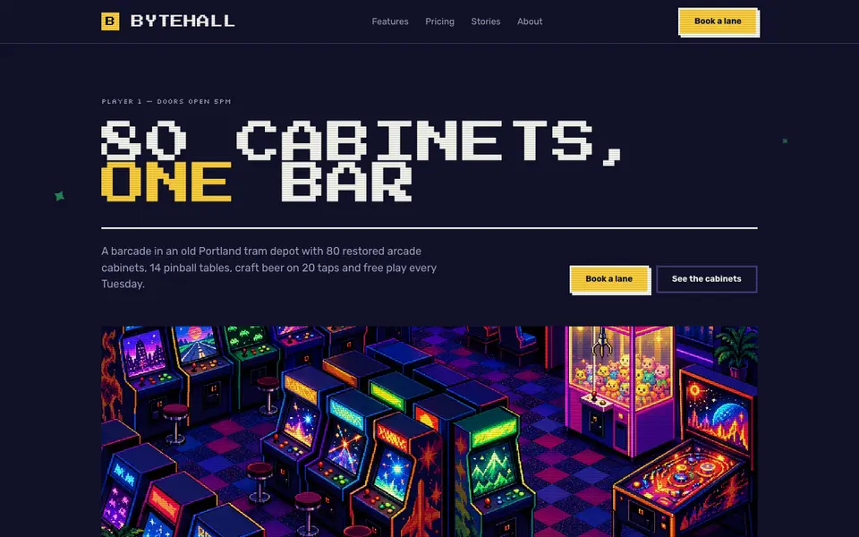
Pixel Arcade
No. 0628-bit type, stepped pixel borders and coin-yellow buttons. Insert coin to continue.