Seventies Groove
Burnt orange, mustard and brown stripes with fat, swashy type. Put a record on.
This style
$9$19
One-time, no subscription · instant download · client use · 7-day refund before download
The idea
Warm cream paper, a stack of orange, mustard and brown stripes curving across the page, and a soft swashy display face that looks hand-painted on a van. Rounded cards, sunny photography of shag rugs and wood panelling. Slow, friendly and good with a drink.
Seventies Groove pulls from 1970s record sleeves, roller-disco signage, kitchen-appliance ads and the stacked rainbow stripes painted on vans and surfboards. Warm cream paper, burnt orange, mustard, chocolate brown and a touch of avocado make up the whole palette. A swashy, rounded display face sets headlines as if hand-painted; a friendly grotesk keeps reading easy. Rounded 28px cards, soft shadows and sun-faded photography of wood-panelled interiors give it warmth. It should feel relaxed, analogue and generous.
Principles
- Everything is warm: no cool greys, no pure white, no blue.
- Stack stripes in orange, mustard and brown — always in that order.
- Round generously: 28px cards, pill buttons, curved stripe ends.
- One swashy headline per section; everything else is quiet.
- Photograph rooms and objects in golden light with film grain.
Motion
Sections drift up slowly like a record settling onto the platter. The striped rainbow behind the hero turns 1° back and forth over 8 seconds, barely noticeable, like a lava lamp.
Do & don't
Do
- ✓ Use the triple orange-mustard-brown stripe as the section divider.
- ✓ Curve stripe ends with full rounded caps.
- ✓ Keep photos warm and slightly faded.
Don't
- ✕ Don't use cool colours or grey.
- ✕ Don't set Shrikhand in uppercase or small sizes.
- ✕ Don't use sharp corners.
+ 3 more of each, and component rules, in the full DESIGN.md.
What's in the DESIGN.md
- 01Overview & principles
- 02Colors (tokens + proportions)
- 03Typography (families + 12-role scale)
- 04Layout & spacing scale
- 05Elevation & depth
- 06Shapes & radii
- 07Motion (easing, durations, signature)
- 08Imagery + generation prompt
- 09Components (button, card, nav, input, badge)
- 10Do's and don'ts
- 11Responsive behaviour
- 12Iteration guide + agent checklist
Plus theme.css (Tailwind v4 @theme), tokens.json (W3C) and the preview page source — 364 lines of DESIGN.md in total.
More like this
All Neo-Retro →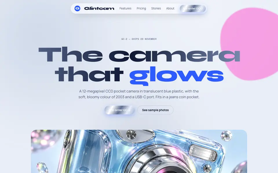
Y2K Chrome
No. 038Liquid chrome, bubble shapes and frosted-blue gadgets from the year 2000.
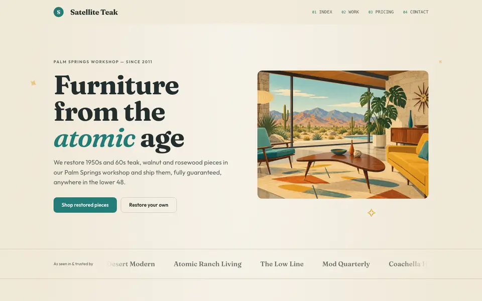
Atomic Modern
No. 058Teal, mustard and teak with starbursts and boomerangs: 1956 at its most optimistic.
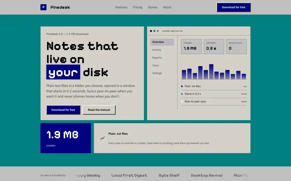
Beige Desktop
No. 059Bevelled grey windows, navy title bars and a pixel font: the 90s desktop as a website.
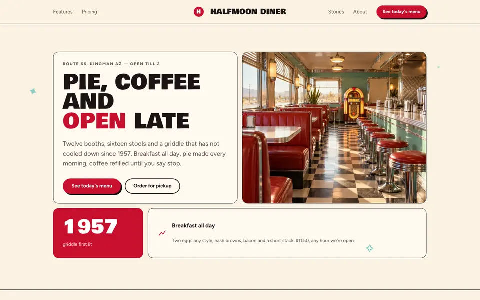
Checker Diner
No. 060Cherry red, cream vinyl and a checkerboard floor: a roadside diner menu, open late.
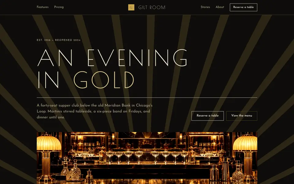
Gilded Deco
No. 061Black lacquer, gold leaf and sunburst geometry from a 1920s grand hotel lobby.
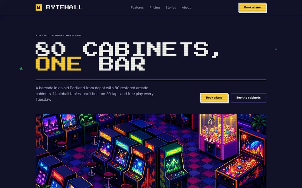
Pixel Arcade
No. 0628-bit type, stepped pixel borders and coin-yellow buttons. Insert coin to continue.