Bauhaus Primary
Bauhaus workshop primaries: circle, square, triangle in red, yellow and blue on bone.
This style
$9$19
One-time, no subscription · instant download · client use · 7-day refund before download
The idea
A modernist teaching poster that became a website. Red circles, yellow triangles and blue squares lock into a bento of geometric panels; a geometric sans set bold and lowercase-friendly carries the words. Playful but rigorous — every shape has a job.
Bauhaus Primary rebuilds the visual language of the 1920s modernist workshops: the three primaries mapped to the three basic forms, geometric sans type, asymmetric balance and an honest, constructive grid. It is joyful because of its colours and rigorous because of its geometry. The page is assembled from panels — each panel carries one shape, one colour and one idea — and thick black 3px lines hold them together like lead in a window.
Principles
- Three primaries, three forms: red circle, yellow triangle, blue square.
- Build pages from panels joined by thick 3px black lines.
- Geometry is decoration; never use illustration or photography.
- Asymmetric balance — a big red circle offsets a block of text.
- Clear, constructive copy: what, how many, when.
Motion
Geometric shapes pop in from 0 to full scale with a back-ease overshoot, one per panel, staggered 90ms. On hover, the circle in each card rotates 90 degrees as if it were a disc on a spindle.
Do & don't
Do
- ✓ Pair each primary with its form: red circle, yellow triangle, blue square.
- ✓ Join bento panels with shared 3px black borders.
- ✓ Put black text on yellow, white text on red and blue.
Don't
- ✕ Don't use secondary colours or gradients.
- ✕ Don't use photography or illustration.
- ✕ Don't round card corners — only buttons are pills.
+ 3 more of each, and component rules, in the full DESIGN.md.
What's in the DESIGN.md
- 01Overview & principles
- 02Colors (tokens + proportions)
- 03Typography (families + 12-role scale)
- 04Layout & spacing scale
- 05Elevation & depth
- 06Shapes & radii
- 07Motion (easing, durations, signature)
- 08Imagery + generation prompt
- 09Components (button, card, nav, input, badge)
- 10Do's and don'ts
- 11Responsive behaviour
- 12Iteration guide + agent checklist
Plus theme.css (Tailwind v4 @theme), tokens.json (W3C) and the preview page source — 359 lines of DESIGN.md in total.
More like this
All Swiss & Minimal →
Nordic Calm
No. 031Scandinavian winter light: cool greys, frost blue, soft corners and a lot of air.
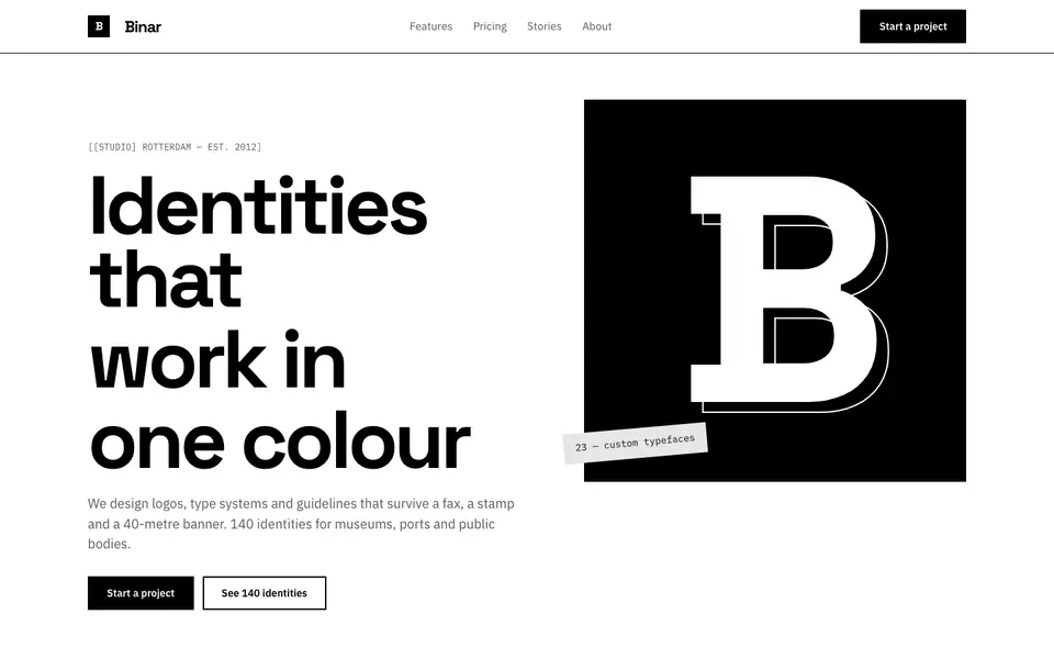
Pure Mono
No. 032Black on white, nothing else: a grotesk, thick rules and a bento of pure contrast.
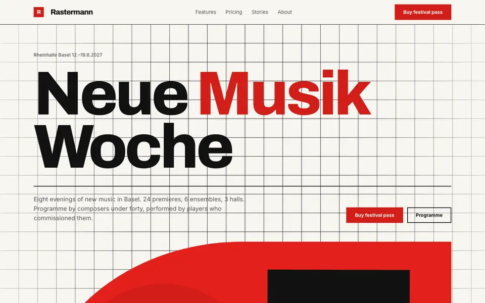
Swiss Poster
No. 033An International Style concert poster: strict grid, flush-left grotesk, red and black.
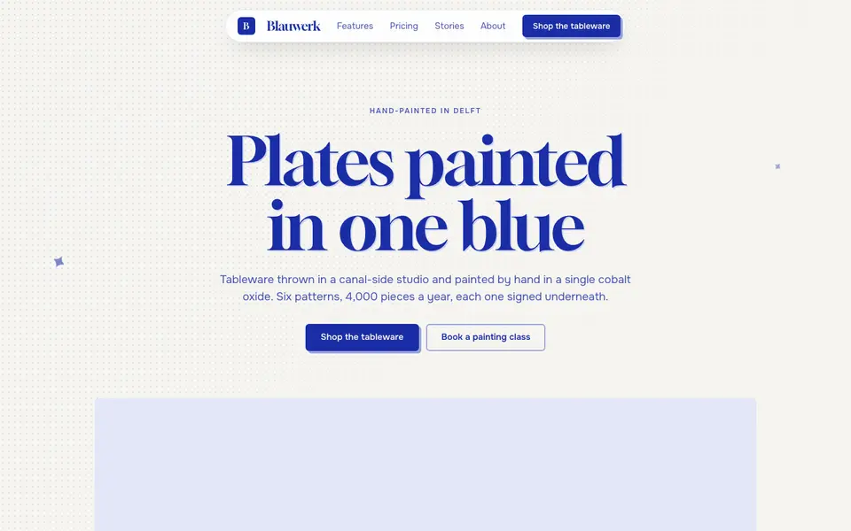
Cobalt Ink
No. 052One ink only: every line, word and shape printed in cobalt blue on bright paper.
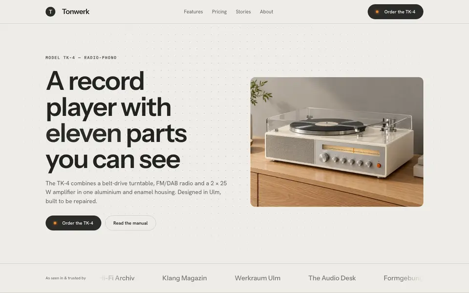
Functionalist Sixties
No. 0531960s functionalist hardware: warm white housings, one orange switch, a grid of controls.
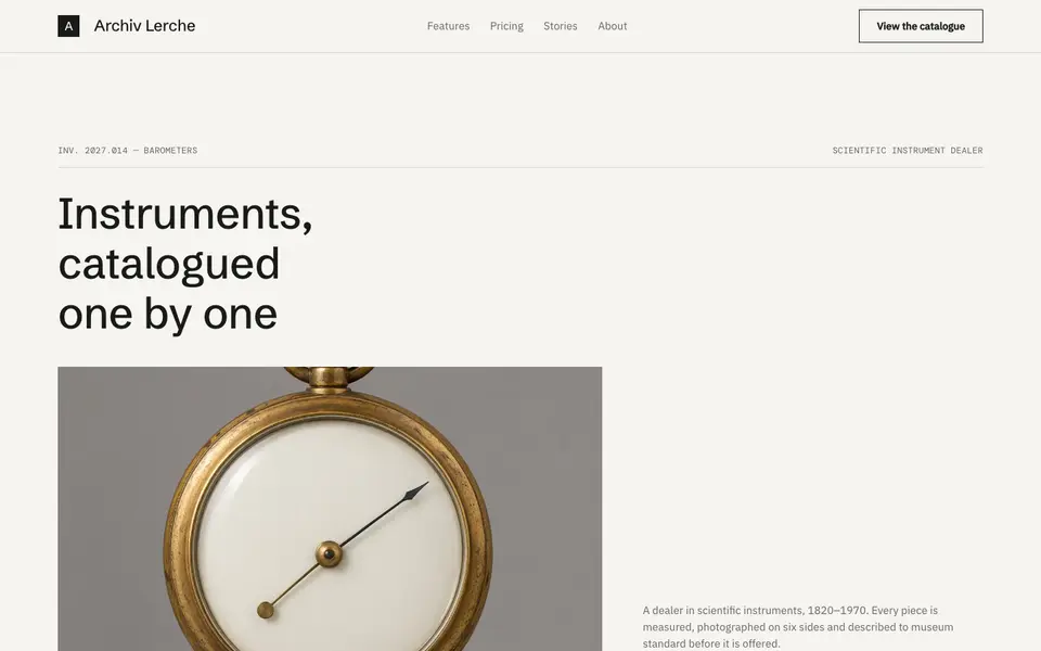
Museum Label
No. 054The wall label beside the object: tiny precise type, vast whitespace, catalogue numbers.