Swiss Poster
An International Style concert poster: strict grid, flush-left grotesk, red and black.
This style
$9$19
One-time, no subscription · instant download · client use · 7-day refund before download
The idea
A 1960s Swiss concert poster rebuilt as a web page. A visible modular grid, flush-left grotesk type at wildly different sizes, objective layout and two inks — signal red and black — on white. Every element sits exactly where the grid says it must.
Swiss Poster is the International Typographic Style applied without nostalgia. It follows the principles of 1950s–60s Swiss concert and exhibition posters: a mathematical modular grid, asymmetric flush-left layouts, sans-serif type at extreme scale contrasts, objective information and two inks. Red and black on off-white do all the work. Nothing is decorative; ornament is replaced by rhythm — numbers, rules and the grid itself, which is allowed to show through faintly.
Principles
- The grid is law: every edge aligns to a 12-column, 8px baseline system.
- Flush left, ragged right. Never centre.
- Contrast through scale: 160px next to 12px.
- Two inks only — signal red and black on off-white.
- Information is the content: dates, times, places, numbers.
Motion
Blocks slide in 40px from the right along grid lines, staggered by column at 60ms. Buttons and rows invert red-to-black instantly on hover.
Do & don't
Do
- ✓ Align every edge to the 12-column grid.
- ✓ Set the hero headline at 160px with tight -0.045em tracking.
- ✓ Use a large red geometric shape that bleeds off the canvas.
Don't
- ✕ Don't centre any text block.
- ✕ Don't use a third colour or tints of red.
- ✕ Don't use rounded corners or shadows.
+ 3 more of each, and component rules, in the full DESIGN.md.
What's in the DESIGN.md
- 01Overview & principles
- 02Colors (tokens + proportions)
- 03Typography (families + 12-role scale)
- 04Layout & spacing scale
- 05Elevation & depth
- 06Shapes & radii
- 07Motion (easing, durations, signature)
- 08Imagery + generation prompt
- 09Components (button, card, nav, input, badge)
- 10Do's and don'ts
- 11Responsive behaviour
- 12Iteration guide + agent checklist
Plus theme.css (Tailwind v4 @theme), tokens.json (W3C) and the preview page source — 359 lines of DESIGN.md in total.
More like this
All Swiss & Minimal →
Nordic Calm
No. 031Scandinavian winter light: cool greys, frost blue, soft corners and a lot of air.
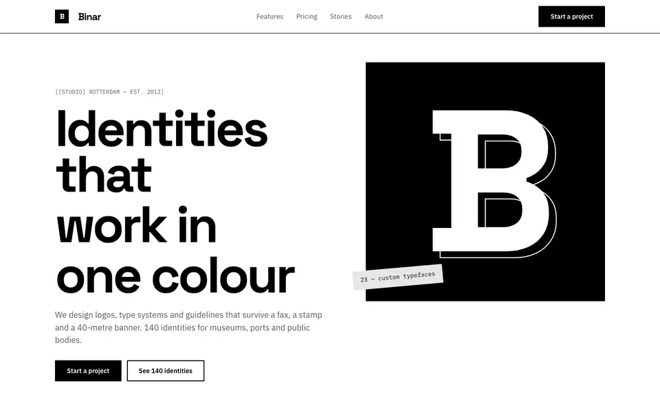
Pure Mono
No. 032Black on white, nothing else: a grotesk, thick rules and a bento of pure contrast.
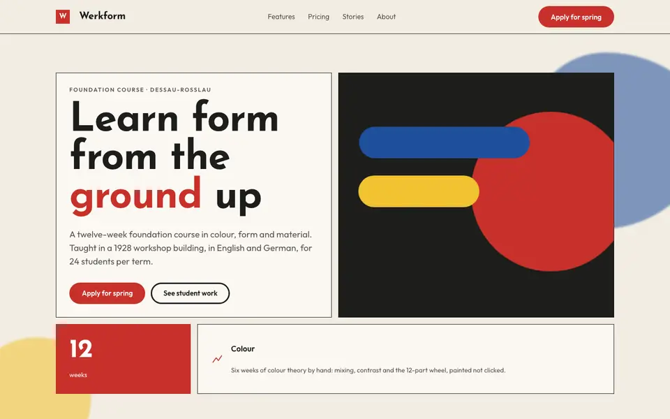
Bauhaus Primary
No. 051Bauhaus workshop primaries: circle, square, triangle in red, yellow and blue on bone.
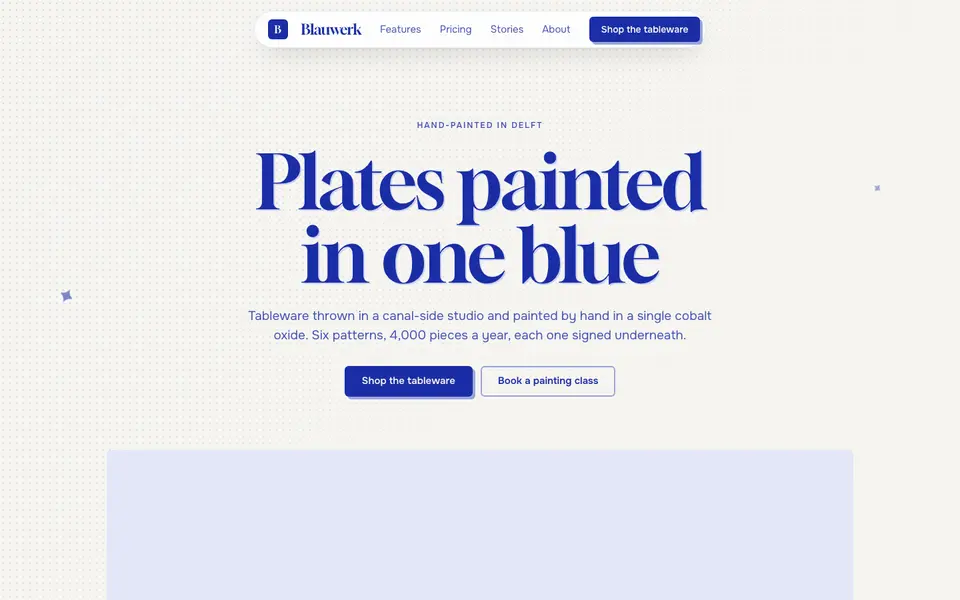
Cobalt Ink
No. 052One ink only: every line, word and shape printed in cobalt blue on bright paper.
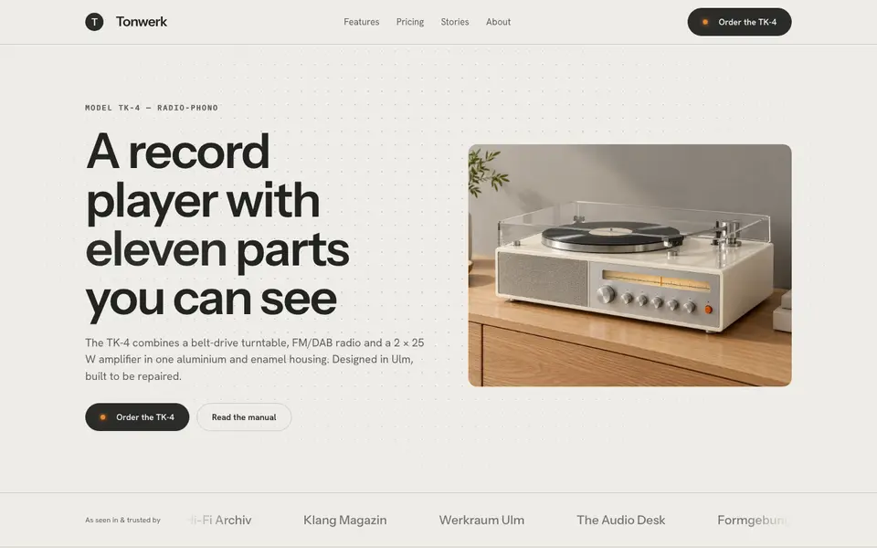
Functionalist Sixties
No. 0531960s functionalist hardware: warm white housings, one orange switch, a grid of controls.
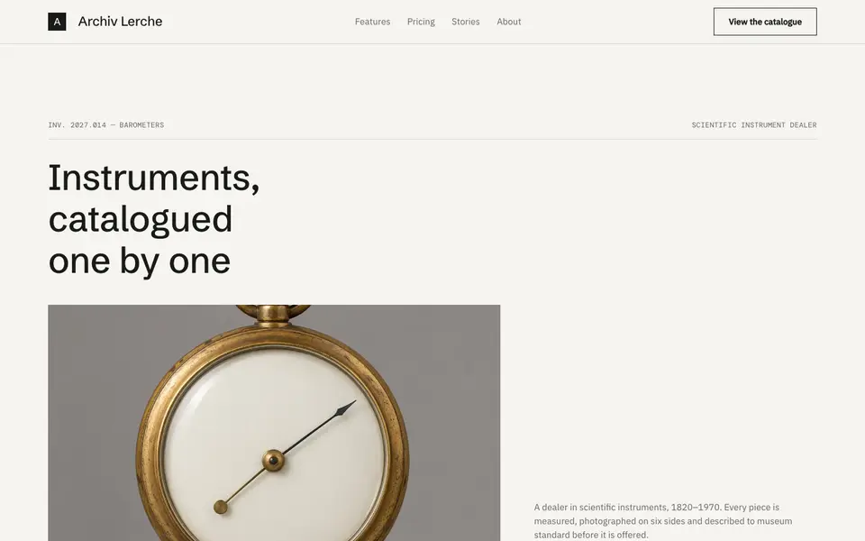
Museum Label
No. 054The wall label beside the object: tiny precise type, vast whitespace, catalogue numbers.