Pure Mono
Black on white, nothing else: a grotesk, thick rules and a bento of pure contrast.
This style
$9$19
One-time, no subscription · instant download · client use · 7-day refund before download
The idea
A monochrome system with zero colour and zero apology. Pure black and pure white, a confident grotesk at heavy weights, 2px rules and bento panels that invert on hover. It feels like a well-designed manual or a gallery wall text — exacting, legible, graphic.
Pure Mono strips a brand down to the two values that print everywhere: black and white. It follows the tradition of Dutch and Swiss identity manuals, technical documentation and gallery wall texts, where meaning has to survive photocopying. A heavy grotesk with very tight tracking provides graphic weight; 2px rules and thick-outlined bento panels give structure. Interaction is binary too — hover inverts, nothing fades. The absence of colour is the brand.
Principles
- Two values: #000000 and #FFFFFF. Grey is only for secondary text.
- Structure with 2px rules and thick outlines, never with shadow.
- Interaction is inversion: black becomes white, instantly.
- Tight, heavy display type creates the graphic weight colour usually would.
- Bracket labels like [Studio] for a technical, catalogued voice.
Motion
Headlines reveal in six hard steps behind a clip mask, like a shutter clicking open. Bento panels flip to white-on-black instantly on hover; a black marquee strip runs studio clients in white mono.
Do & don't
Do
- ✓ Use only #000 and #FFF for UI.
- ✓ Share 2px borders between bento panels with zero gap.
- ✓ Invert on hover — instantly, with no transition blur.
Don't
- ✕ Don't add any colour, even for errors — use labels and icons.
- ✕ Don't use shadows or rounded corners.
- ✕ Don't use soft fades; use steps or instant changes.
+ 3 more of each, and component rules, in the full DESIGN.md.
What's in the DESIGN.md
- 01Overview & principles
- 02Colors (tokens + proportions)
- 03Typography (families + 12-role scale)
- 04Layout & spacing scale
- 05Elevation & depth
- 06Shapes & radii
- 07Motion (easing, durations, signature)
- 08Imagery + generation prompt
- 09Components (button, card, nav, input, badge)
- 10Do's and don'ts
- 11Responsive behaviour
- 12Iteration guide + agent checklist
Plus theme.css (Tailwind v4 @theme), tokens.json (W3C) and the preview page source — 366 lines of DESIGN.md in total.
More like this
All Swiss & Minimal →
Nordic Calm
No. 031Scandinavian winter light: cool greys, frost blue, soft corners and a lot of air.
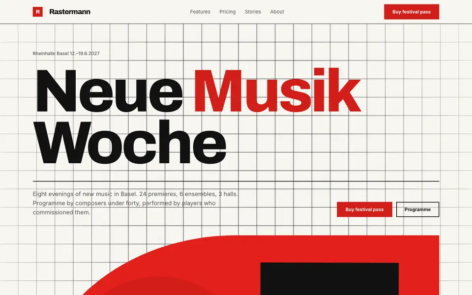
Swiss Poster
No. 033An International Style concert poster: strict grid, flush-left grotesk, red and black.
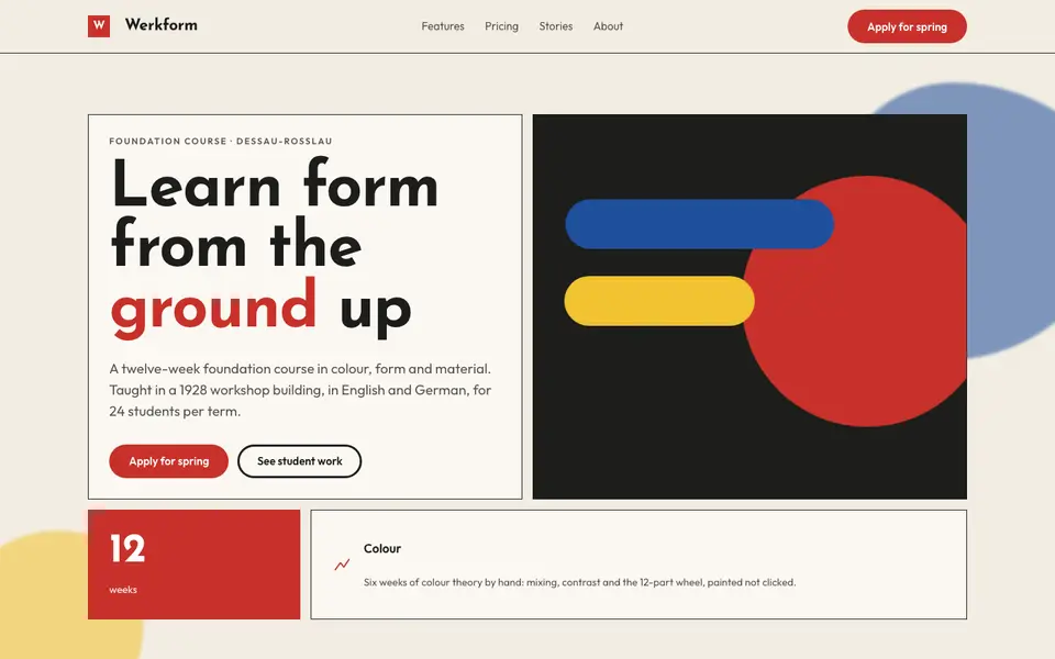
Bauhaus Primary
No. 051Bauhaus workshop primaries: circle, square, triangle in red, yellow and blue on bone.
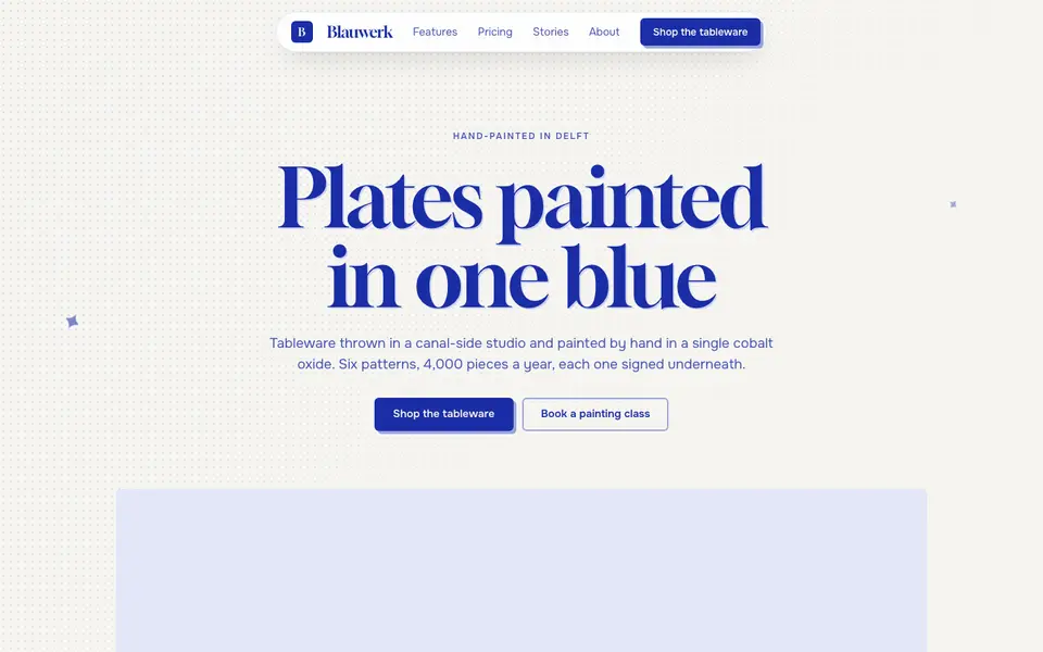
Cobalt Ink
No. 052One ink only: every line, word and shape printed in cobalt blue on bright paper.
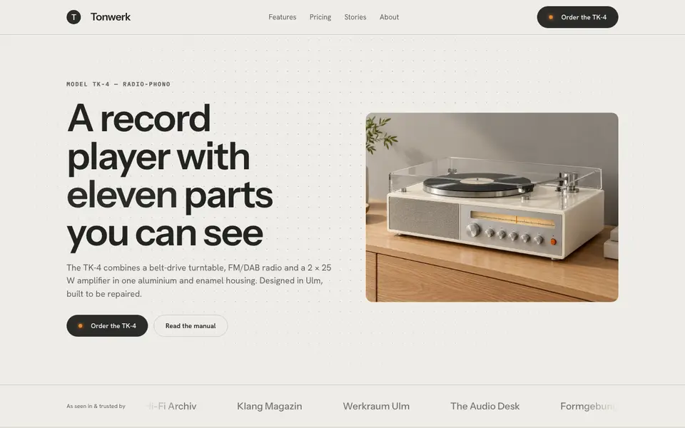
Functionalist Sixties
No. 0531960s functionalist hardware: warm white housings, one orange switch, a grid of controls.
Museum Label
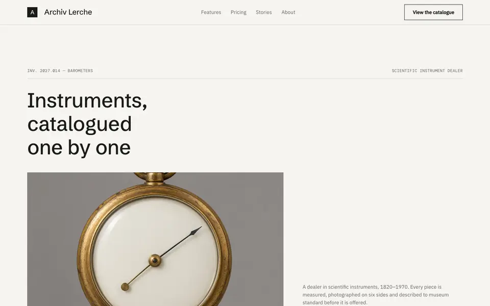
No. 054The wall label beside the object: tiny precise type, vast whitespace, catalogue numbers.