Functionalist Sixties
1960s functionalist hardware: warm white housings, one orange switch, a grid of controls.
This style
$9$19
One-time, no subscription · instant download · client use · 7-day refund before download
The idea
Inspired by the radios, record players and calculators of 1960s German functionalist design. Warm white and pale grey like enamelled housings, a crisp grotesk, controls arranged on a strict grid and a single orange-yellow detail like a power switch. Less, but better — and engineered with love.
Functionalist Sixties draws on the industrial design of 1960s German schools of form: radios, record players and calculators in which every control has one function and sits on a grid. The palette is warm white enamel, pale aluminium greys and one orange-yellow detail like a power switch. Rounded 14px corners echo pressed-steel housings; layered shadows suggest real objects on a shelf. The language is honest and technical — part numbers, weights, wattages — but warm, because good tools are friendly.
Principles
- Every element has one function; remove what doesn't work.
- Arrange components on a visible grid, like controls on a panel.
- One orange detail per view — the power switch.
- Rounded housing corners (14px), crisp internal alignment.
- Write like a manual: model numbers, specs, plain verbs.
Motion
Bento panels settle in from 96% scale like a lid closing with a soft click. On hover a panel lifts 2px with a layered shadow, and the orange dot on the primary button glows like a power indicator.
Do & don't
Do
- ✓ Show model numbers (TK-4) and specs in mono.
- ✓ Use a faint dot grid like a speaker grille.
- ✓ Put one orange dot on the primary button.
Don't
- ✕ Don't use more than one orange detail per view.
- ✕ Don't use dark mode or neon.
- ✕ Don't use dramatic angles or moody lighting.
+ 3 more of each, and component rules, in the full DESIGN.md.
What's in the DESIGN.md
- 01Overview & principles
- 02Colors (tokens + proportions)
- 03Typography (families + 12-role scale)
- 04Layout & spacing scale
- 05Elevation & depth
- 06Shapes & radii
- 07Motion (easing, durations, signature)
- 08Imagery + generation prompt
- 09Components (button, card, nav, input, badge)
- 10Do's and don'ts
- 11Responsive behaviour
- 12Iteration guide + agent checklist
Plus theme.css (Tailwind v4 @theme), tokens.json (W3C) and the preview page source — 365 lines of DESIGN.md in total.
More like this
All Swiss & Minimal →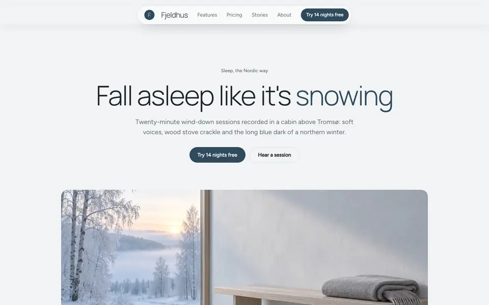
Nordic Calm
No. 031Scandinavian winter light: cool greys, frost blue, soft corners and a lot of air.
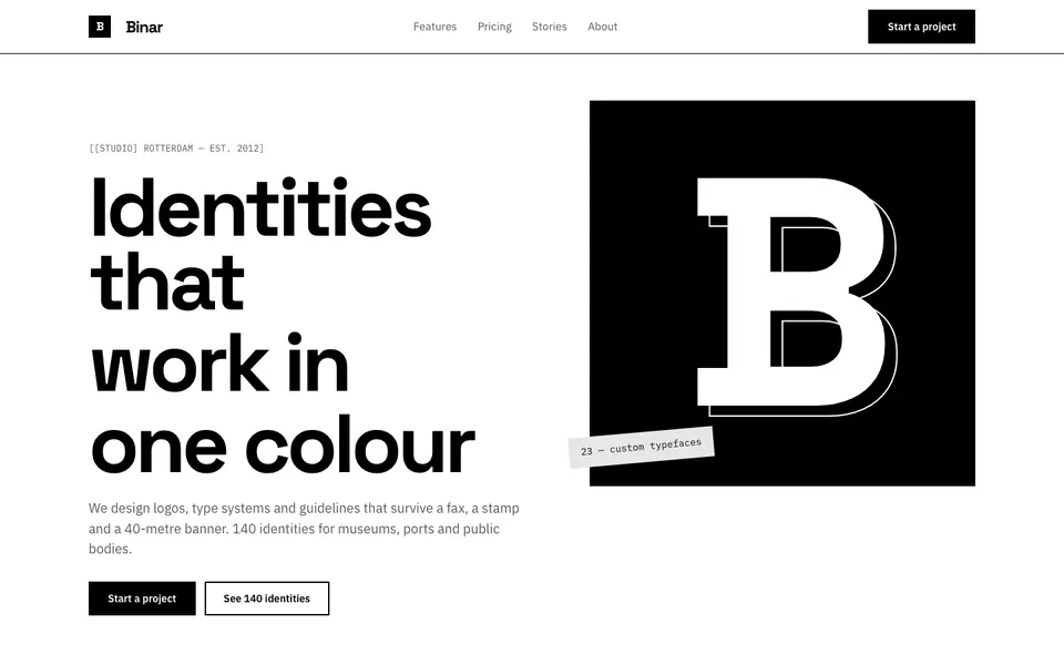
Pure Mono
No. 032Black on white, nothing else: a grotesk, thick rules and a bento of pure contrast.
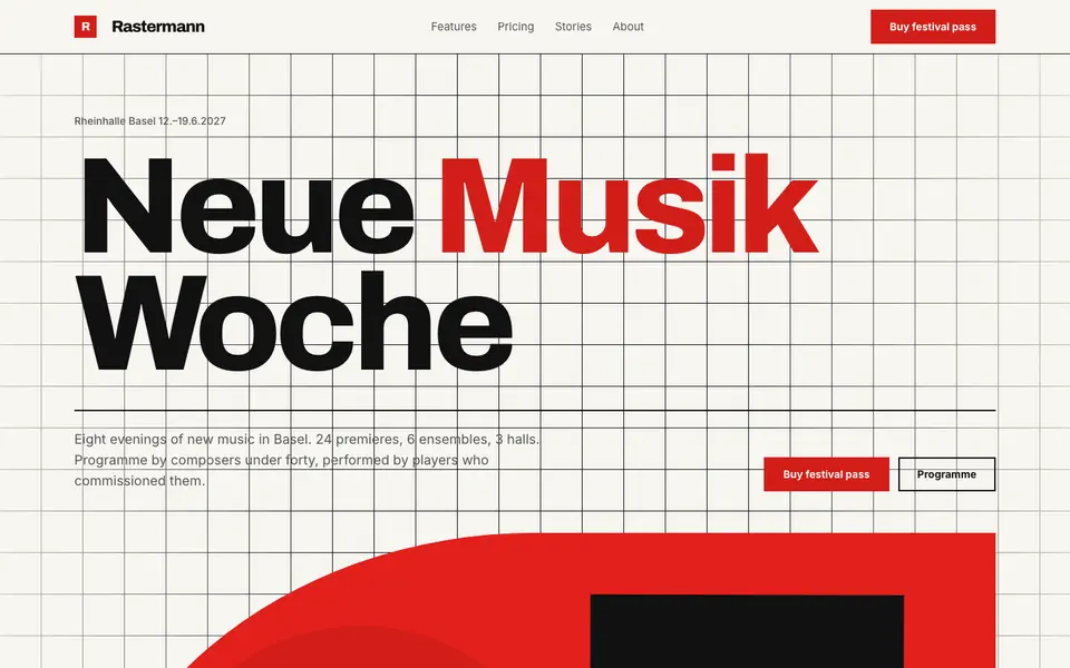
Swiss Poster
No. 033An International Style concert poster: strict grid, flush-left grotesk, red and black.
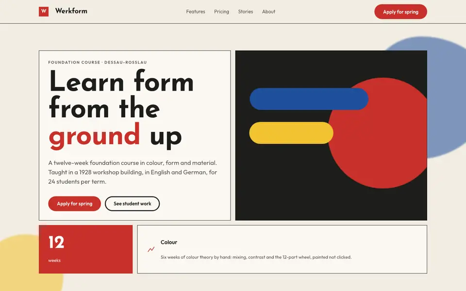
Bauhaus Primary
No. 051Bauhaus workshop primaries: circle, square, triangle in red, yellow and blue on bone.
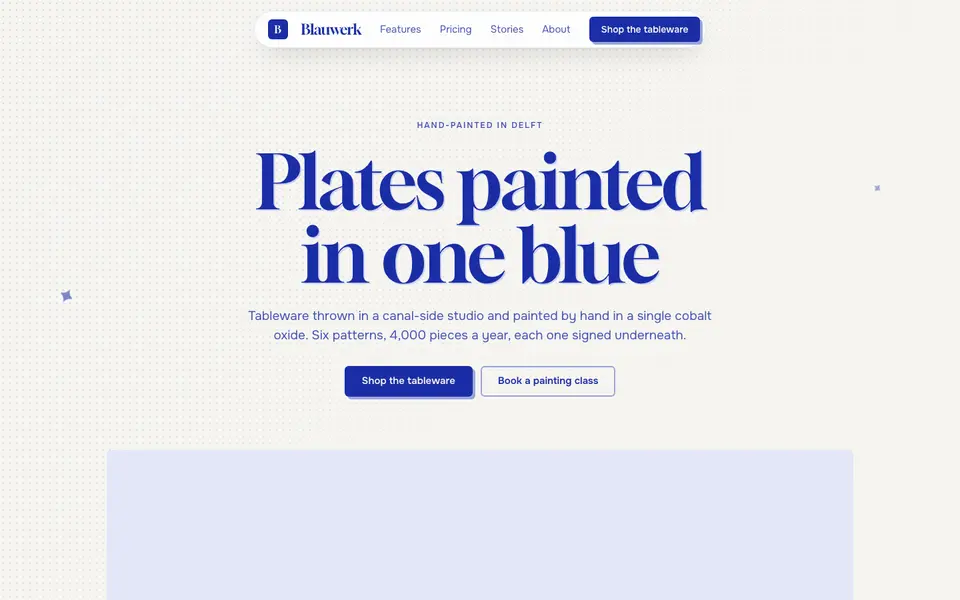
Cobalt Ink
No. 052One ink only: every line, word and shape printed in cobalt blue on bright paper.
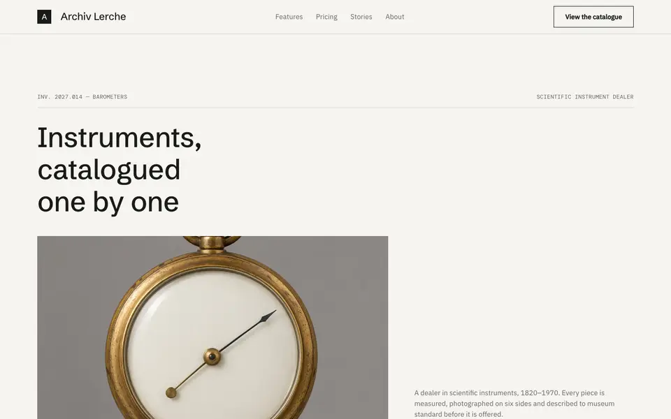
Museum Label
No. 054The wall label beside the object: tiny precise type, vast whitespace, catalogue numbers.