Butter Yellow
Sunny butter, a fat friendly grotesk and halftone dots like a cereal box.
This style
$9$19
One-time, no subscription · instant download · client use · 7-day refund before download
The idea
A morning-person pastel: soft butter canvas printed with halftone dots, a chunky grotesk at poster size, and sky-blue, tomato and egg-yolk shapes stacked like breakfast. Outlined cards with offset shadows make it graphic, not twee. It's impossible to look at without smiling.
Butter Yellow is a cheerful, graphic pastel that borrows from 1960s cereal boxes, Swiss poster type and halftone newsprint. The canvas is soft butter with a faint halftone screen, the headline is a chunky friendly grotesk set enormous and tight, and simple geometric shapes — a yolk circle, a toast square, a sky-blue arch — stack in the hero instead of photography. Every card and button is outlined in 2px dark ink with a hard shadow, which keeps the pastel crisp and confident. The feeling is Saturday morning.
Principles
- Set the headline at poster scale — it is the hero image.
- Use flat geometric shapes, not photographs, for the visual.
- Outline in 2px ink and offset hard shadows 5px.
- Number every list item in big mono numerals.
- Tomato is for one thing per screen: the thing you should click or read first.
Motion
Lines of the headline slide in from the left one after another like toast popping in sequence; cards jump 3px up-left on hover so their hard shadow grows underneath.
Do & don't
Do
- ✓ Let the headline break into three short lines.
- ✓ Stack 3–4 shapes in the hero with overlaps.
- ✓ Keep halftone at 8% opacity.
Don't
- ✕ Don't use photography in the hero.
- ✕ Don't blur shadows.
- ✕ Don't use gradients.
+ 3 more of each, and component rules, in the full DESIGN.md.
What's in the DESIGN.md
- 01Overview & principles
- 02Colors (tokens + proportions)
- 03Typography (families + 12-role scale)
- 04Layout & spacing scale
- 05Elevation & depth
- 06Shapes & radii
- 07Motion (easing, durations, signature)
- 08Imagery + generation prompt
- 09Components (button, card, nav, input, badge)
- 10Do's and don'ts
- 11Responsive behaviour
- 12Iteration guide + agent checklist
Plus theme.css (Tailwind v4 @theme), tokens.json (W3C) and the preview page source — 361 lines of DESIGN.md in total.
More like this
All Pastel & Soft →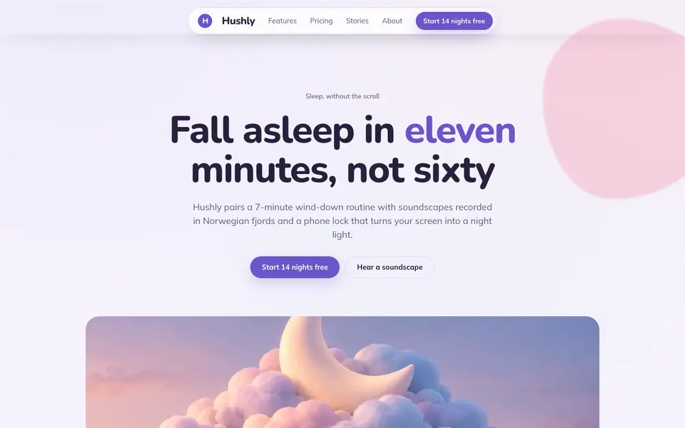
Cloud Lavender
No. 023Pillow-soft lavender, rounded everything, and a sky that never gets dark.
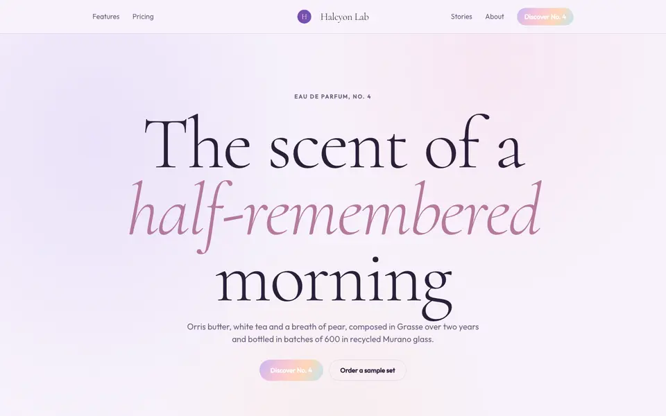
Lilac Dream
No. 024Iridescent lilac haze, a whispering serif and light that seems to float.
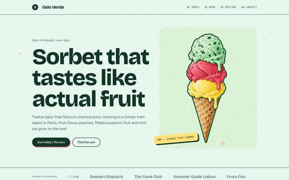
Mint Sorbet
No. 025Cold mint, a chunky grotesk and stickers slapped on like a gelato cart.
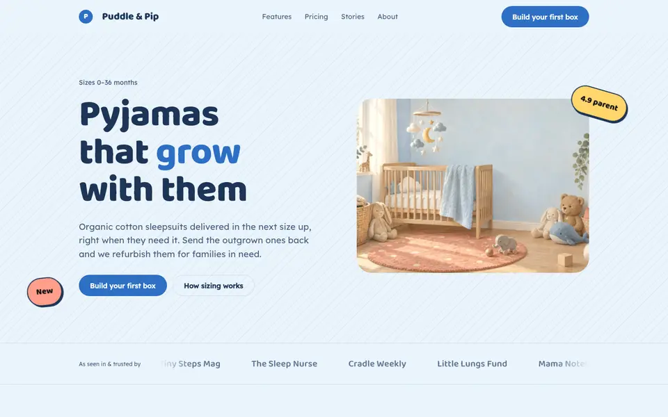
Nursery Blue
No. 026Baby-blue skies, bubbly type and corners soft enough for a toddler.
Peach Fuzz
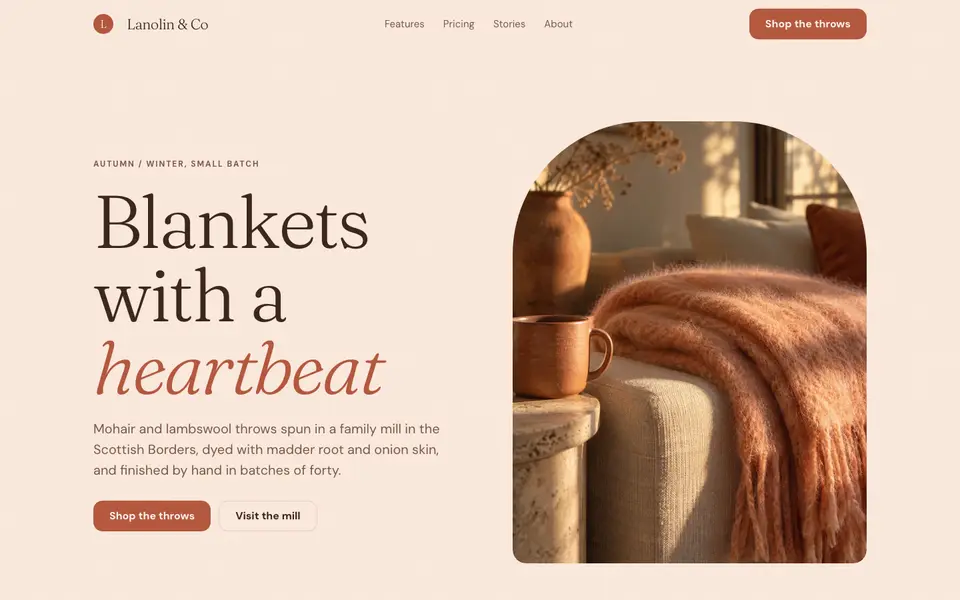
No. 027Velvety peach, a soft-bellied serif and the warmth of brushed wool.
Xerox Zine
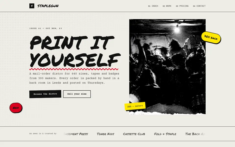
No. 037Cut, paste, photocopy: a punk zine with toner streaks, tape and red marker.