Nursery Blue
Baby-blue skies, bubbly type and corners soft enough for a toddler.
This style
$9$19
One-time, no subscription · instant download · client use · 7-day refund before download
The idea
A nursery-wall palette of powder blue, buttermilk and a little coral, with a bouncy rounded display face and pinstripes like a crib sheet. Everything is big, round and easy to tap with a thumb while holding a baby. Reassuring for parents, delightful for kids.
Nursery Blue is a family-friendly pastel system designed to calm parents and charm small children at once. It takes its cues from mid-century children's-book illustration and the pinstriped cotton of crib sheets: powder blue canvas with faint vertical stripes, a bubbly rounded display face, oversized 32px corners and floating white cards. The palette is soft but never washed out — a confident cobalt carries actions so tired parents always know where to tap. It should feel safe, warm and slightly whimsical.
Principles
- Make every tap target at least 48px; parents use one thumb.
- Round corners hard — 32px on cards, full pill on buttons.
- Keep cobalt for actions only so the next step is never ambiguous.
- Use stickers and illustration for joy, never icons alone.
- Write in short, kind, specific sentences.
Motion
Cards float up with a gentle bounce at the end, like a balloon finding its height; stickers wobble once (±4°) when they enter the viewport.
Do & don't
Do
- ✓ Keep tap targets 48px or taller.
- ✓ Use the pinstripe background at 6% contrast so it reads as texture.
- ✓ Place one sticker per section, overlapping a card corner.
Don't
- ✕ Don't use red for anything but errors.
- ✕ Don't use sharp corners under 16px.
- ✕ Don't show children's faces in photography.
+ 3 more of each, and component rules, in the full DESIGN.md.
What's in the DESIGN.md
- 01Overview & principles
- 02Colors (tokens + proportions)
- 03Typography (families + 12-role scale)
- 04Layout & spacing scale
- 05Elevation & depth
- 06Shapes & radii
- 07Motion (easing, durations, signature)
- 08Imagery + generation prompt
- 09Components (button, card, nav, input, badge)
- 10Do's and don'ts
- 11Responsive behaviour
- 12Iteration guide + agent checklist
Plus theme.css (Tailwind v4 @theme), tokens.json (W3C) and the preview page source — 364 lines of DESIGN.md in total.
More like this
All Pastel & Soft →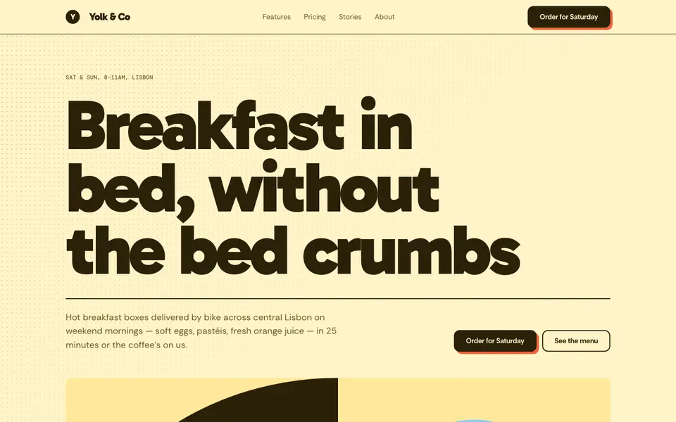
Butter Yellow
No. 022Sunny butter, a fat friendly grotesk and halftone dots like a cereal box.
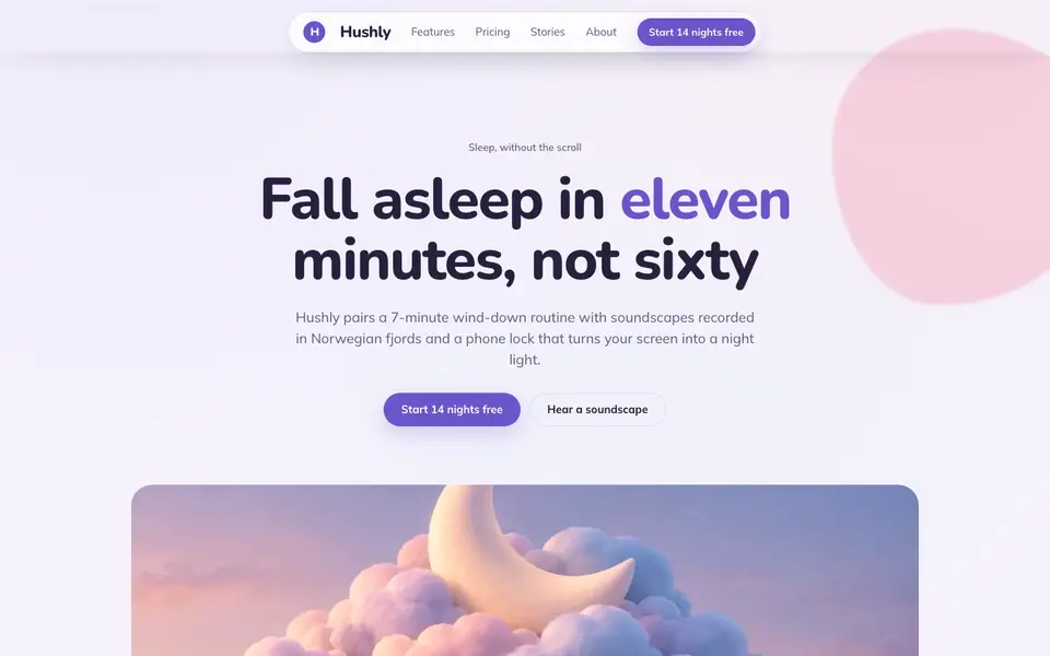
Cloud Lavender
No. 023Pillow-soft lavender, rounded everything, and a sky that never gets dark.
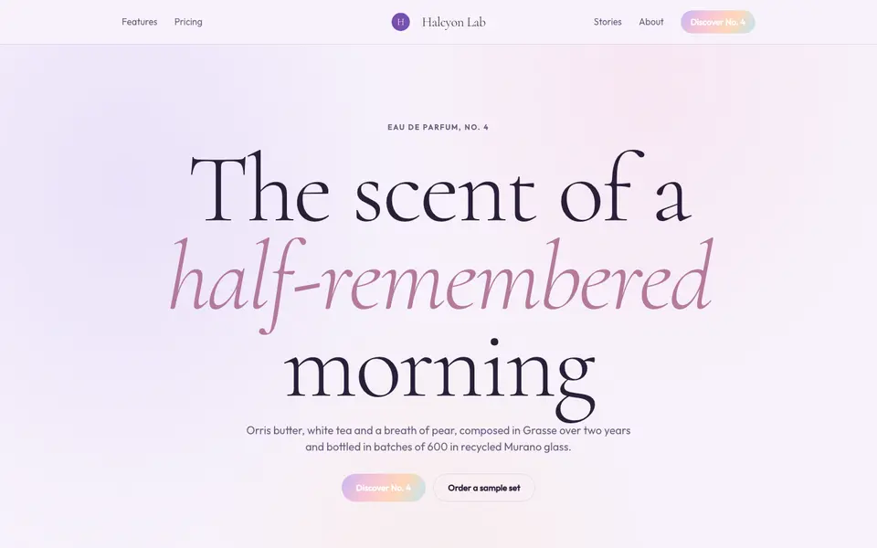
Lilac Dream
No. 024Iridescent lilac haze, a whispering serif and light that seems to float.
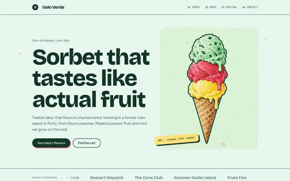
Mint Sorbet
No. 025Cold mint, a chunky grotesk and stickers slapped on like a gelato cart.
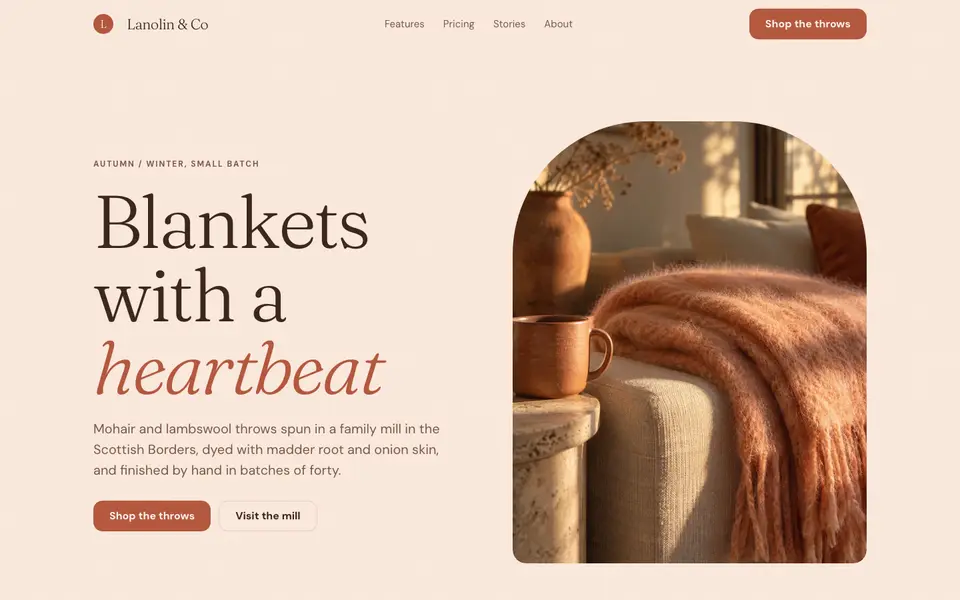
Peach Fuzz
No. 027Velvety peach, a soft-bellied serif and the warmth of brushed wool.
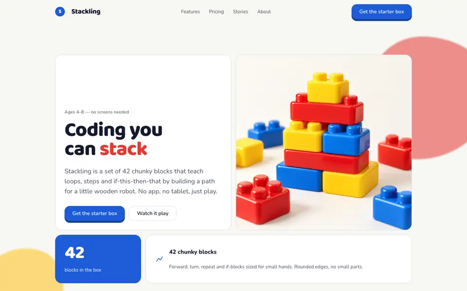
Toy Blocks
No. 080Primary-colour building blocks with studs on top and a satisfying 6px click.