Toy Blocks
Primary-colour building blocks with studs on top and a satisfying 6px click.
This style
$9$19
One-time, no subscription · instant download · client use · 7-day refund before download
The idea
Chunky rounded blocks in red, blue and yellow, each with a darker base edge so it looks moulded and stackable. Soft round headlines, generous padding, buttons that press down with a click. It feels like a toy box on a white playroom floor: bright, safe and made for small hands.
Toy Blocks translates classic interlocking plastic bricks and wooden nursery blocks into an interface. Each card is a chunky moulded block: a saturated primary colour, generous 20px rounded corners and a darker 6px base edge that makes it look solid and stackable. A white playroom canvas keeps it clean; soft round headlines and an easy rounded sans make it friendly to parents and teachers. Interactions click and bounce like snapping a brick on. It should feel safe, sturdy and delightful.
Principles
- Every block has a darker base edge (6px) instead of a blurred shadow.
- Primary colours only: red, blue, yellow on white.
- Round generously; there are no sharp corners in a toy box.
- Stack and snap — layouts should feel built, not floated.
- Write for parents: ages, safety, numbers, materials.
Motion
Blocks drop into place from 90% scale with a bouncy settle, one after another like a tower being built. Buttons sink 4px into their darker base when pressed and spring back on release.
Do & don't
Do
- ✓ Use a darker 6px base edge on every block.
- ✓ Add two round studs to the top of feature cards.
- ✓ Keep tap targets at least 56px.
Don't
- ✕ Don't use blurred drop shadows alone.
- ✕ Don't use pastels or muted tones.
- ✕ Don't use sharp corners.
+ 3 more of each, and component rules, in the full DESIGN.md.
What's in the DESIGN.md
- 01Overview & principles
- 02Colors (tokens + proportions)
- 03Typography (families + 12-role scale)
- 04Layout & spacing scale
- 05Elevation & depth
- 06Shapes & radii
- 07Motion (easing, durations, signature)
- 08Imagery + generation prompt
- 09Components (button, card, nav, input, badge)
- 10Do's and don'ts
- 11Responsive behaviour
- 12Iteration guide + agent checklist
Plus theme.css (Tailwind v4 @theme), tokens.json (W3C) and the preview page source — 364 lines of DESIGN.md in total.
More like this
All Playful →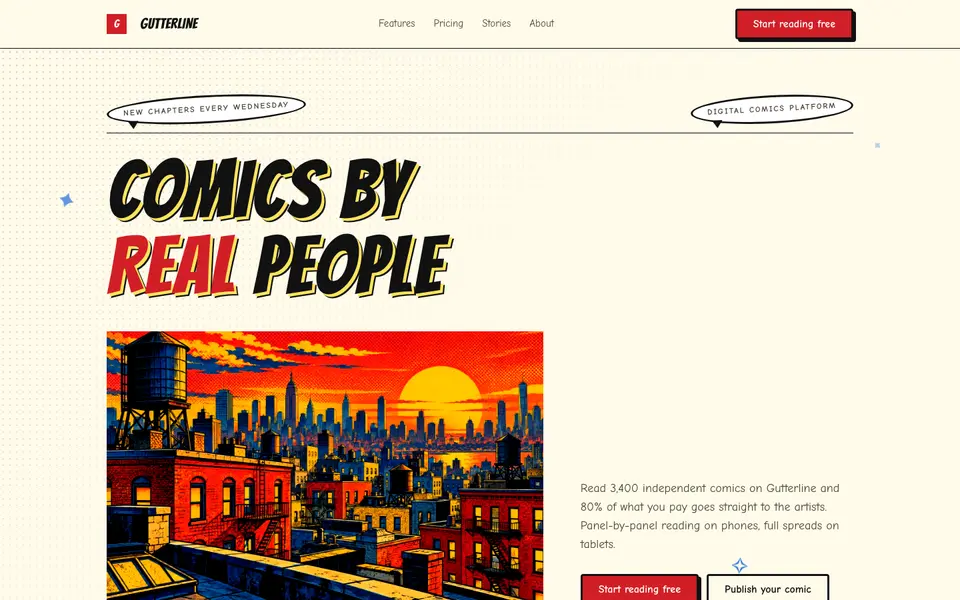
Comic Panels
No. 077Ben-Day dots, thick ink panels and speech bubbles. Every section is a splash page.
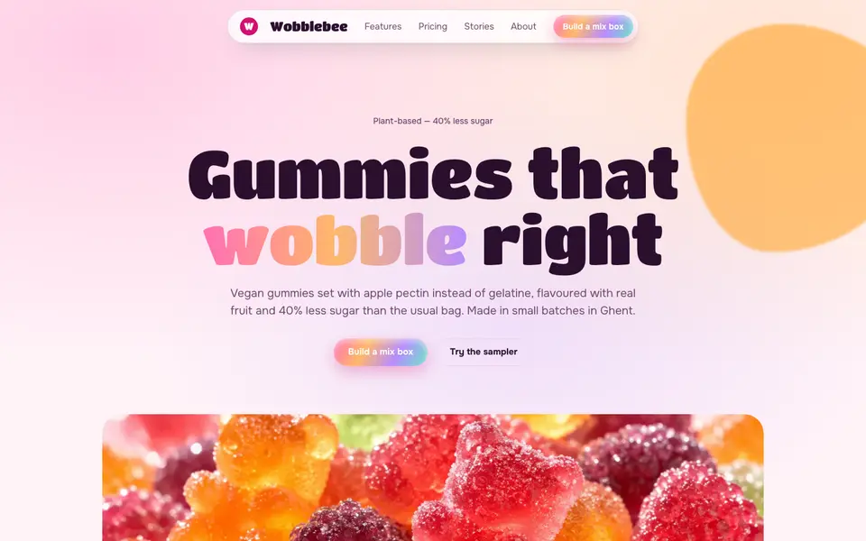
Gummy Candy
No. 078Glossy gummy gradients, jelly-wobble buttons and a sugar-pink canvas.
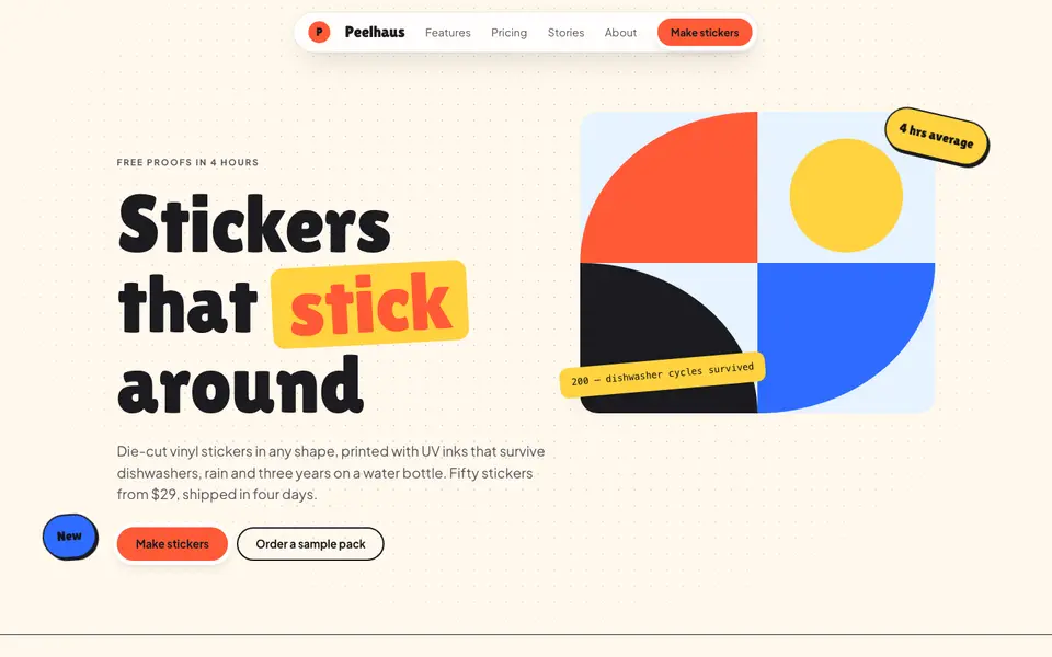
Sticker Pop
No. 079Die-cut stickers slapped on at jaunty angles: coral, cobalt and sunshine on cream.
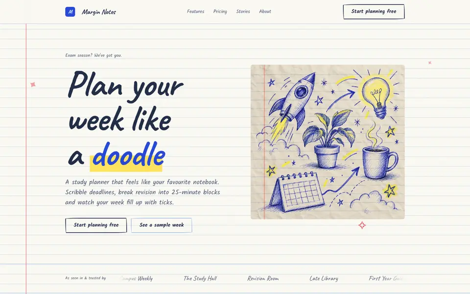
Doodle Notebook
No. 097Ballpoint doodles on ruled paper, a red margin and sticky notes for the important bits.
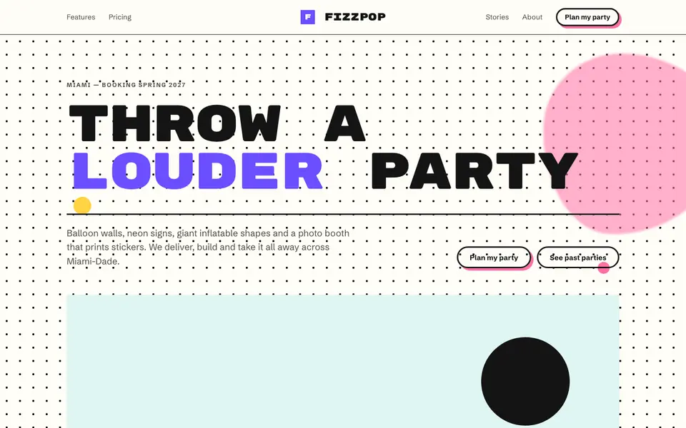
Memphis Party
No. 098Squiggles, confetti triangles and clashing colour: the 1981 design party, still going.
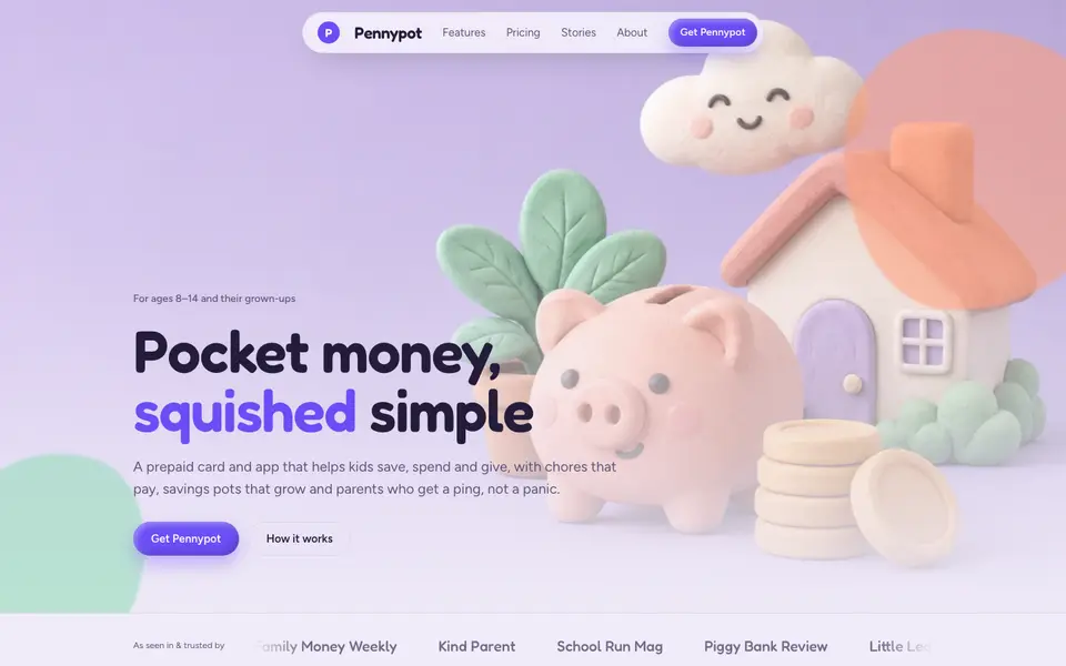
Soft Clay
No. 099Puffy clay cards, plasticine 3D renders and lavender light. Squeezable interfaces.