Comic Panels
Ben-Day dots, thick ink panels and speech bubbles. Every section is a splash page.
This style
$9$19
One-time, no subscription · instant download · client use · 7-day refund before download
The idea
The page reads like a comic book: content sits in ink-outlined panels with gutters between them, labels pop out of speech bubbles, and Ben-Day halftone dots shade the backgrounds. Shouty hand-lettered headlines, primary red and blue, newsprint cream. KAPOW, but tasteful.
Comic Panels turns the page into a mid-century American comic book with a pop-art finish: thick black ink panels separated by cream gutters, Ben-Day halftone dots for shading, hand-lettered uppercase headlines and labels that pop out of speech bubbles and caption boxes. Primary red, blue and yellow do the colouring on newsprint cream. Sections read like a sequence: establishing shot, close-ups, splash page, cliffhanger. It should feel energetic, narrative and fun without becoming childish.
Principles
- Every block is a panel with a 3px ink border and a gutter around it.
- Read left to right, top to bottom; animate in that order.
- Labels live in speech bubbles or yellow caption boxes.
- Shade with halftone dots, never gradients.
- One splash moment per page: the hero headline gets the biggest panel.
Motion
Panels pop in one by one in reading order, left to right, top to bottom, with a punchy overshoot. Speech-bubble labels wobble 3° once as they appear, and buttons shift into their shadow on hover.
Do & don't
Do
- ✓ Use cream gutters of 16px between panels.
- ✓ Open sections with a yellow 'MEANWHILE' caption box.
- ✓ Shade panels with halftone at 12–18%.
Don't
- ✕ Don't use gradients or soft shadows.
- ✕ Don't use rounded panel corners.
- ✕ Don't set body text in Bangers.
+ 3 more of each, and component rules, in the full DESIGN.md.
What's in the DESIGN.md
- 01Overview & principles
- 02Colors (tokens + proportions)
- 03Typography (families + 12-role scale)
- 04Layout & spacing scale
- 05Elevation & depth
- 06Shapes & radii
- 07Motion (easing, durations, signature)
- 08Imagery + generation prompt
- 09Components (button, card, nav, input, badge)
- 10Do's and don'ts
- 11Responsive behaviour
- 12Iteration guide + agent checklist
Plus theme.css (Tailwind v4 @theme), tokens.json (W3C) and the preview page source — 364 lines of DESIGN.md in total.
More like this
All Playful →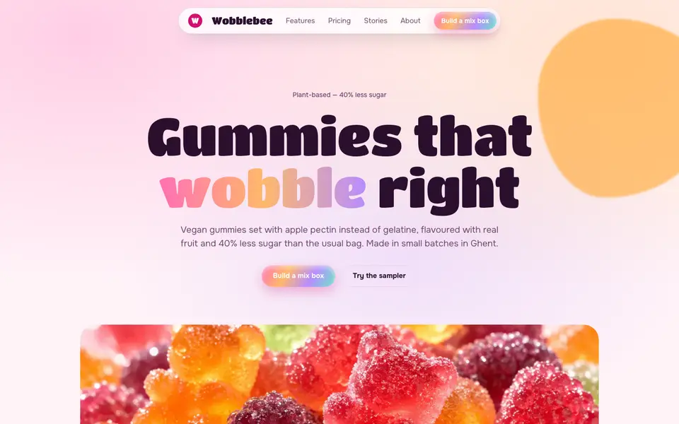
Gummy Candy
No. 078Glossy gummy gradients, jelly-wobble buttons and a sugar-pink canvas.
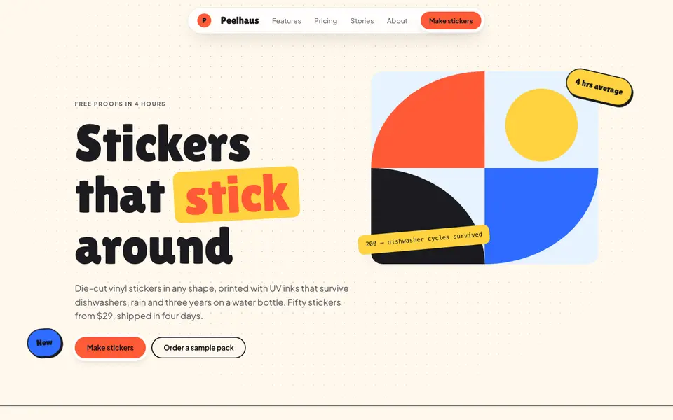
Sticker Pop
No. 079Die-cut stickers slapped on at jaunty angles: coral, cobalt and sunshine on cream.
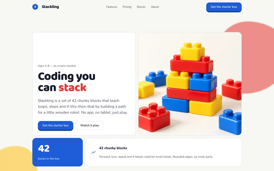
Toy Blocks
No. 080Primary-colour building blocks with studs on top and a satisfying 6px click.
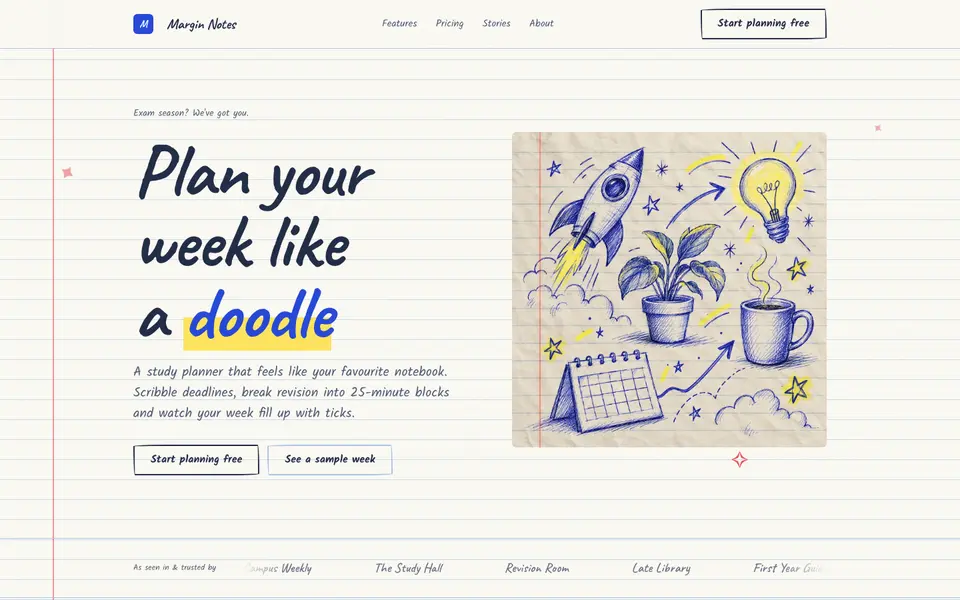
Doodle Notebook
No. 097Ballpoint doodles on ruled paper, a red margin and sticky notes for the important bits.
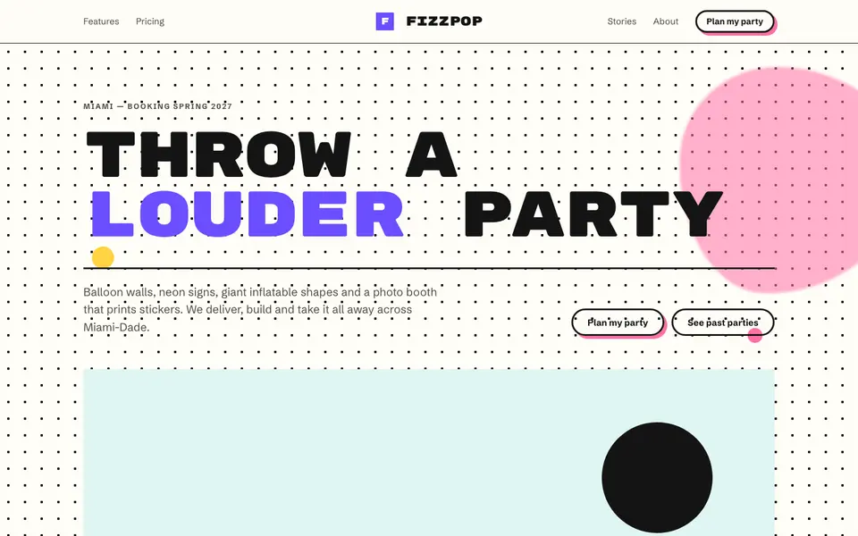
Memphis Party
No. 098Squiggles, confetti triangles and clashing colour: the 1981 design party, still going.
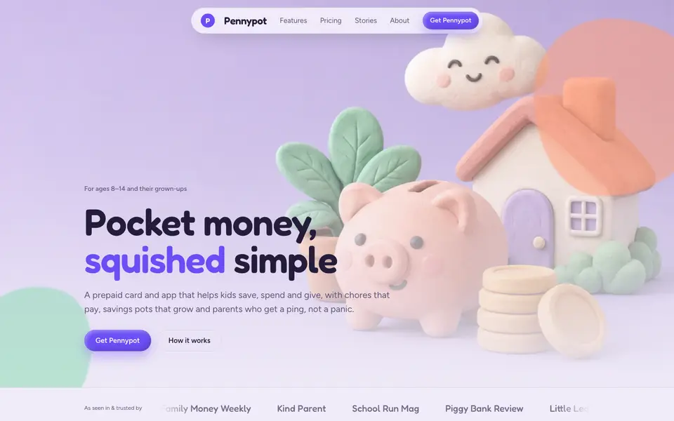
Soft Clay
No. 099Puffy clay cards, plasticine 3D renders and lavender light. Squeezable interfaces.