Soft Clay
Puffy clay cards, plasticine 3D renders and lavender light. Squeezable interfaces.
This style
$9$19
One-time, no subscription · instant download · client use · 7-day refund before download
The idea
Everything looks moulded from soft modelling clay: puffy cards with a bright inner highlight and a deep, diffuse shadow underneath, buttons that look pressable with a thumb, and matte 3D renders of tiny clay objects. Lavender, peach and mint on a soft lilac canvas. Calm, cuddly and trustworthy.
Soft Clay applies claymorphism — the 2020s evolution of neumorphism — to a friendly consumer product. Surfaces look moulded from matte modelling clay: puffy cards with a bright inner highlight on the top-left, a darker inner shadow on the bottom-right, and a large soft outer shadow tinted with the brand colour. Matte 3D clay renders with visible fingerprint texture replace photography. The palette is lavender, peach and mint on a lilac canvas; type is round and chunky. It should feel safe, tactile and kind, like a toy a careful parent would choose.
Principles
- Every surface is puffy: inner highlight top-left, inner shade bottom-right, soft outer shadow.
- Round to 36px or more; clay has no edges.
- Imagery is matte 3D clay with fingerprints, never glossy.
- Lavender acts, peach warms, mint reassures.
- Generous space so each clay object can breathe.
Motion
Cards inflate from 94% to 100% like dough rising, with a soft overshoot. On press, buttons squash to 96% and their inner highlight dims, as if a thumb pushed into clay.
Do & don't
Do
- ✓ Layer two inset shadows and one outer shadow on every clay surface.
- ✓ Tint shadows with violet, not grey.
- ✓ Keep radii at 36px or more on cards.
Don't
- ✕ Don't use borders; depth comes from shadow.
- ✕ Don't use sharp corners or hard shadows.
- ✕ Don't use glossy or metallic renders.
+ 3 more of each, and component rules, in the full DESIGN.md.
What's in the DESIGN.md
- 01Overview & principles
- 02Colors (tokens + proportions)
- 03Typography (families + 12-role scale)
- 04Layout & spacing scale
- 05Elevation & depth
- 06Shapes & radii
- 07Motion (easing, durations, signature)
- 08Imagery + generation prompt
- 09Components (button, card, nav, input, badge)
- 10Do's and don'ts
- 11Responsive behaviour
- 12Iteration guide + agent checklist
Plus theme.css (Tailwind v4 @theme), tokens.json (W3C) and the preview page source — 364 lines of DESIGN.md in total.
More like this
All Playful →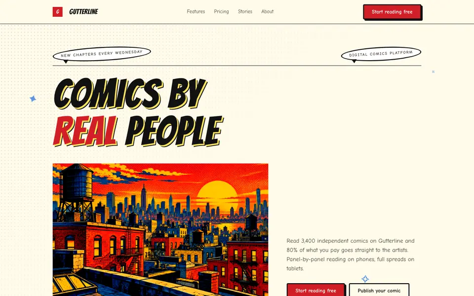
Comic Panels
No. 077Ben-Day dots, thick ink panels and speech bubbles. Every section is a splash page.
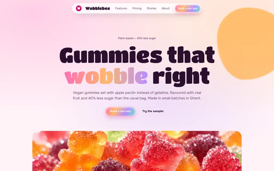
Gummy Candy
No. 078Glossy gummy gradients, jelly-wobble buttons and a sugar-pink canvas.
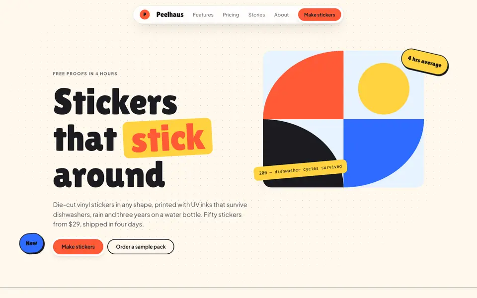
Sticker Pop
No. 079Die-cut stickers slapped on at jaunty angles: coral, cobalt and sunshine on cream.
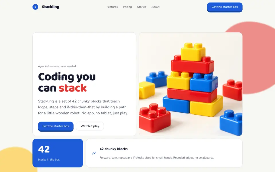
Toy Blocks
No. 080Primary-colour building blocks with studs on top and a satisfying 6px click.
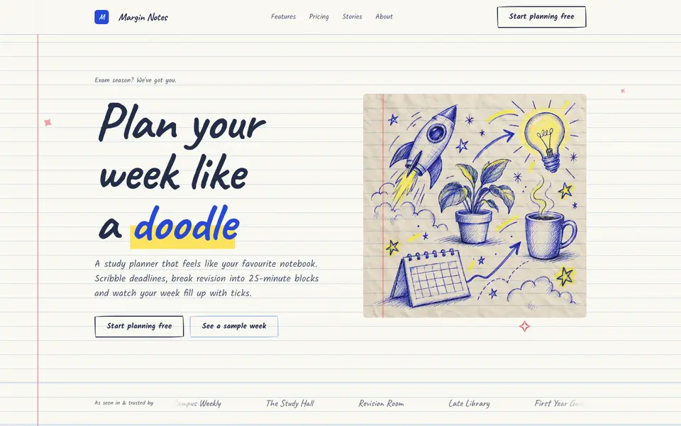
Doodle Notebook
No. 097Ballpoint doodles on ruled paper, a red margin and sticky notes for the important bits.
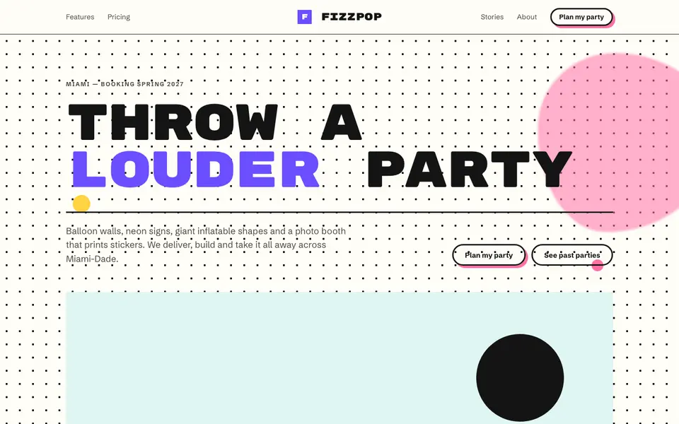
Memphis Party
No. 098Squiggles, confetti triangles and clashing colour: the 1981 design party, still going.