Mint Sorbet
Cold mint, a chunky grotesk and stickers slapped on like a gelato cart.
This style
$9$19
One-time, no subscription · instant download · client use · 7-day refund before download
The idea
A fresh, cold-to-the-touch pastel: pale mint canvas dotted like a waffle cone, a squat expressive grotesk, and hand-placed stickers in raspberry and lemon. Crisp 2px outlines keep it from going mushy. It tastes like the first spoonful in July.
Mint Sorbet is a cold pastel with a crisp edge. It borrows from 1950s soda-fountain signage, riso-printed zines and the sticker-bombed fridge door: a pale mint field patterned like a waffle cone, an expressive squat grotesk set tight and heavy, and stickers in raspberry and lemon placed at jaunty angles. Unlike most pastels, everything is outlined in 2px deep green with a hard offset shadow, so the page feels printed and graphic rather than fuzzy. The mood is fresh, cheeky and a little sugary.
Principles
- Outline everything in 2px deep green — that line is what keeps pastel from going limp.
- Use hard offset shadows, never blurred ones.
- Rotate stickers between -6° and 6°; never leave them straight.
- Keep raspberry and lemon as accents on stickers, not as surfaces.
- Headlines are short, heavy and set tight.
Motion
Stickers pop in from 85% scale with a springy overshoot; cards tilt 2 degrees on hover as if nudged on a counter, and a flavour marquee scrolls steadily under the hero.
Do & don't
Do
- ✓ Use 2px outlines on every card, button and input.
- ✓ Rotate stickers and feature cards slightly.
- ✓ Keep hard shadows at exactly 4px offset.
Don't
- ✕ Don't use blurred or soft shadows.
- ✕ Don't use raspberry for body text.
- ✕ Don't set long paragraphs in Bricolage.
+ 3 more of each, and component rules, in the full DESIGN.md.
What's in the DESIGN.md
- 01Overview & principles
- 02Colors (tokens + proportions)
- 03Typography (families + 12-role scale)
- 04Layout & spacing scale
- 05Elevation & depth
- 06Shapes & radii
- 07Motion (easing, durations, signature)
- 08Imagery + generation prompt
- 09Components (button, card, nav, input, badge)
- 10Do's and don'ts
- 11Responsive behaviour
- 12Iteration guide + agent checklist
Plus theme.css (Tailwind v4 @theme), tokens.json (W3C) and the preview page source — 365 lines of DESIGN.md in total.
More like this
All Pastel & Soft →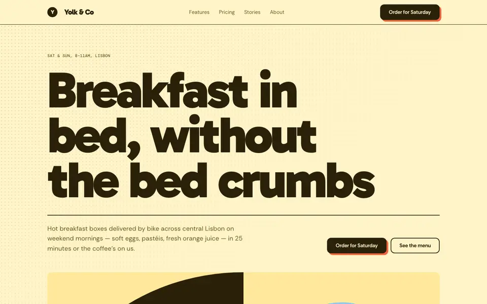
Butter Yellow
No. 022Sunny butter, a fat friendly grotesk and halftone dots like a cereal box.
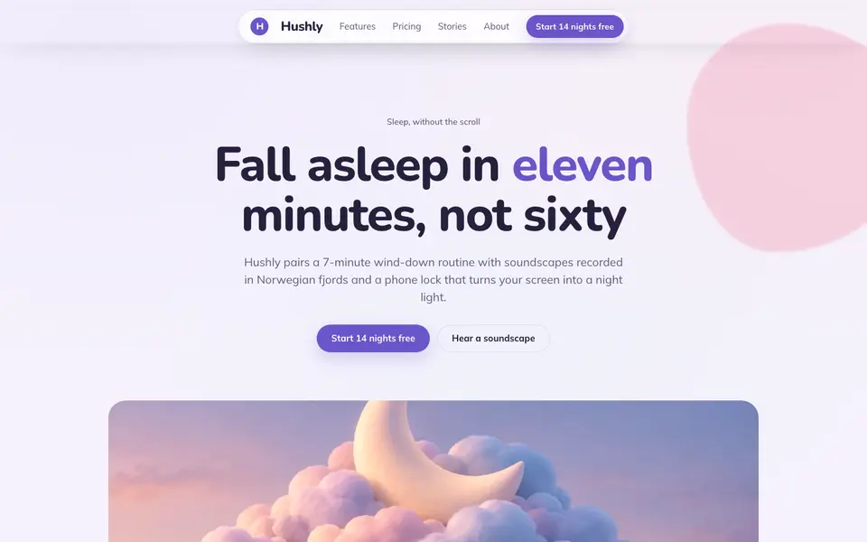
Cloud Lavender
No. 023Pillow-soft lavender, rounded everything, and a sky that never gets dark.
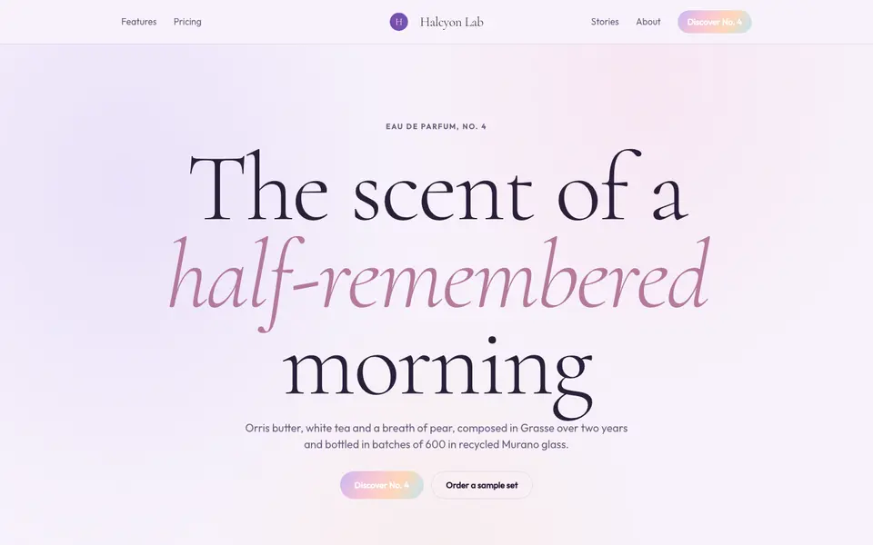
Lilac Dream
No. 024Iridescent lilac haze, a whispering serif and light that seems to float.
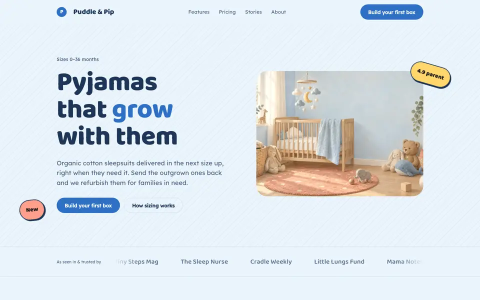
Nursery Blue
No. 026Baby-blue skies, bubbly type and corners soft enough for a toddler.
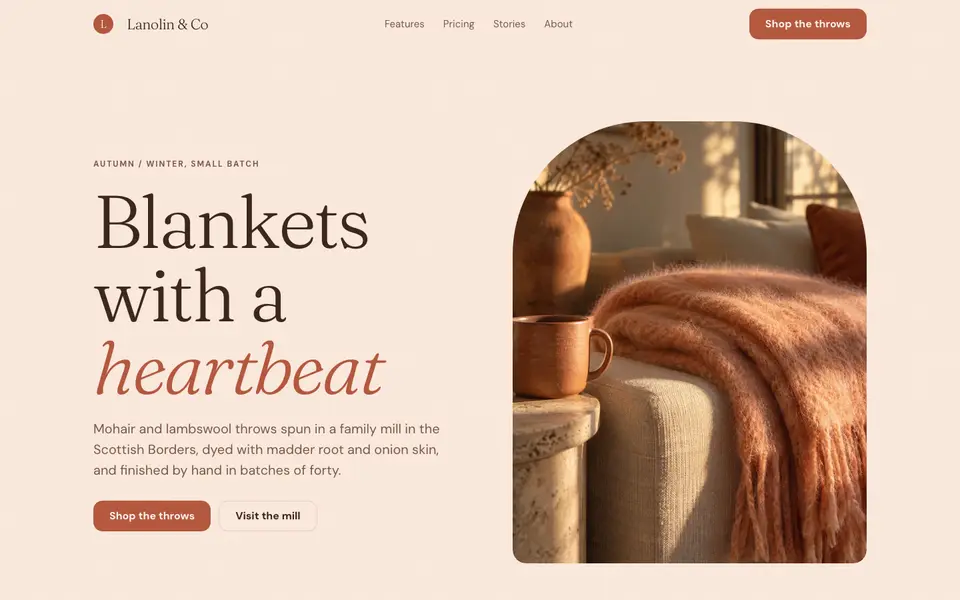
Peach Fuzz
No. 027Velvety peach, a soft-bellied serif and the warmth of brushed wool.
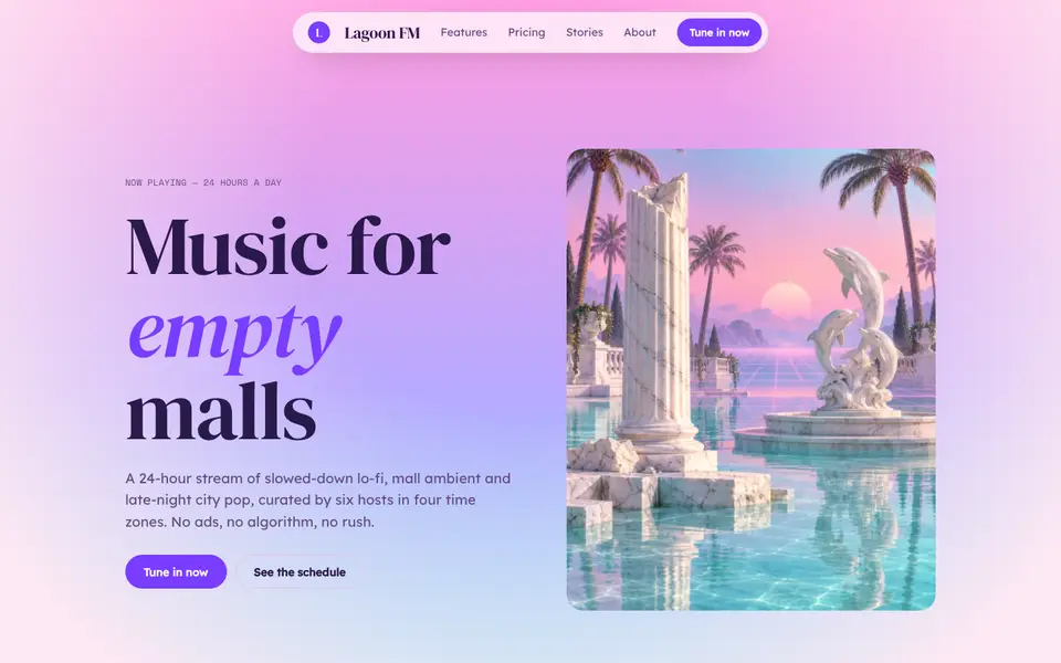
Vapor Pastel
No. 066Pink-to-cyan sunsets, marble columns and lo-fi calm from an empty 1990s mall.