Peach Fuzz
Velvety peach, a soft-bellied serif and the warmth of brushed wool.
This style
$9$19
One-time, no subscription · instant download · client use · 7-day refund before download
The idea
A palette you could touch: apricot canvas with a fine grain, a plump old-style serif with generous italics, and photographs of textiles in late sun. It feels like a cashmere throw left on a linen sofa — tactile, warm and a little indulgent.
Peach Fuzz turns softness into a material. It draws on 1970s craft-revival catalogues and contemporary textile photography: a light, plump old-style serif with lavish italics, a friendly geometric sans for reading, and an apricot canvas dusted with grain so the screen feels like brushed fabric. Colour is warm all the way through — even the darkest ink is a cocoa brown. Layouts are calm and alternate image and text like the pages of a catalogue. It should feel touchable, homely and well made.
Principles
- Make the screen feel like fabric — keep the grain on, keep colours warm.
- Use light-weight serif at large sizes; let the italic carry emotion.
- Alternate photograph and text, never two photographs side by side.
- Prefer flat surfaces with tonal shifts over shadows or borders.
- Write like a maker: places, dates, materials, batch numbers.
Motion
Content settles upward 16px over a full second like fabric falling into place; on hover, cards and links nudge 4px to the right as if brushed by a hand.
Do & don't
Do
- ✓ Keep grain at 4–6% opacity over every section.
- ✓ Crop textile photographs tight so fibres are visible.
- ✓ Use the italic for the one emotional word in a headline.
Don't
- ✕ Don't use drop shadows.
- ✕ Don't use cool greys, blues or pure white.
- ✕ Don't set Fraunces bold.
+ 3 more of each, and component rules, in the full DESIGN.md.
What's in the DESIGN.md
- 01Overview & principles
- 02Colors (tokens + proportions)
- 03Typography (families + 12-role scale)
- 04Layout & spacing scale
- 05Elevation & depth
- 06Shapes & radii
- 07Motion (easing, durations, signature)
- 08Imagery + generation prompt
- 09Components (button, card, nav, input, badge)
- 10Do's and don'ts
- 11Responsive behaviour
- 12Iteration guide + agent checklist
Plus theme.css (Tailwind v4 @theme), tokens.json (W3C) and the preview page source — 363 lines of DESIGN.md in total.
More like this
All Pastel & Soft →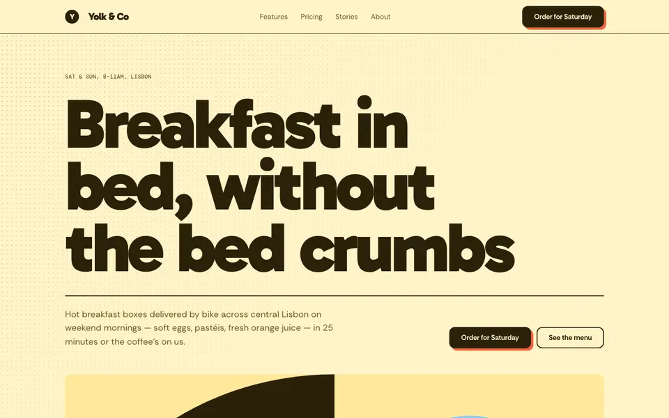
Butter Yellow
No. 022Sunny butter, a fat friendly grotesk and halftone dots like a cereal box.
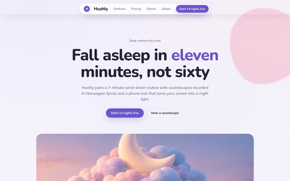
Cloud Lavender
No. 023Pillow-soft lavender, rounded everything, and a sky that never gets dark.
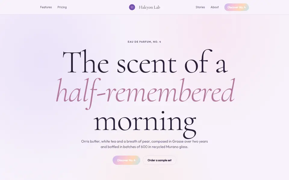
Lilac Dream
No. 024Iridescent lilac haze, a whispering serif and light that seems to float.
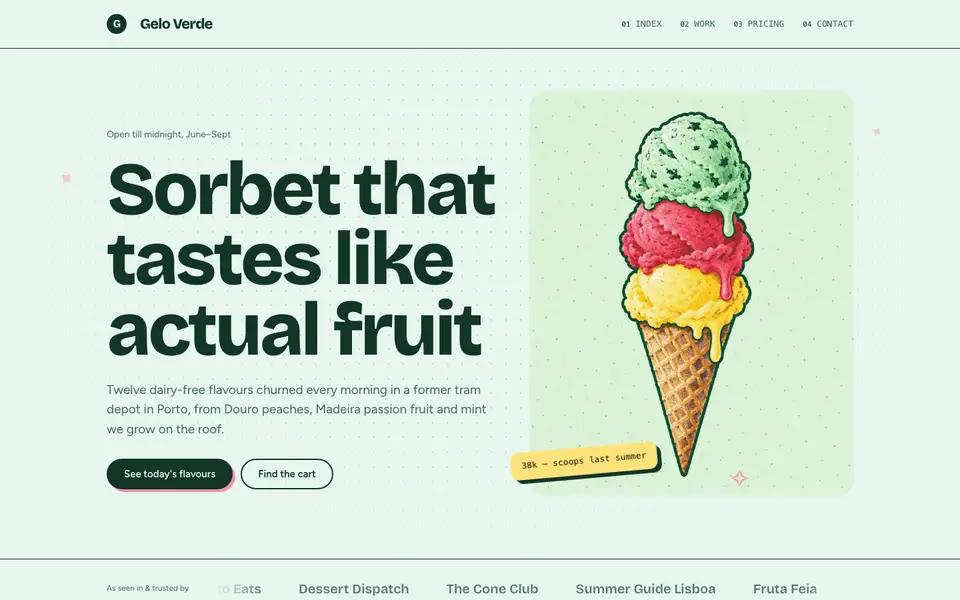
Mint Sorbet
No. 025Cold mint, a chunky grotesk and stickers slapped on like a gelato cart.
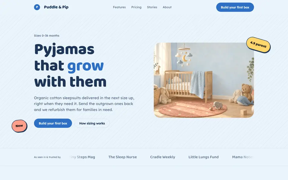
Nursery Blue
No. 026Baby-blue skies, bubbly type and corners soft enough for a toddler.
 Free
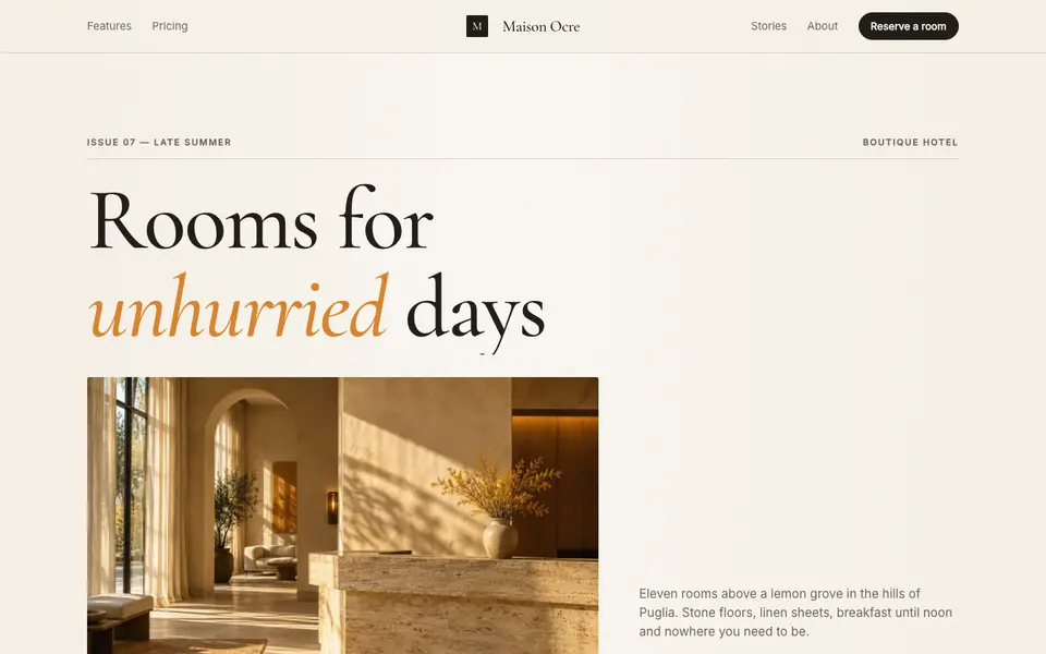
FreeSaffron Editorial
No. 008A slow-living magazine spread: oversized serif, saffron ink, sunlit stone.