Saffron Editorial
A slow-living magazine spread: oversized serif, saffron ink, sunlit stone.
Free style · full files
Includes DESIGN.md, theme.css, tokens.json and the preview page. Want the other 99? All-Access $19
The idea
Built like the opening spread of a Sunday supplement. A towering high-contrast serif carries the headline, a single saffron rule marks what matters, and warm sunlit photography does the rest. Calm, expensive, unhurried.
Saffron Editorial is a magazine spread translated to the web. It borrows from mid-century European travel magazines and contemporary slow-living journals: a towering, high-contrast serif at display sizes, a disciplined sans for reading, and large warm photography given room to breathe. Nothing shouts; hierarchy comes from scale and whitespace, not colour. The single saffron accent behaves like a printer's second ink — a rule, an underline, a number — never a fill. The result should feel calm, expensive and slightly literary.
Principles
- Let one photograph per section carry the mood; never tile small images.
- Set headlines huge and tight; let them break across lines deliberately.
- Use saffron as a second ink only: rules, underlines, numerals.
- Whitespace is the luxury — sections need at least 128px of air.
- Write captions and labels like a magazine: small caps, issue numbers, dates.
Motion
Headlines rise line by line from behind a clip mask; the hero photograph drifts 4% in a 14-second Ken Burns. Links draw a saffron underline from left to right.
Do & don't
Do
- ✓ Pair every section with one strong photograph or one strong headline, not both competing.
- ✓ Use issue numbers, dates and small captions for editorial texture.
- ✓ Let headlines break into three lines at desktop.
- ✓ Keep body copy in a narrow measure (55–62ch).
- ✓ Use italic for exactly one emphasised word per headline.
- ✓ Leave large margins — 144px between sections on desktop.
Don't
- ✕ Don't use saffron as a background or button colour.
- ✕ Don't round images or add drop shadows.
- ✕ Don't use icons in feature lists — numerals instead.
- ✕ Don't centre long paragraphs.
- ✕ Don't use pure white (#FFFFFF) or pure black.
- ✕ Don't add gradients, glass or glow.
What's in the DESIGN.md
- 01Overview & principles
- 02Colors (tokens + proportions)
- 03Typography (families + 12-role scale)
- 04Layout & spacing scale
- 05Elevation & depth
- 06Shapes & radii
- 07Motion (easing, durations, signature)
- 08Imagery + generation prompt
- 09Components (button, card, nav, input, badge)
- 10Do's and don'ts
- 11Responsive behaviour
- 12Iteration guide + agent checklist
Plus theme.css (Tailwind v4 @theme), tokens.json (W3C) and the preview page source — 365 lines of DESIGN.md in total.
More like this
All Editorial & Luxury →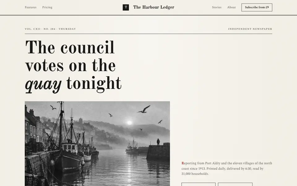
Broadsheet Press
No. 001A morning broadsheet: masthead, column rules, datelines and a grey halftone photograph.
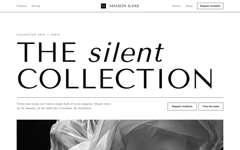
Didone Couture
No. 002Haute couture in two inks: a hairline Didone, paper white and absolute black.
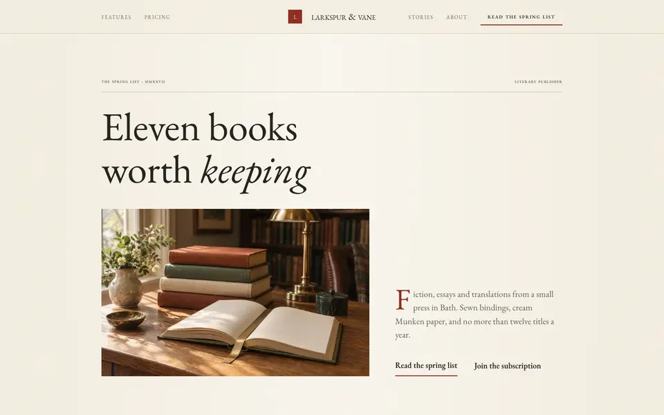
Folio Press
No. 003A literary publisher's catalogue: Garamond, small caps, cream paper and a printer's red.
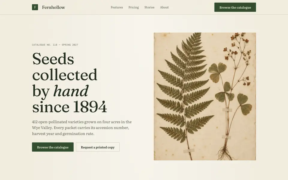
Herbarium Journal
No. 004A naturalist's field journal: specimen plates, Latin names, moss green and foxed paper.
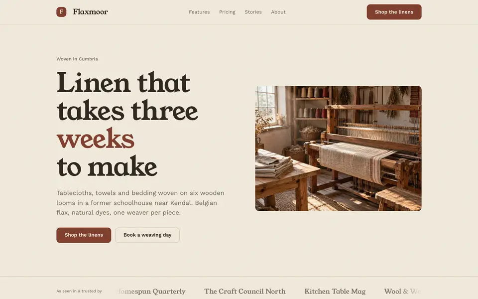
Linen Atelier
No. 005An artisan workshop journal: flax tones, soft serif, stitched details and daylight.
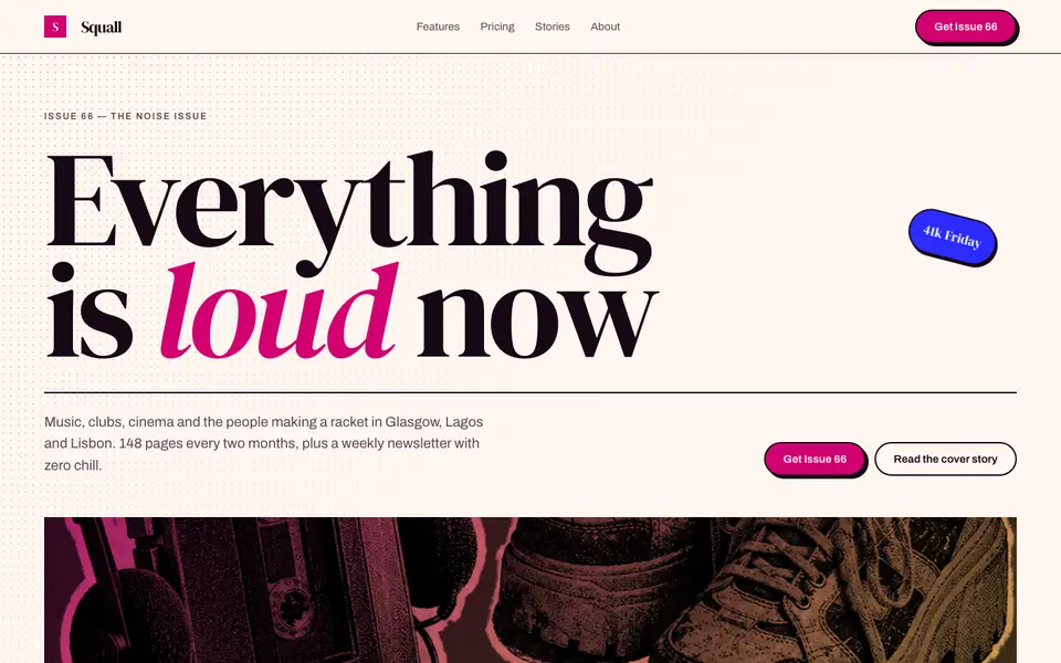
Magenta Shout
No. 006A pop-culture magazine at full volume: towering italics, hot magenta, cut-out photos.