Xerox Zine
Cut, paste, photocopy: a punk zine with toner streaks, tape and red marker.
This style
$9$19
One-time, no subscription · instant download · client use · 7-day refund before download
The idea
A fold-and-staple fanzine run off on the library copier at midnight. Off-white paper, black toner halftone, marker headlines, typewriter body copy and strips of tape holding everything at slightly wrong angles. One red marker for the bits that matter.
Xerox Zine channels late-70s and 80s punk fanzines and the riot-grrrl paste-ups that followed: everything looks cut out with scissors, glued down and run through a tired photocopier. Black toner on off-white paper does most of the work, with coarse halftone photographs, marker-pen headlines and typewritten body text. Elements sit a few degrees off true, held by strips of tape. A red marker circles the important things and a yellow highlighter swipes the occasional line. It should feel urgent, handmade and defiantly cheap.
Principles
- Nothing sits perfectly straight: rotate blocks between -3° and 3°.
- Photos are always halftoned and high-contrast, never clean.
- Headlines are hand-lettered in marker; body text is typewritten.
- Red marker is for circling and underlining, not filling.
- Density is a feature — pack the page like a crowded A5 spread.
Motion
Cards jump in from the left in three choppy frames, like pages fed through a copier. On hover a card rotates a further 2° as if someone nudged the paste-up.
Do & don't
Do
- ✓ Tape every image and card with a translucent strip.
- ✓ Rotate alternating cards in opposite directions.
- ✓ Circle one key word per section in red marker.
Don't
- ✕ Don't align everything to the grid.
- ✕ Don't use colour photographs.
- ✕ Don't use rounded corners or soft shadows.
+ 3 more of each, and component rules, in the full DESIGN.md.
What's in the DESIGN.md
- 01Overview & principles
- 02Colors (tokens + proportions)
- 03Typography (families + 12-role scale)
- 04Layout & spacing scale
- 05Elevation & depth
- 06Shapes & radii
- 07Motion (easing, durations, signature)
- 08Imagery + generation prompt
- 09Components (button, card, nav, input, badge)
- 10Do's and don'ts
- 11Responsive behaviour
- 12Iteration guide + agent checklist
Plus theme.css (Tailwind v4 @theme), tokens.json (W3C) and the preview page source — 364 lines of DESIGN.md in total.
More like this
All Brutalist →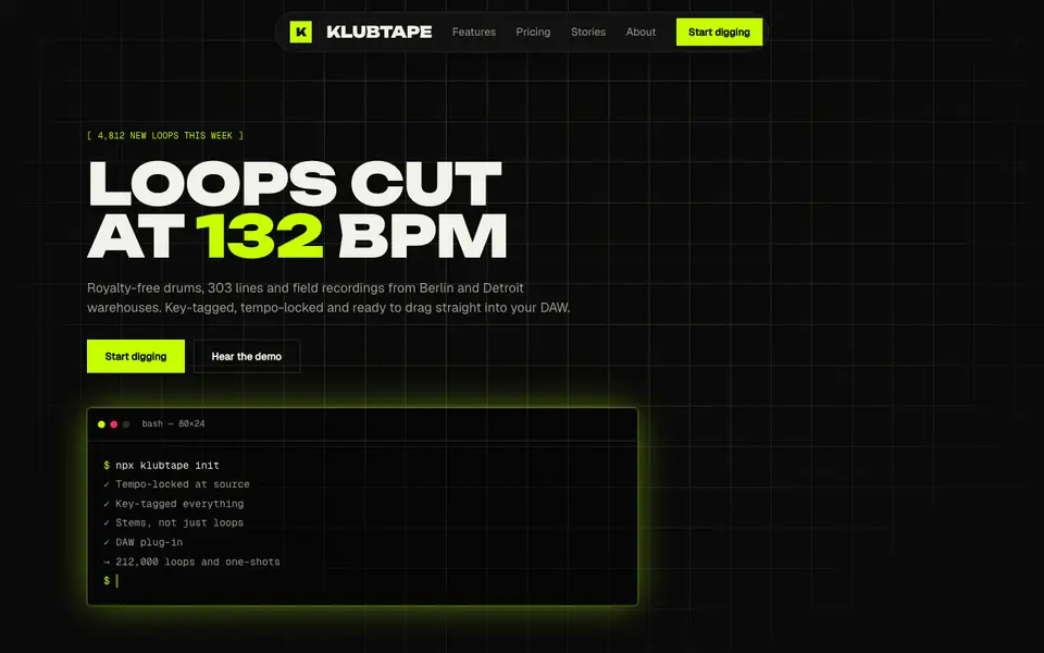
Acid Black
No. 011Acid green on pure night: a warehouse-rave flyer that boots like a terminal.
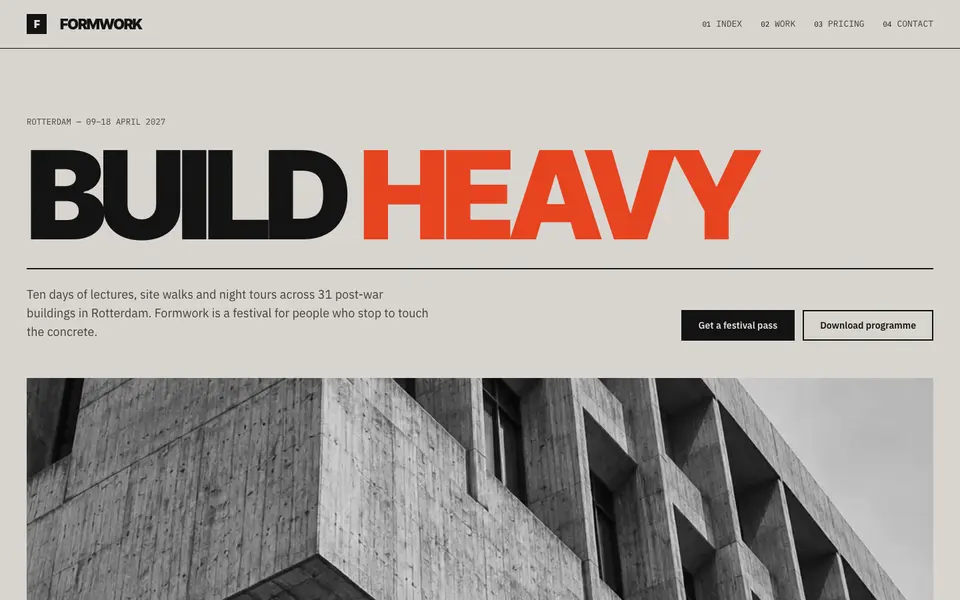
Concrete Poster
No. 012Board-marked concrete and a grotesk set so large it becomes the building.
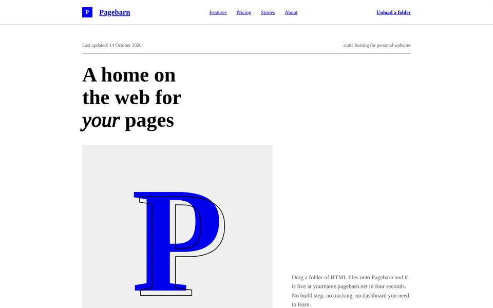
Default HTML
No. 013The browser's own stylesheet, taken seriously: Times, blue links, exposed structure.
 Free
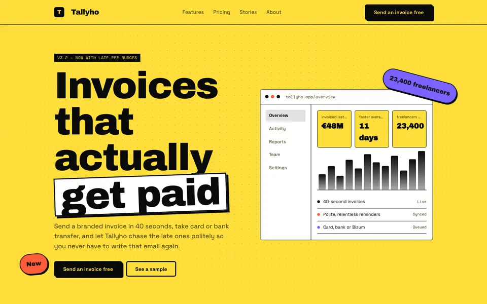
FreeNeo Brutal Yellow
No. 014Highlighter yellow, 3px black borders and shadows that never blur. Loud on purpose.
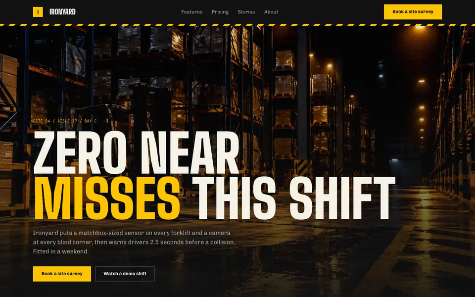
Hazard Industrial
No. 034Black and safety yellow, hazard tape and stencil type from the loading dock.
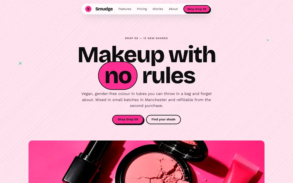
Hot Pink Brutal
No. 035Hot pink, hard black shadows and pill buttons: neo-brutalism with lipstick on.