Concrete Poster
Board-marked concrete and a grotesk set so large it becomes the building.
This style
$9$19
One-time, no subscription · instant download · client use · 7-day refund before download
The idea
A wheat-pasted exhibition poster blown up to screen size. Raw concrete grey, black type in a grotesk so heavy and tight it fills the viewport edge to edge, one signal-orange mark. Grayscale photographs of brutalist buildings provide the only texture the type does not.
Concrete Poster is the International Typographic poster pushed into brutalist territory. It references 1960s exhibition posters, the raw béton of post-war civic architecture and wheat-pasted gig bills: one enormous grotesk headline set uppercase at -0.055em that crops against the viewport, a concrete-grey field with fine grain, and black as the only real colour. Signal orange appears once, like a site marker spray-painted on a slab. Photography is grayscale, architectural, shot from below with hard sun. The page should feel monumental, cold and certain.
Principles
- The headline is the building: set it so big that one word fills a line.
- Crop type against the edges; letters may touch or bleed past the frame.
- Black, concrete grey and one orange mark. Nothing else.
- Number everything — sections, buildings, days — in mono.
- Photographs are grayscale and architectural, never decorative.
Motion
Each headline line is unmasked bottom-to-top like a poster being pasted up, 120ms apart. Hovered links and rows invert to concrete-on-black instantly, with no fade.
Do & don't
Do
- ✓ Let the h1 crop at the right edge on purpose.
- ✓ Use the mono index ('01 —') before every section label.
- ✓ Set body copy in narrow columns, 36–44 characters.
Don't
- ✕ Don't introduce colour photography.
- ✕ Don't use orange for more than one element per screen.
- ✕ Don't round corners or add shadows.
+ 3 more of each, and component rules, in the full DESIGN.md.
What's in the DESIGN.md
- 01Overview & principles
- 02Colors (tokens + proportions)
- 03Typography (families + 12-role scale)
- 04Layout & spacing scale
- 05Elevation & depth
- 06Shapes & radii
- 07Motion (easing, durations, signature)
- 08Imagery + generation prompt
- 09Components (button, card, nav, input, badge)
- 10Do's and don'ts
- 11Responsive behaviour
- 12Iteration guide + agent checklist
Plus theme.css (Tailwind v4 @theme), tokens.json (W3C) and the preview page source — 366 lines of DESIGN.md in total.
More like this
All Brutalist →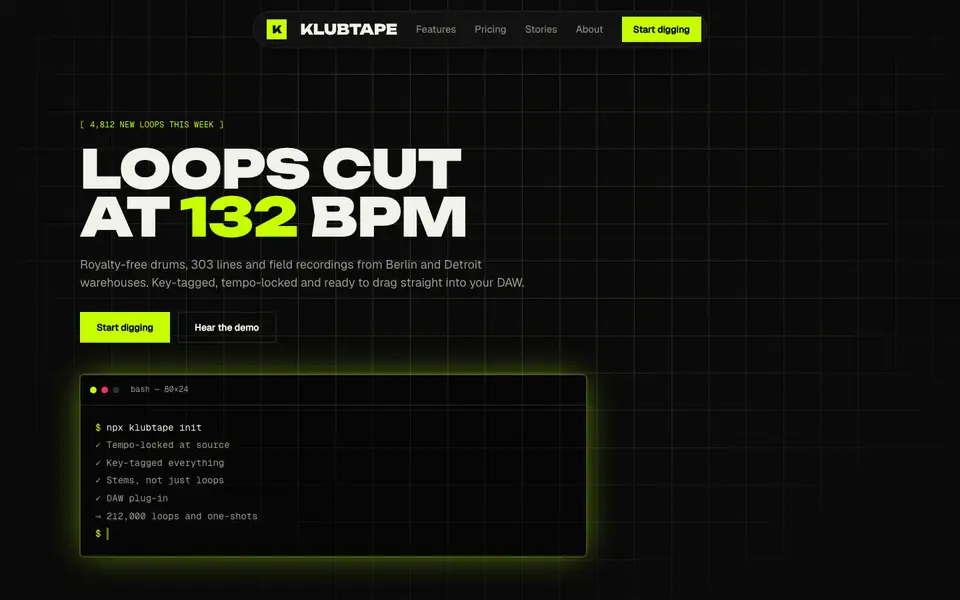
Acid Black
No. 011Acid green on pure night: a warehouse-rave flyer that boots like a terminal.
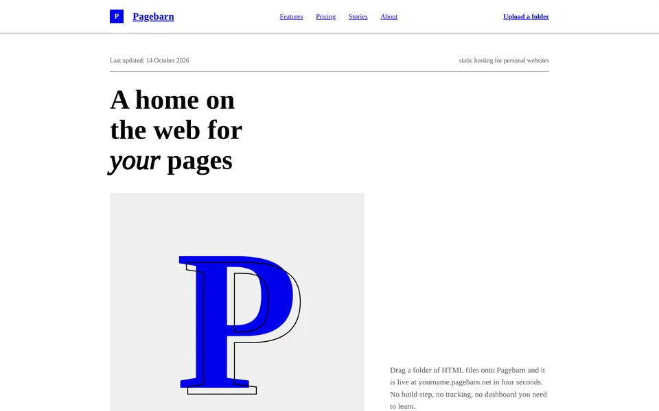
Default HTML
No. 013The browser's own stylesheet, taken seriously: Times, blue links, exposed structure.
 Free
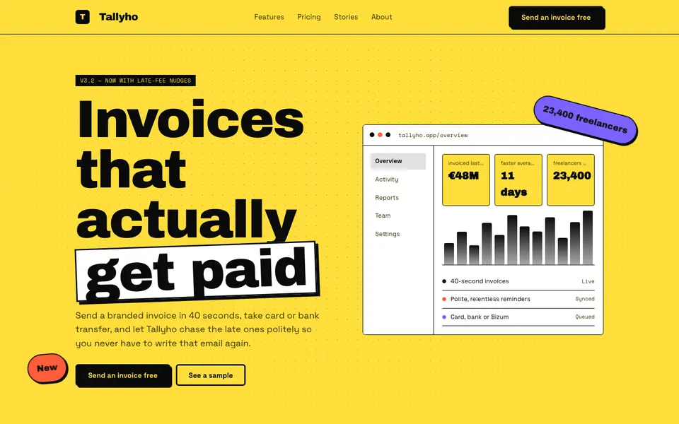
FreeNeo Brutal Yellow
No. 014Highlighter yellow, 3px black borders and shadows that never blur. Loud on purpose.
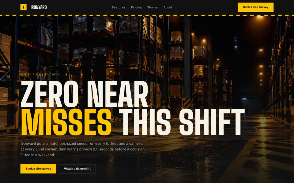
Hazard Industrial
No. 034Black and safety yellow, hazard tape and stencil type from the loading dock.
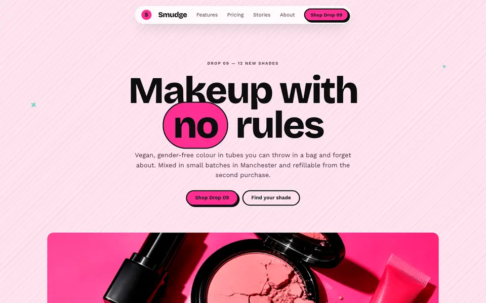
Hot Pink Brutal
No. 035Hot pink, hard black shadows and pill buttons: neo-brutalism with lipstick on.
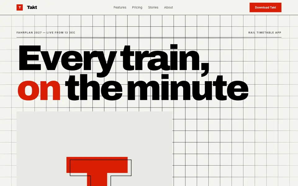
Swiss Numerals
No. 036Brutal Swiss: a hard grid, signal red and numerals the height of the screen.