Swiss Numerals
Brutal Swiss: a hard grid, signal red and numerals the height of the screen.
This style
$9$19
One-time, no subscription · instant download · client use · 7-day refund before download
The idea
The International Typographic Style with the politeness removed. A visible black grid, flush-left grotesk, and numerals so large they become the architecture of the page: 01, 02, 03 stacked like platform signs. Signal red marks the one thing you should do next.
Swiss Numerals takes the International Typographic Style of 1950s Basel and Zürich — flush-left grotesk, objective grids, asymmetric balance — and hardens it into brutalism. The grid is not hidden: 2px black rules and a faint 12-column background make the structure visible. Enormous numerals at 200px+ function as section markers, wayfinding and decoration at once, like platform numbers on a station. Signal red is used exactly as in railway signage: for the one action and the one warning. It should feel rational, punctual and severe.
Principles
- Numbers are the ornament: index every section and feature with a huge numeral.
- Everything is flush left and ragged right. Never centre.
- Show the grid: 2px black rules between columns and sections.
- Red marks the next action only; black does everything else.
- Information first — timetables, figures and units, never adjectives.
Motion
Giant numerals slide in from the left edge and lock to the grid like a split-flap board settling. Table rows and links invert to white-on-black on hover with no easing.
Do & don't
Do
- ✓ Use tabular figures for every number.
- ✓ Let section numerals bleed off the left edge by 4px.
- ✓ Align every element to the 12-column grid and 8px baseline.
Don't
- ✕ Don't centre text.
- ✕ Don't use rounded corners or shadows.
- ✕ Don't add photography or illustration.
+ 3 more of each, and component rules, in the full DESIGN.md.
What's in the DESIGN.md
- 01Overview & principles
- 02Colors (tokens + proportions)
- 03Typography (families + 12-role scale)
- 04Layout & spacing scale
- 05Elevation & depth
- 06Shapes & radii
- 07Motion (easing, durations, signature)
- 08Imagery + generation prompt
- 09Components (button, card, nav, input, badge)
- 10Do's and don'ts
- 11Responsive behaviour
- 12Iteration guide + agent checklist
Plus theme.css (Tailwind v4 @theme), tokens.json (W3C) and the preview page source — 359 lines of DESIGN.md in total.
More like this
All Brutalist →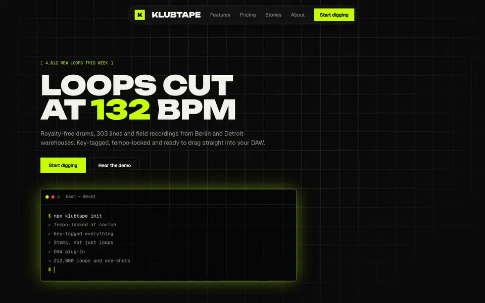
Acid Black
No. 011Acid green on pure night: a warehouse-rave flyer that boots like a terminal.
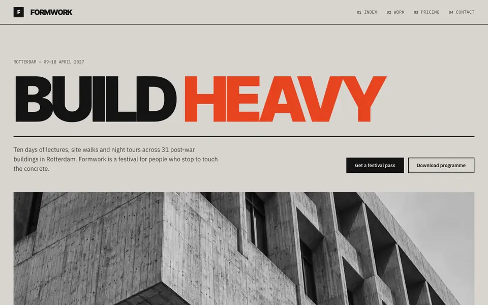
Concrete Poster
No. 012Board-marked concrete and a grotesk set so large it becomes the building.
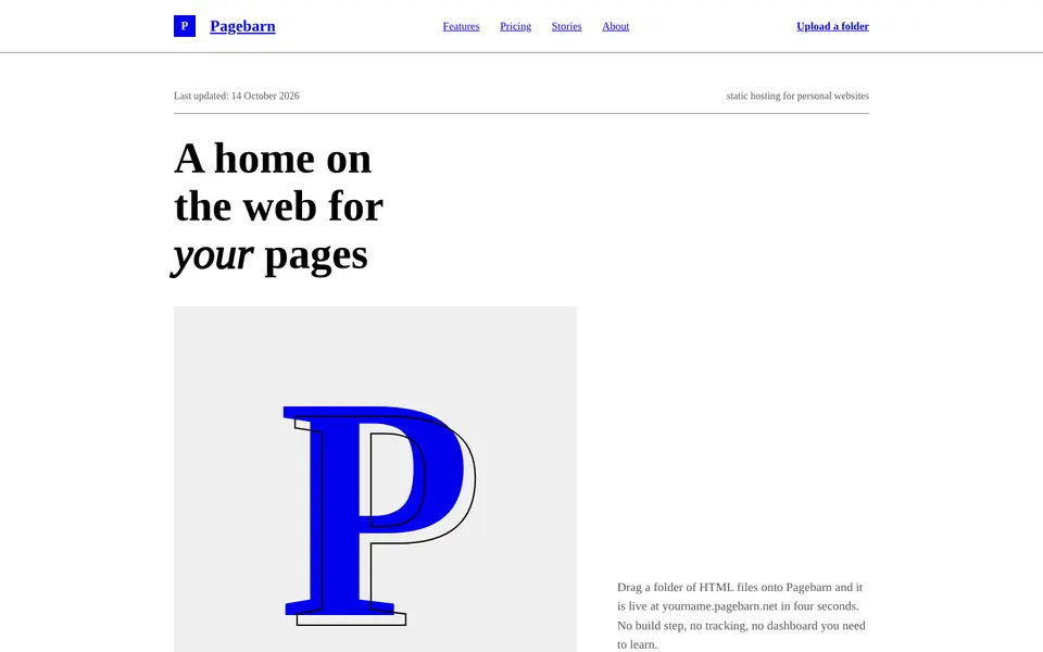
Default HTML
No. 013The browser's own stylesheet, taken seriously: Times, blue links, exposed structure.
 Free
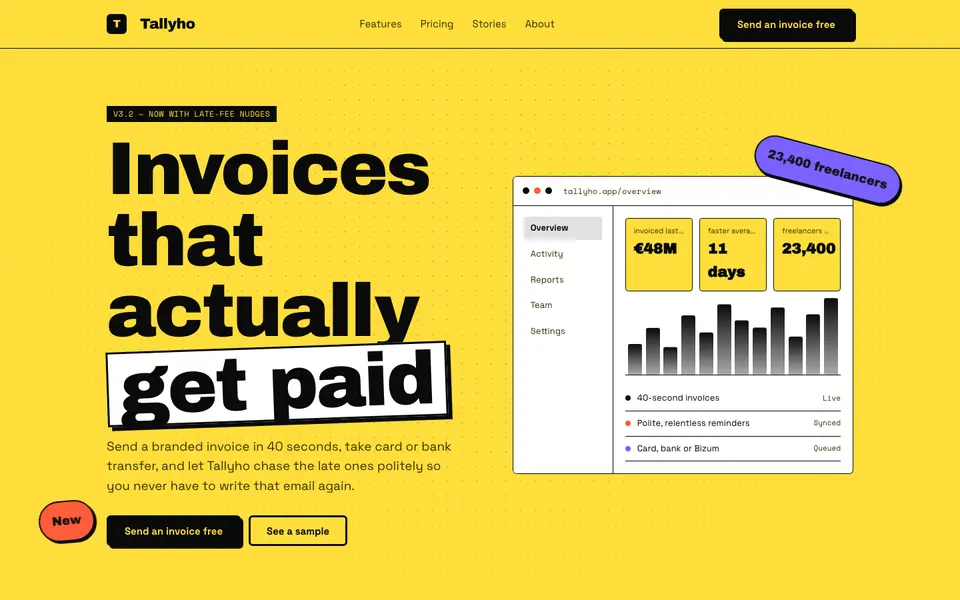
FreeNeo Brutal Yellow
No. 014Highlighter yellow, 3px black borders and shadows that never blur. Loud on purpose.
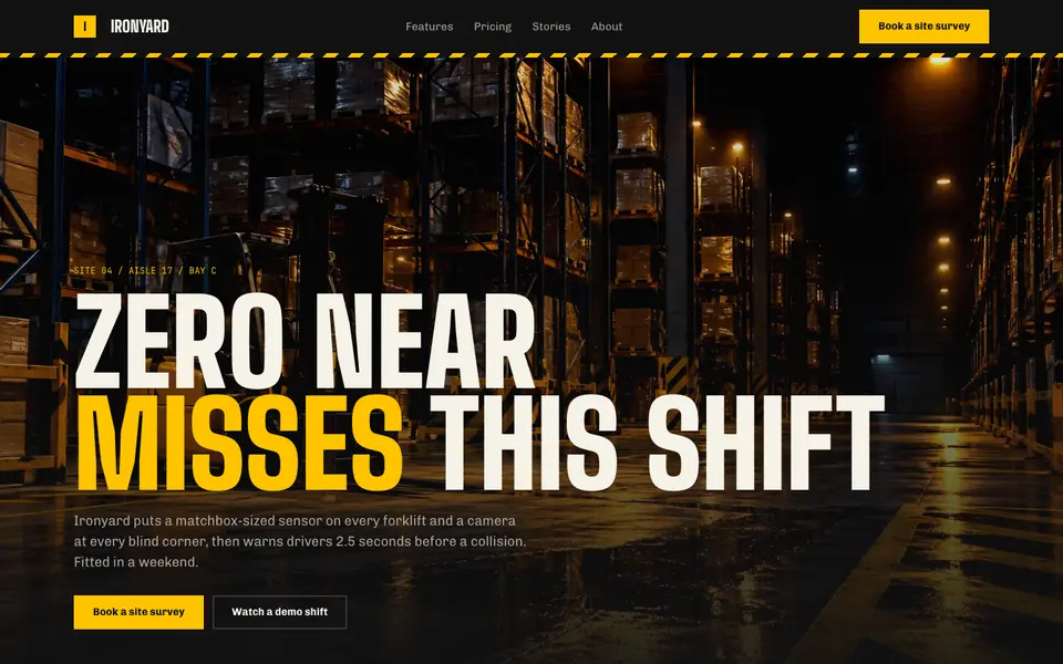
Hazard Industrial
No. 034Black and safety yellow, hazard tape and stencil type from the loading dock.
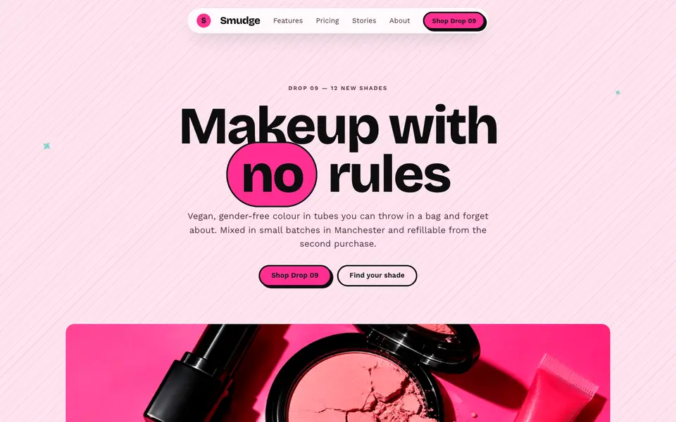
Hot Pink Brutal
No. 035Hot pink, hard black shadows and pill buttons: neo-brutalism with lipstick on.