Hazard Industrial
Black and safety yellow, hazard tape and stencil type from the loading dock.
This style
$9$19
One-time, no subscription · instant download · client use · 7-day refund before download
The idea
The visual language of a warehouse floor: safety yellow on black, diagonal hazard tape at the edges, condensed stencil-like headlines and inventory numbers everywhere. Nothing is decorative unless it would also keep you from walking into a forklift.
Hazard Industrial borrows directly from the floor markings, signage and labelling of warehouses, docks and construction sites: safety yellow on black, 45° hazard tape, condensed stencil-style capitals, and asset numbers stencilled on everything. Mid-century industrial signage and contemporary logistics dashboards both inform it. The page is dark and dense like a control room, with yellow reserved for things that demand attention and diagonal tape framing the edges. Photography shows real working spaces at night under sodium light. It should feel serious, robust and built to code.
Principles
- Yellow means attention or action; it is never decoration.
- Frame, don't fill: hazard tape belongs on edges and dividers only.
- Label everything with codes: SITE 04 / AISLE 17 / BAY C.
- Condensed uppercase for headlines, sturdy sans for reading.
- Dense, information-rich layouts like an operations board.
Motion
A hazard-tape strip scrolls slowly along the top of the hero at 20px per second. Cards and rows invert to yellow-on-black instantly on hover, like a scanner beam passing over a label.
Do & don't
Do
- ✓ Use 45° yellow/black stripes at 16px period for hazard strips.
- ✓ Stencil location codes in mono beside headings.
- ✓ Keep photography dark with amber highlights.
Don't
- ✕ Don't use rounded corners.
- ✕ Don't fill large areas with hazard stripes.
- ✕ Don't use yellow for body text.
+ 3 more of each, and component rules, in the full DESIGN.md.
What's in the DESIGN.md
- 01Overview & principles
- 02Colors (tokens + proportions)
- 03Typography (families + 12-role scale)
- 04Layout & spacing scale
- 05Elevation & depth
- 06Shapes & radii
- 07Motion (easing, durations, signature)
- 08Imagery + generation prompt
- 09Components (button, card, nav, input, badge)
- 10Do's and don'ts
- 11Responsive behaviour
- 12Iteration guide + agent checklist
Plus theme.css (Tailwind v4 @theme), tokens.json (W3C) and the preview page source — 366 lines of DESIGN.md in total.
More like this
All Brutalist →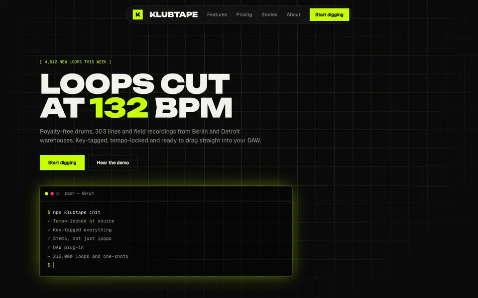
Acid Black
No. 011Acid green on pure night: a warehouse-rave flyer that boots like a terminal.
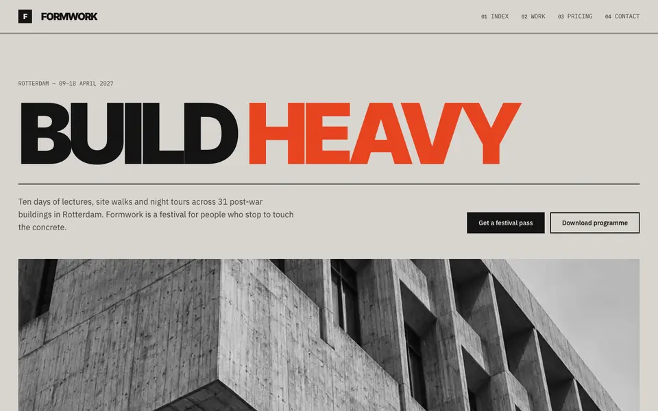
Concrete Poster
No. 012Board-marked concrete and a grotesk set so large it becomes the building.
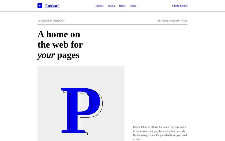
Default HTML
No. 013The browser's own stylesheet, taken seriously: Times, blue links, exposed structure.
 Free
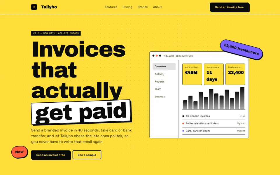
FreeNeo Brutal Yellow
No. 014Highlighter yellow, 3px black borders and shadows that never blur. Loud on purpose.
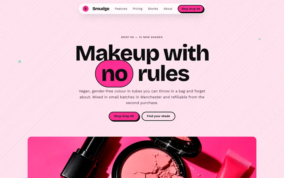
Hot Pink Brutal
No. 035Hot pink, hard black shadows and pill buttons: neo-brutalism with lipstick on.
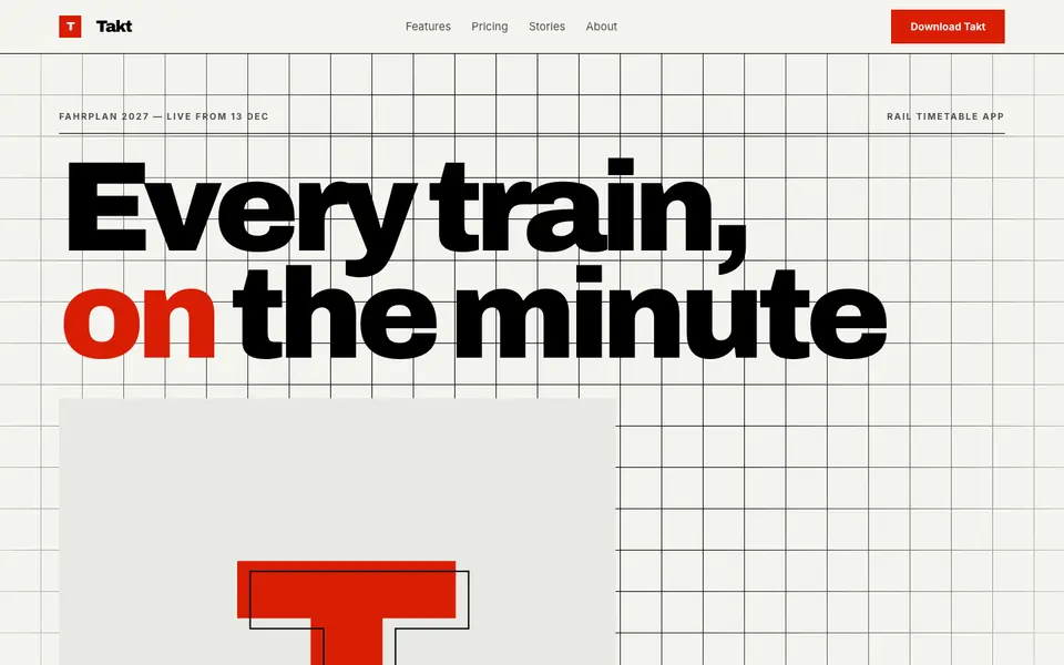
Swiss Numerals
No. 036Brutal Swiss: a hard grid, signal red and numerals the height of the screen.