Neo Brutal Yellow
Highlighter yellow, 3px black borders and shadows that never blur. Loud on purpose.
Free style · full files
Includes DESIGN.md, theme.css, tokens.json and the preview page. Want the other 99? All-Access $19
The idea
A full-bleed sheet of highlighter yellow with every box drawn in a 3px black marker line and pushed off the page by a solid 6px shadow. Chunky grotesk headlines, white cards, one coral sticker. It looks like a wireframe someone decided to ship, and that is the point.
Neo Brutal Yellow takes the exposed structure of 1960s béton brut and the cut-and-paste honesty of early web wireframes and makes them friendly. Every element is a box with a 3px black outline and a solid, unblurred offset shadow, sitting on a saturated highlighter-yellow field. There are no gradients, no transparency and no soft edges: depth is faked like a cartoon, with a hard black shape behind each object. The voice is direct and a little cheeky, the type is heavy and compact, and colour is used like stickers slapped on a laptop. It should feel useful, fast and impossible to ignore.
Principles
- Outline everything: 3px solid ink on every card, button, input and image.
- Shadows are solid ink rectangles offset 6px right and 6px down; never blurred.
- Yellow is the page, white is the paper, black is the pen.
- Use coral as a sticker, not a theme: one per viewport.
- Show the product — UI mocks in white boxes beat abstract illustration.
Motion
Cards pop in at 96% scale with a small overshoot. On hover a button slides 3px down-right into its own shadow, so the shadow shrinks from 6px to 3px like a key being pressed.
Do & don't
Do
- ✓ Keep every border exactly 3px and every shadow exactly 6px.
- ✓ Overlap the hero mock card past the grid edge by 24px.
- ✓ Use real numbers in stickers: '€12/mo', 'v3.2', '11 days faster'.
- ✓ Rotate stickers between -6° and 6°, never more.
- ✓ Use the mono face for prices, dates and keyboard shortcuts.
- ✓ Let the dotted yellow background show between every card.
Don't
- ✕ Don't blur a shadow or add opacity to it.
- ✕ Don't use grey; use black, white or yellow.
- ✕ Don't round corners beyond 6px.
- ✕ Don't place more than one coral element per viewport.
- ✕ Don't use gradients, glass or photography.
- ✕ Don't centre body paragraphs longer than two lines.
What's in the DESIGN.md
- 01Overview & principles
- 02Colors (tokens + proportions)
- 03Typography (families + 12-role scale)
- 04Layout & spacing scale
- 05Elevation & depth
- 06Shapes & radii
- 07Motion (easing, durations, signature)
- 08Imagery + generation prompt
- 09Components (button, card, nav, input, badge)
- 10Do's and don'ts
- 11Responsive behaviour
- 12Iteration guide + agent checklist
Plus theme.css (Tailwind v4 @theme), tokens.json (W3C) and the preview page source — 361 lines of DESIGN.md in total.
More like this
All Brutalist →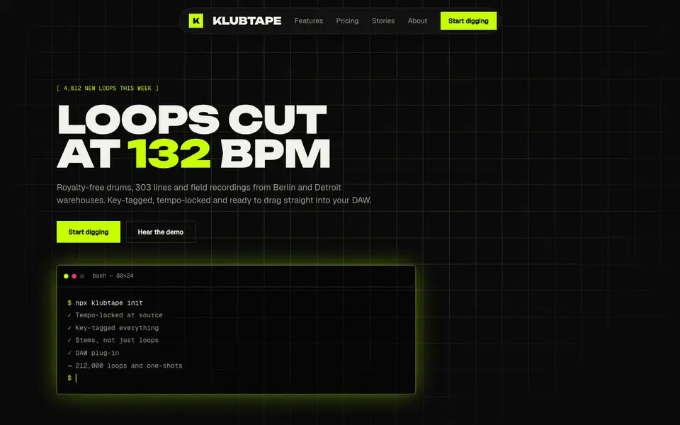
Acid Black
No. 011Acid green on pure night: a warehouse-rave flyer that boots like a terminal.
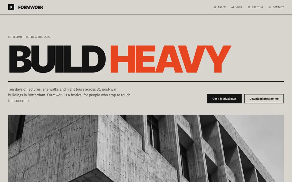
Concrete Poster
No. 012Board-marked concrete and a grotesk set so large it becomes the building.
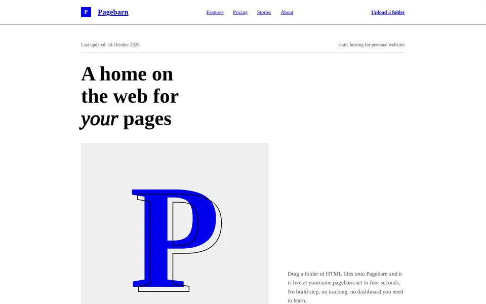
Default HTML
No. 013The browser's own stylesheet, taken seriously: Times, blue links, exposed structure.
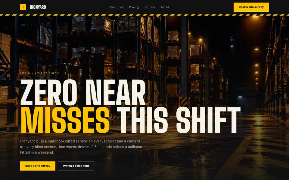
Hazard Industrial
No. 034Black and safety yellow, hazard tape and stencil type from the loading dock.
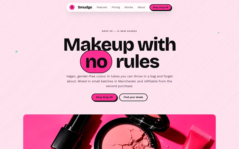
Hot Pink Brutal
No. 035Hot pink, hard black shadows and pill buttons: neo-brutalism with lipstick on.
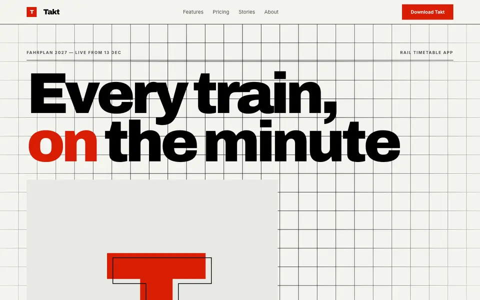
Swiss Numerals
No. 036Brutal Swiss: a hard grid, signal red and numerals the height of the screen.