Liquid Chrome
Molten mirror metal on graphite: wide caps, oil-slick sheen, machined edges.
This style
$9$19
One-time, no subscription · instant download · client use · 7-day refund before download
The idea
Graphite darkness with blobs of liquid mirror metal that reflect an oil-slick rainbow along their edges. Headlines are wide, uppercase and machined; buttons shimmer like polished steel. It feels like a precision object photographed in a black studio.
Liquid Chrome is late-Y2K futurism grown up: molten mirror metal against graphite, wide machined capitals, and an oil-slick iridescence that only appears at the edges of things. It borrows from luxury product photography in black studios and from industrial design of precision instruments. The palette is almost monochrome — graphite, steel, white — with the rainbow strictly confined to reflections. Everything should feel weighty, cold to the touch and expensive.
Principles
- The rainbow only lives on edges and reflections, never on fills.
- Set display type wide, uppercase and short — four words maximum per line.
- Light comes from above: top edges bright, bottom edges dark.
- One hero object per page; give it the whole viewport.
- Specs and numbers are part of the aesthetic — show them in mono.
Motion
The chrome headline carries a slow specular sweep: a 30-degree band of white light crosses the letters every 6 seconds. Cards tilt up to 4 degrees toward the cursor, as if turning a polished object in the hand.
Do & don't
Do
- ✓ Show machining specs (grams, dB, mm) in Space Mono near every product image.
- ✓ Keep headlines to three words where possible.
- ✓ Use a single chrome object per section.
Don't
- ✕ Don't fill buttons or panels with rainbow gradients.
- ✕ Don't use Unbounded for body text or small labels.
- ✕ Don't put chrome renders on light backgrounds.
+ 3 more of each, and component rules, in the full DESIGN.md.
What's in the DESIGN.md
- 01Overview & principles
- 02Colors (tokens + proportions)
- 03Typography (families + 12-role scale)
- 04Layout & spacing scale
- 05Elevation & depth
- 06Shapes & radii
- 07Motion (easing, durations, signature)
- 08Imagery + generation prompt
- 09Components (button, card, nav, input, badge)
- 10Do's and don'ts
- 11Responsive behaviour
- 12Iteration guide + agent checklist
Plus theme.css (Tailwind v4 @theme), tokens.json (W3C) and the preview page source — 375 lines of DESIGN.md in total.
More like this
All Glass & Gradient →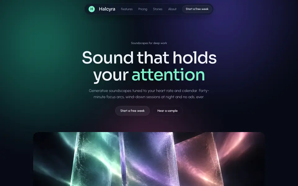 Free
FreeAurora Frost
No. 015Northern lights behind frosted panes: deep night, mint glow, cards like cold glass.
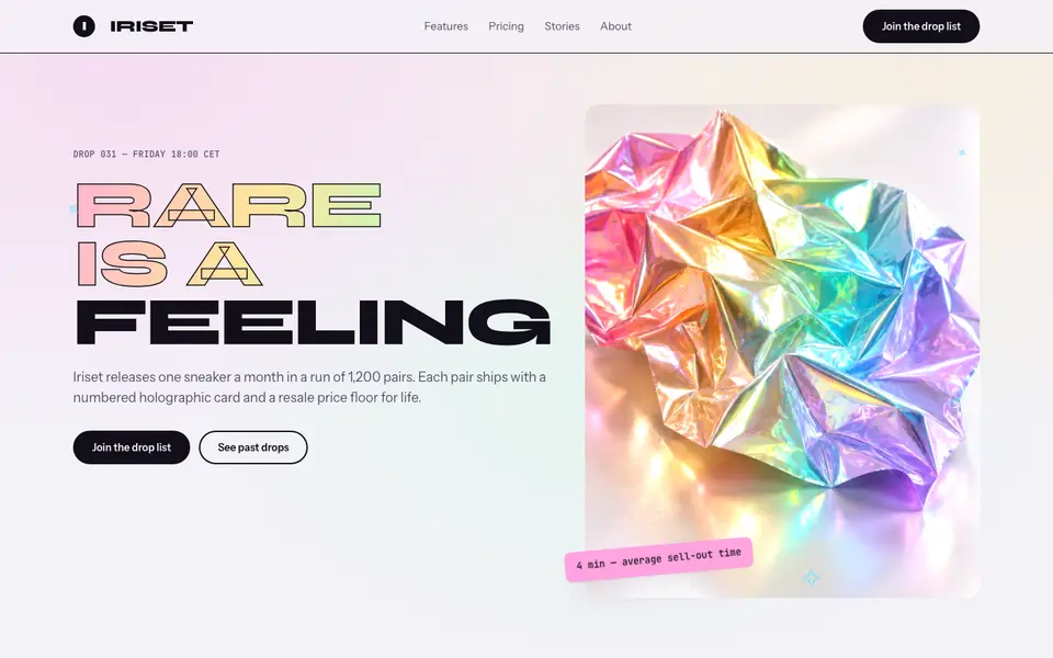
Holo Foil
No. 016Pearl-white page, foil-stamped type and rainbow sheen that shifts as you scroll.
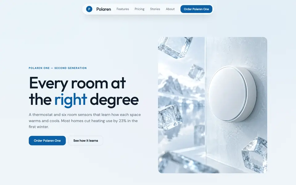
Ice Glass
No. 017Clear ice over pale sky: frosted white panes, glacier blue, crisp edges.
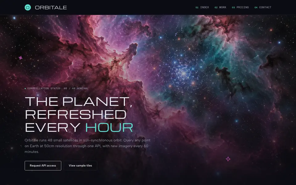
Nebula Deep
No. 019Deep-field imagery, wide technical caps and smoked-glass panels drifting in the void.
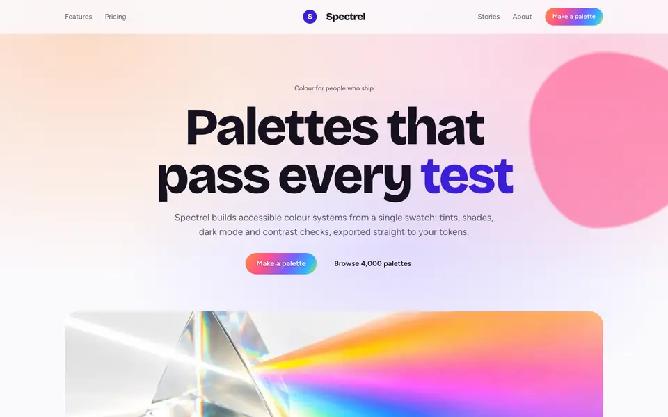
Prism Mesh
No. 020White light split through a prism: saturated colour fields on a bright, airy page.
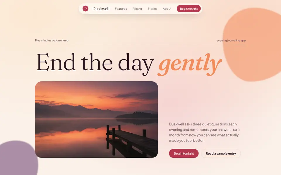
Sunset Mesh
No. 021Golden-hour gradients, milky glass and a soft italic serif for the end of the day.