Prism Mesh
White light split through a prism: saturated colour fields on a bright, airy page.
This style
$9$19
One-time, no subscription · instant download · client use · 7-day refund before download
The idea
A bright white page washed with a full-spectrum gradient mesh — tangerine, magenta, electric blue, lime — blurred until it glows. Chunky friendly grotesque headlines, soft floating cards and generous rounded corners. Optimistic, energetic and unmistakably creative.
Prism Mesh is what happens when white light hits a prism and lands on a clean page. The canvas stays bright and nearly white; behind the hero and one feature band, a full-spectrum gradient mesh blooms in tangerine, magenta, violet, electric blue and lime, blurred so heavily it reads as light rather than shapes. It borrows from 2020s gradient-mesh illustration and from lab photography of optics. Chunky, playful grotesque type and big soft cards keep it friendly. The feeling is optimism with craft behind it.
Principles
- Keep the page white; the spectrum is a light source, not a background colour.
- Blur mesh blobs at 120px or more and never let edges show.
- One deep violet carries actions; the spectrum carries emotion.
- Big, round and soft: 28px card radius, pill buttons.
- Never let the mesh sit behind body text without a white card.
Motion
The mesh blobs breathe: each scales between 0.9 and 1.1 on offset 18–26 second loops so the colour fields slowly shift. Cards spring up 6px with a slight overshoot on hover.
Do & don't
Do
- ✓ Blur every mesh blob at 120px+ so colours merge into light.
- ✓ Use a gradient swatch strip as a feature icon instead of line icons.
- ✓ Keep headlines bold and tight, with plenty of white around them.
Don't
- ✕ Don't flood whole sections with the gradient.
- ✕ Don't place grey or violet text directly over mesh colour.
- ✕ Don't use sharp corners anywhere.
+ 3 more of each, and component rules, in the full DESIGN.md.
What's in the DESIGN.md
- 01Overview & principles
- 02Colors (tokens + proportions)
- 03Typography (families + 12-role scale)
- 04Layout & spacing scale
- 05Elevation & depth
- 06Shapes & radii
- 07Motion (easing, durations, signature)
- 08Imagery + generation prompt
- 09Components (button, card, nav, input, badge)
- 10Do's and don'ts
- 11Responsive behaviour
- 12Iteration guide + agent checklist
Plus theme.css (Tailwind v4 @theme), tokens.json (W3C) and the preview page source — 376 lines of DESIGN.md in total.
More like this
All Glass & Gradient →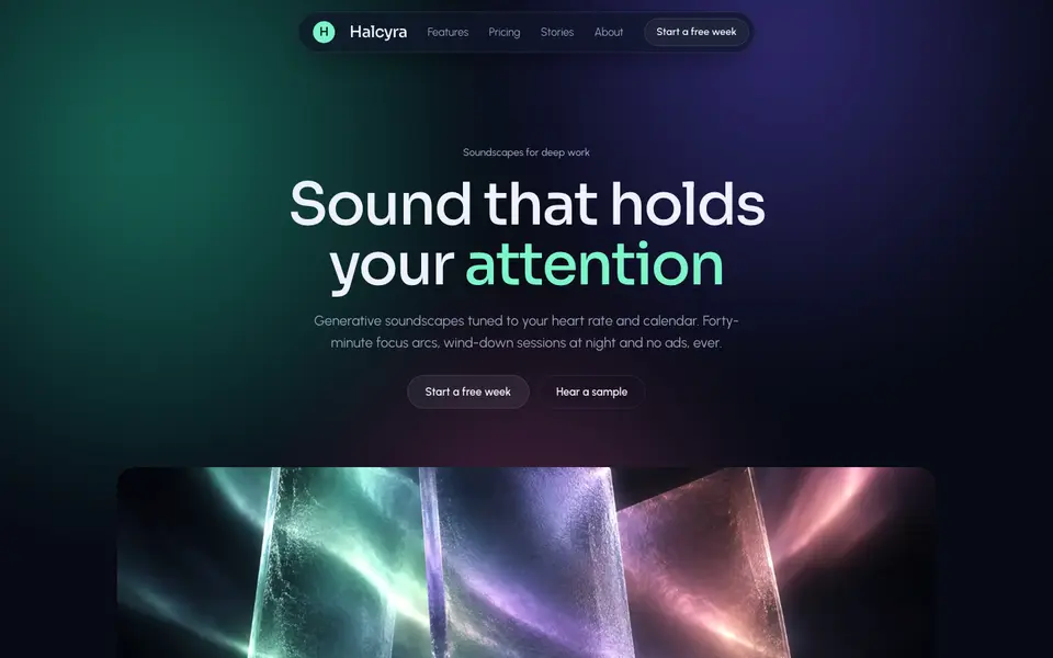 Free
FreeAurora Frost
No. 015Northern lights behind frosted panes: deep night, mint glow, cards like cold glass.
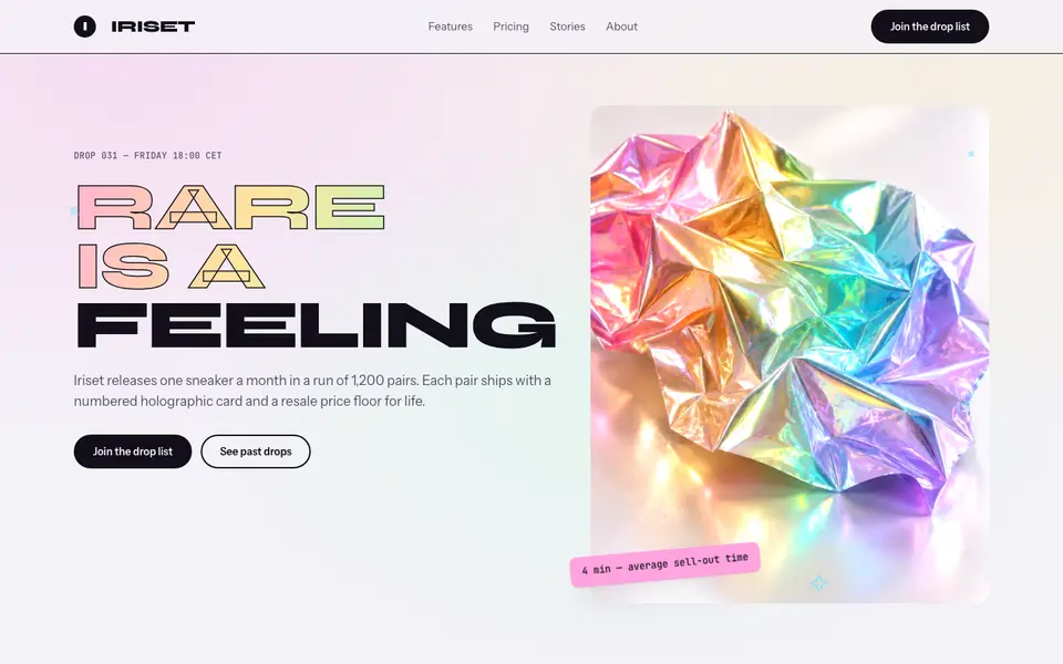
Holo Foil
No. 016Pearl-white page, foil-stamped type and rainbow sheen that shifts as you scroll.
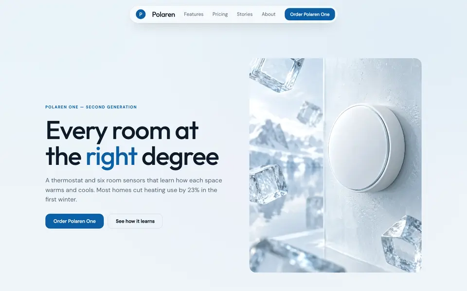
Ice Glass
No. 017Clear ice over pale sky: frosted white panes, glacier blue, crisp edges.
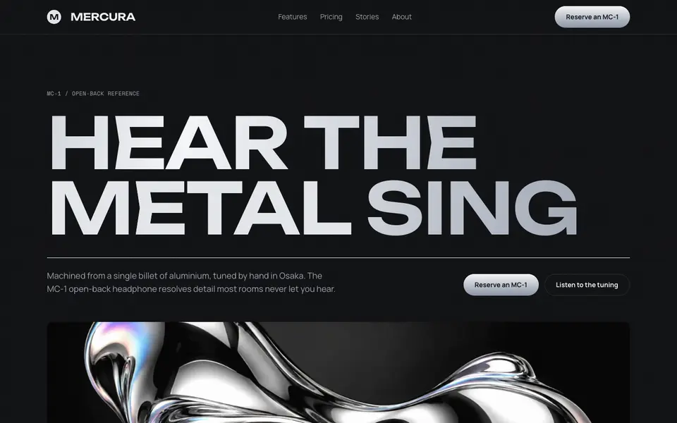
Liquid Chrome
No. 018Molten mirror metal on graphite: wide caps, oil-slick sheen, machined edges.
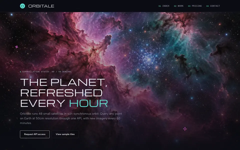
Nebula Deep
No. 019Deep-field imagery, wide technical caps and smoked-glass panels drifting in the void.
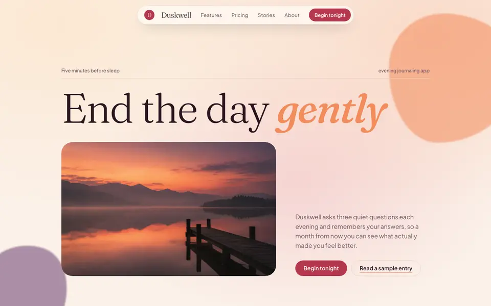
Sunset Mesh
No. 021Golden-hour gradients, milky glass and a soft italic serif for the end of the day.