Signal Orange
Swiss precision with one international-orange signal: grids, data and nothing extra.
This style
$9$19
One-time, no subscription · instant download · client use · 7-day refund before download
The idea
A Swiss-school layout for products that run on numbers. Neutral warm greys, a tight neo-grotesk and a strict grid, interrupted by a single international orange — the colour of safety vests and aircraft beacons — wherever attention is required. Clean enough for engineers, sharp enough for marketing.
Signal Orange applies the Swiss International Style to data products. It inherits the strict grid, objective tone and neo-grotesk type of Swiss design, but replaces the classic red with international orange — the colour used for safety, aviation and warnings — to make its single signal unmistakable. Everything neutral is grey and quiet; orange appears only where a human must act. The result reads like an exceptionally well-designed operations manual.
Principles
- Orange means action or alert — nothing decorative is ever orange.
- Grey everything else, including secondary buttons and charts.
- Show real numbers: precision, counts, latency, euros.
- Grid-aligned, flush-left, no centring.
- Charts are illustrations; draw them flat, with one orange series.
Motion
Chart bars grow from the baseline in 450ms, staggered 40ms each, and the headline's orange word underlines itself once on load. Cards shift their arrow 4px right on hover.
Do & don't
Do
- ✓ Reserve orange for primary actions and alerts.
- ✓ Draw charts flat with one orange series and grey others.
- ✓ Label units in mono (min, km, €/vehicle).
Don't
- ✕ Don't use orange for decoration, icons or backgrounds.
- ✕ Don't use photography or 3D illustrations.
- ✕ Don't centre headlines.
+ 3 more of each, and component rules, in the full DESIGN.md.
What's in the DESIGN.md
- 01Overview & principles
- 02Colors (tokens + proportions)
- 03Typography (families + 12-role scale)
- 04Layout & spacing scale
- 05Elevation & depth
- 06Shapes & radii
- 07Motion (easing, durations, signature)
- 08Imagery + generation prompt
- 09Components (button, card, nav, input, badge)
- 10Do's and don'ts
- 11Responsive behaviour
- 12Iteration guide + agent checklist
Plus theme.css (Tailwind v4 @theme), tokens.json (W3C) and the preview page source — 360 lines of DESIGN.md in total.
More like this
All Swiss & Minimal →
Nordic Calm
No. 031Scandinavian winter light: cool greys, frost blue, soft corners and a lot of air.
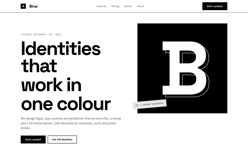
Pure Mono
No. 032Black on white, nothing else: a grotesk, thick rules and a bento of pure contrast.
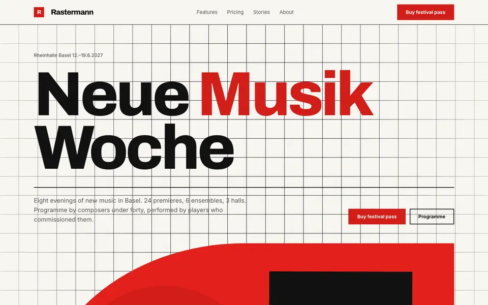
Swiss Poster
No. 033An International Style concert poster: strict grid, flush-left grotesk, red and black.
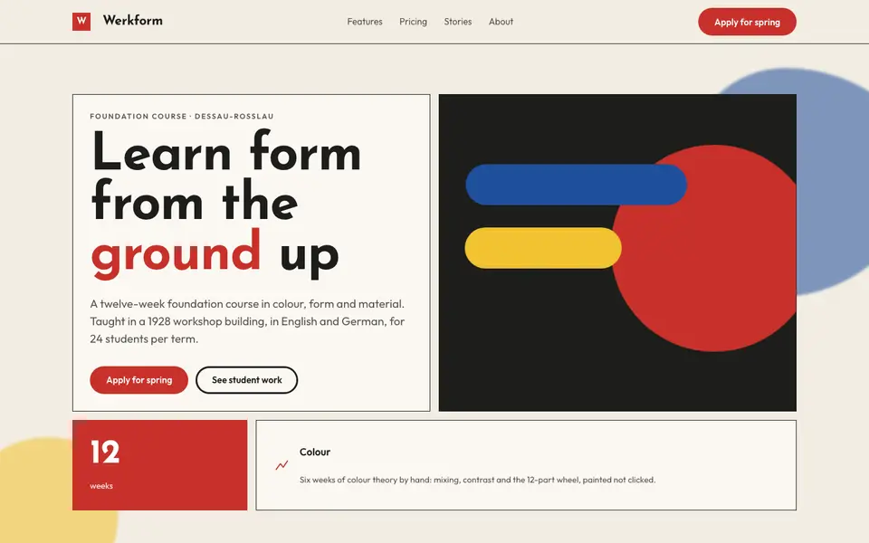
Bauhaus Primary
No. 051Bauhaus workshop primaries: circle, square, triangle in red, yellow and blue on bone.
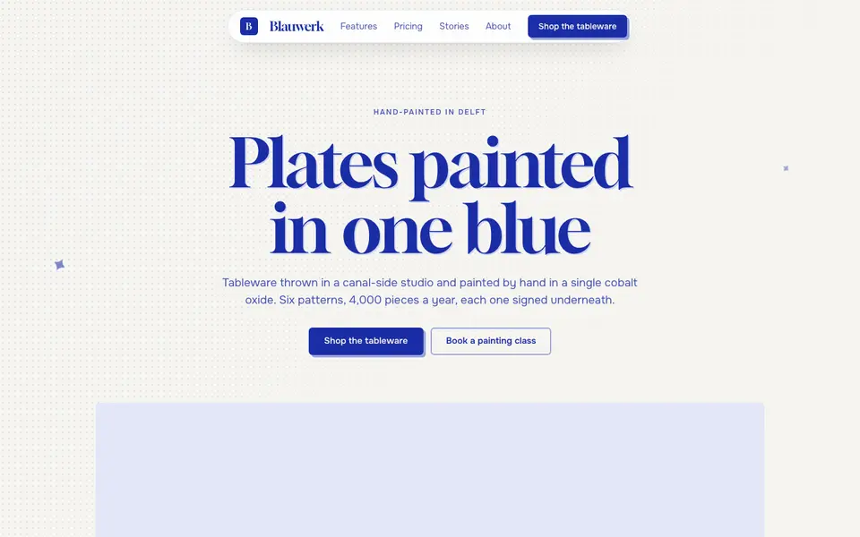
Cobalt Ink
No. 052One ink only: every line, word and shape printed in cobalt blue on bright paper.
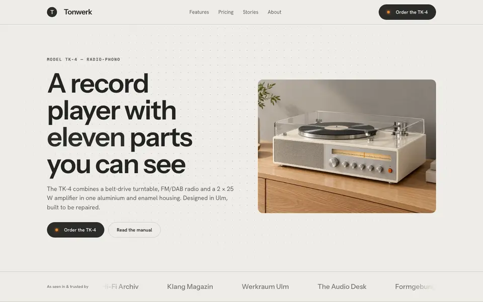
Functionalist Sixties
No. 0531960s functionalist hardware: warm white housings, one orange switch, a grid of controls.