IDE Nightshade
A dark editor theme as a brand: gutter numbers, syntax colours and a tab bar for nav.
This style
$9$19
One-time, no subscription · instant download · client use · 7-day refund before download
The idea
The page is styled like a beloved dark editor theme. A deep plum-navy background, line numbers in the gutter, and a full syntax palette — keyword violet, string green, number orange, function blue — used as the brand colours. It feels like home to anyone who spends ten hours a day in an editor.
IDE Nightshade treats a dark editor theme as a brand system. A deep plum-navy canvas, a gutter of line numbers down the left of the hero, a tab bar for navigation and the full syntax palette — keyword violet, string green, number orange, function blue — repurposed as semantic colours. It borrows from decades of beloved dark themes and the editor as a workplace. Headlines are set in a bold mono with one italic word, like an emphasised comment. It should feel instantly familiar to developers and pleasantly crafted to everyone else.
Principles
- Use syntax colours semantically: violet acts, green confirms, orange counts.
- Line numbers are ornament — use them in the hero and code blocks.
- Bold mono for headlines, a soft geometric sans for reading.
- Every visual is code or editor chrome, never illustration.
- Keep colour on text; surfaces stay neutral plum-navy.
Motion
The hero headline types like autocomplete: ghost text in muted grey appears first, then 'accepts' and turns solid with a tab keystroke. Cards glow faintly in their syntax colour on hover, like a highlighted matching bracket.
Do & don't
Do
- ✓ Show line numbers in the hero gutter.
- ✓ Name feature cards like files ('patterns.ts').
- ✓ Colour the italic accent word string-green.
Don't
- ✕ Don't use syntax colours as surface fills.
- ✕ Don't show long or fake-looking code.
- ✕ Don't use photography or illustrations.
+ 3 more of each, and component rules, in the full DESIGN.md.
What's in the DESIGN.md
- 01Overview & principles
- 02Colors (tokens + proportions)
- 03Typography (families + 12-role scale)
- 04Layout & spacing scale
- 05Elevation & depth
- 06Shapes & radii
- 07Motion (easing, durations, signature)
- 08Imagery + generation prompt
- 09Components (button, card, nav, input, badge)
- 10Do's and don'ts
- 11Responsive behaviour
- 12Iteration guide + agent checklist
Plus theme.css (Tailwind v4 @theme), tokens.json (W3C) and the preview page source — 360 lines of DESIGN.md in total.
More like this
All Terminal & Dev →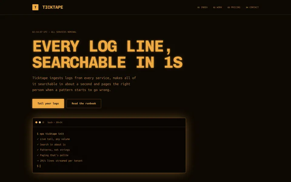
Amber Terminal
No. 071Warm amber phosphor on brown-black, thick frames and log lines scrolling past.
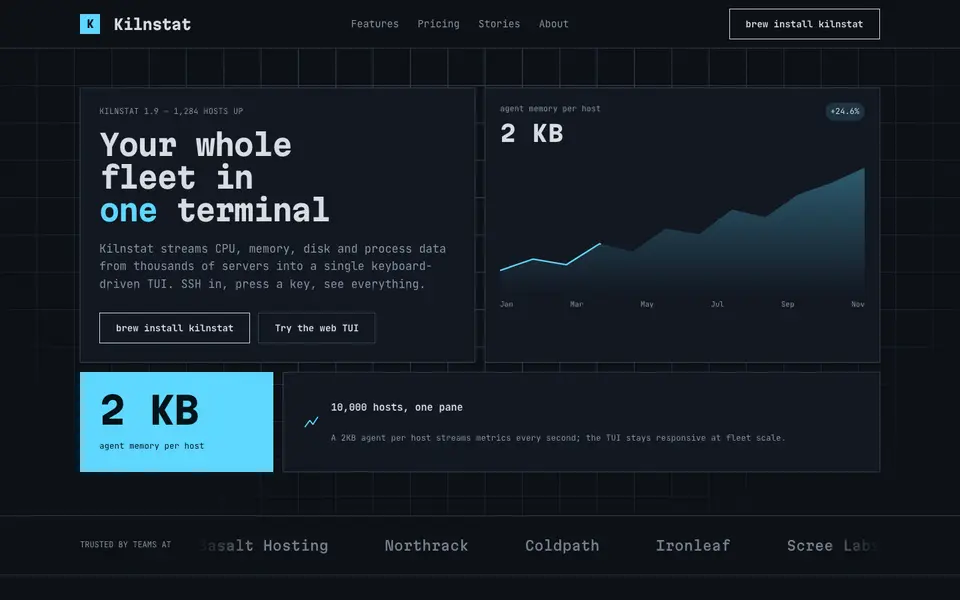
Box Drawing
No. 072A text-mode dashboard drawn in ┌─┐ characters: panes, gauges and ANSI colours.
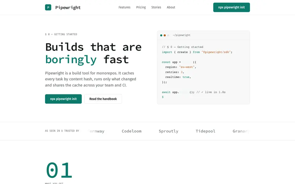
Mono Docs
No. 074A light developer handbook: mono headings, numbered sections, code that reads like prose.
 Free
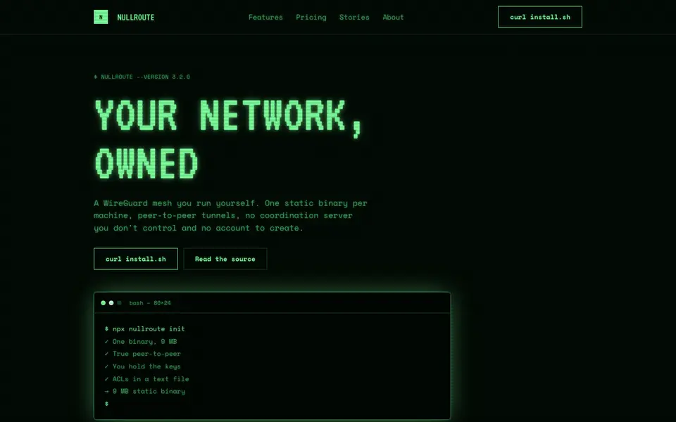
FreePhosphor Green
No. 075A green-phosphor CRT at 2am: scanlines, bloom and a cursor that never stops blinking.
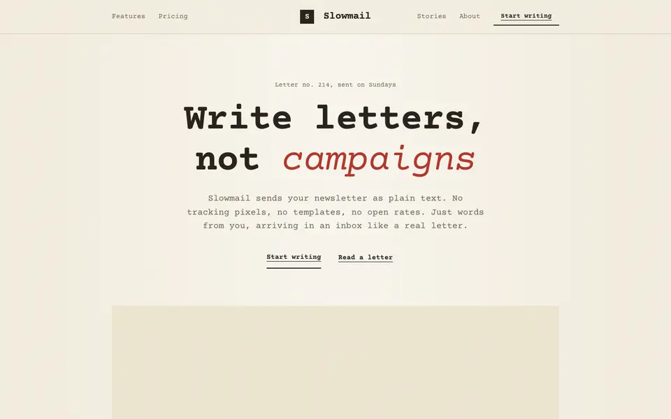
Plaintext Cream
No. 076Typewritten on cream paper: monospace everything, ink rules and a red pencil for emphasis.
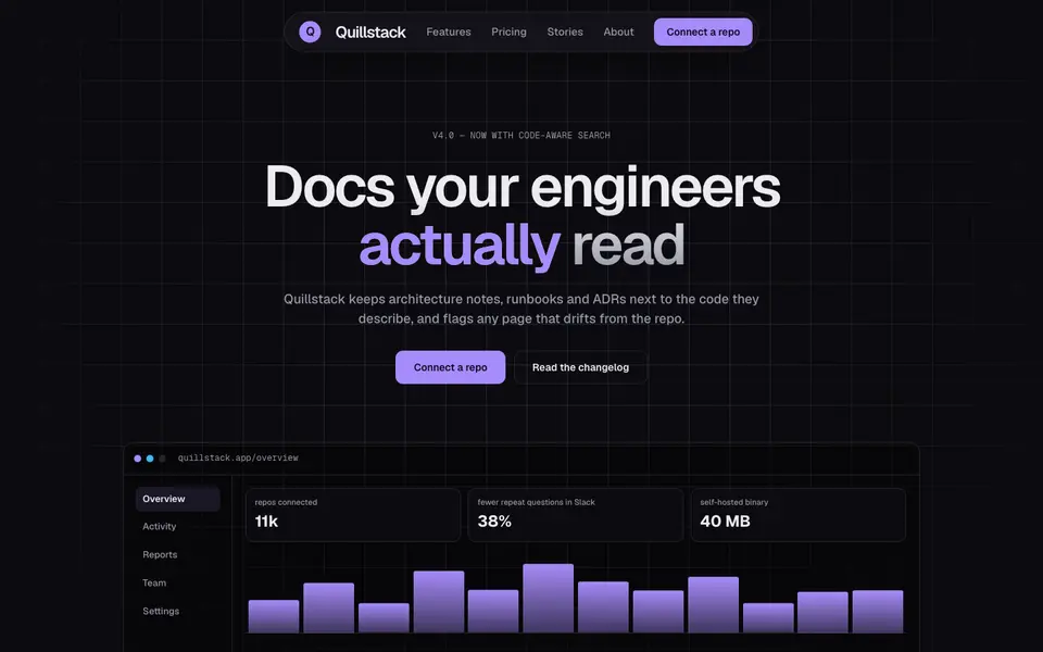
Bento Midnight
No. 040Charcoal tiles on a blueprint grid, lit from inside by a single violet glow.