Phosphor Green
A green-phosphor CRT at 2am: scanlines, bloom and a cursor that never stops blinking.
Free style · full files
Includes DESIGN.md, theme.css, tokens.json and the preview page. Want the other 99? All-Access $19
The idea
Everything glows green on black, as if drawn by an electron beam on a curved glass tube. Bitmap-style display type, faint scanlines, a soft phosphor bloom around every letter and a block cursor blinking after the headline. Nostalgic, nerdy and utterly committed to the bit.
Phosphor Green is a love letter to the monochrome CRT terminal. Pure green-on-black, a bitmap display face, faint horizontal scanlines and a soft phosphor bloom around every glyph. It borrows from 1980s mainframe terminals, BBS culture and the command line itself. Everything is monospaced and left-aligned, and the hero is literally a shell session. It should feel like logging into something powerful — honest, a little cheeky, and built for people who read the install script.
Principles
- Everything is phosphor green on black; there is no second hue except one warning yellow.
- Monospace everywhere; left-align everything.
- Bloom, don't shadow: glow is the only depth.
- Write UI copy like shell output: prompts, flags, exit codes.
- The cursor blinks forever; it's the heartbeat of the page.
Motion
Headlines type out character by character with a solid block cursor that keeps blinking at 1Hz afterwards. Scanlines roll slowly down the screen and the whole page flickers once, imperceptibly, on load.
Do & don't
Do
- ✓ Add a blinking block cursor after the hero headline.
- ✓ Apply a 2–8px green text-shadow bloom on headings.
- ✓ Overlay scanlines at about 6% opacity.
- ✓ Write CTAs as commands ('curl install.sh').
- ✓ Use ASCII brackets and box characters as ornaments.
- ✓ Show exit codes and timings in output lines.
Don't
- ✕ Don't use any proportional font.
- ✕ Don't use colours other than green and one warning yellow.
- ✕ Don't round corners.
- ✕ Don't use drop shadows — only bloom.
- ✕ Don't set VT323 below 24px.
- ✕ Don't animate the typewriter on body copy; headlines only.
What's in the DESIGN.md
- 01Overview & principles
- 02Colors (tokens + proportions)
- 03Typography (families + 12-role scale)
- 04Layout & spacing scale
- 05Elevation & depth
- 06Shapes & radii
- 07Motion (easing, durations, signature)
- 08Imagery + generation prompt
- 09Components (button, card, nav, input, badge)
- 10Do's and don'ts
- 11Responsive behaviour
- 12Iteration guide + agent checklist
Plus theme.css (Tailwind v4 @theme), tokens.json (W3C) and the preview page source — 360 lines of DESIGN.md in total.
More like this
All Terminal & Dev →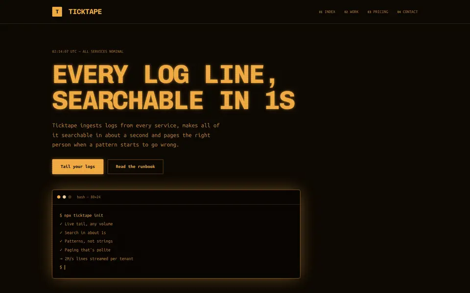
Amber Terminal
No. 071Warm amber phosphor on brown-black, thick frames and log lines scrolling past.
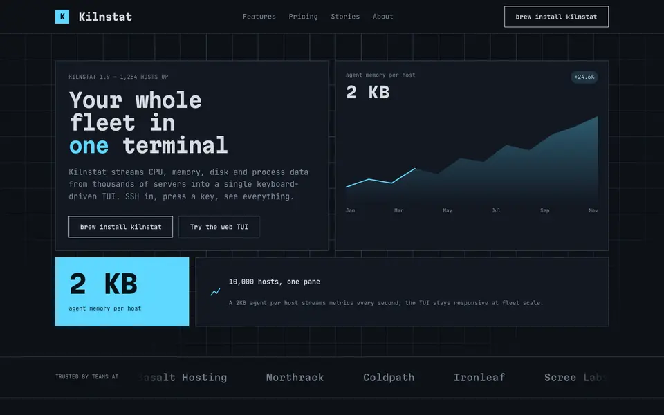
Box Drawing
No. 072A text-mode dashboard drawn in ┌─┐ characters: panes, gauges and ANSI colours.
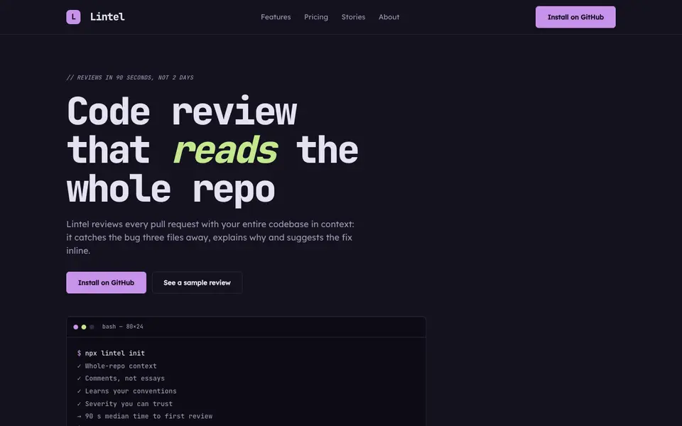
IDE Nightshade
No. 073A dark editor theme as a brand: gutter numbers, syntax colours and a tab bar for nav.
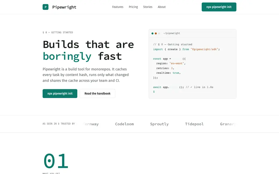
Mono Docs
No. 074A light developer handbook: mono headings, numbered sections, code that reads like prose.
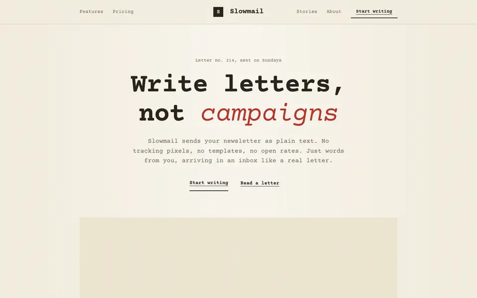
Plaintext Cream
No. 076Typewritten on cream paper: monospace everything, ink rules and a red pencil for emphasis.
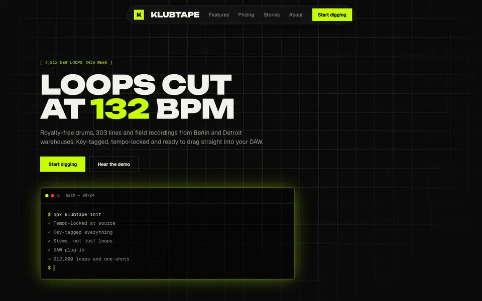
Acid Black
No. 011Acid green on pure night: a warehouse-rave flyer that boots like a terminal.