Amber Terminal
Warm amber phosphor on brown-black, thick frames and log lines scrolling past.
This style
$9$19
One-time, no subscription · instant download · client use · 7-day refund before download
The idea
The other classic CRT: amber glyphs glowing on a deep brown-black tube, with heavy outlined panels and log output that scrolls like a teleprinter. Warmer and steadier than green, it feels like an operations room on the night shift, calm because everything is being watched.
Amber Terminal is the warm sibling of the green CRT: amber phosphor glowing on a brown-black tube, heavy 2px frames and timestamped log lines everywhere. It borrows from 1980s amber monitors, teleprinter feeds and the night-shift operations room. Compared to green it is steadier, warmer and more operational — less hacker, more on-call engineer. Density is high and the information is real. It should feel like a control room where nothing is on fire, because someone is watching.
Principles
- Amber on brown-black only, with one red-orange for alerts.
- Timestamp everything; time is the organising principle.
- Thick 2px frames divide the screen into panels.
- Show real log lines, real commands, real numbers.
- Inversion is the hover state: amber fill, dark text.
Motion
A marquee of timestamped log lines scrolls continuously beneath the nav like a teleprinter feed. Headlines type on in 12-step bursts and thick panels invert to amber fill when hovered.
Do & don't
Do
- ✓ Show a live UTC clock or timestamp in the nav.
- ✓ Use a teleprinter marquee of log lines under the nav.
- ✓ Number feature panels 01–06 in mono.
Don't
- ✕ Don't introduce green, blue or white.
- ✕ Don't use proportional fonts.
- ✕ Don't use thin 1px frames for panels.
+ 3 more of each, and component rules, in the full DESIGN.md.
What's in the DESIGN.md
- 01Overview & principles
- 02Colors (tokens + proportions)
- 03Typography (families + 12-role scale)
- 04Layout & spacing scale
- 05Elevation & depth
- 06Shapes & radii
- 07Motion (easing, durations, signature)
- 08Imagery + generation prompt
- 09Components (button, card, nav, input, badge)
- 10Do's and don'ts
- 11Responsive behaviour
- 12Iteration guide + agent checklist
Plus theme.css (Tailwind v4 @theme), tokens.json (W3C) and the preview page source — 361 lines of DESIGN.md in total.
More like this
All Terminal & Dev →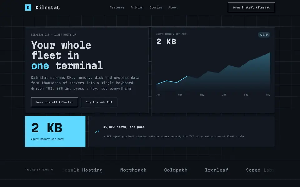
Box Drawing
No. 072A text-mode dashboard drawn in ┌─┐ characters: panes, gauges and ANSI colours.
IDE Nightshade
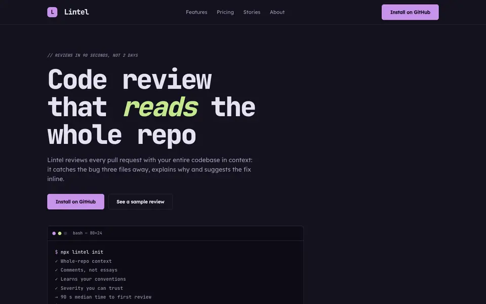
No. 073A dark editor theme as a brand: gutter numbers, syntax colours and a tab bar for nav.
Mono Docs
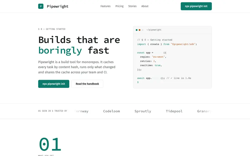
No. 074A light developer handbook: mono headings, numbered sections, code that reads like prose.
 Free
FreePhosphor Green
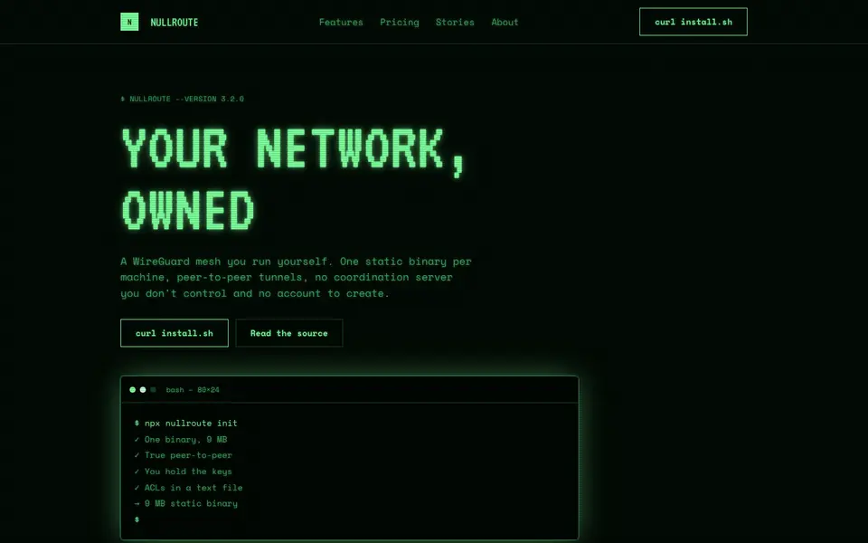
No. 075A green-phosphor CRT at 2am: scanlines, bloom and a cursor that never stops blinking.
Plaintext Cream
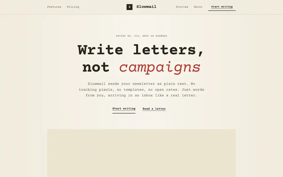
No. 076Typewritten on cream paper: monospace everything, ink rules and a red pencil for emphasis.
Acid Black
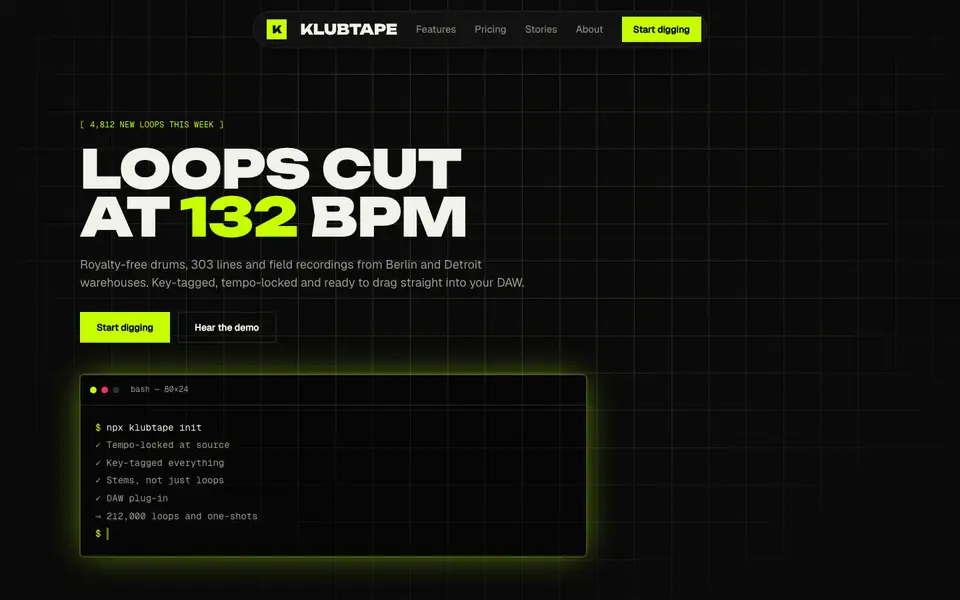
No. 011Acid green on pure night: a warehouse-rave flyer that boots like a terminal.