Atelier Plan
An architecture studio's drawing set: plan-paper white, tracing grid, titleblock captions.
This style
$9$19
One-time, no subscription · instant download · client use · 7-day refund before download
The idea
A studio site laid out like a well-organised drawing set. Bright plan-paper white, a faint tracing grid, project captions set like titleblocks with sheet numbers and scales, and large photographs of finished buildings in clear daylight. Precise, generous and project-first.
Atelier Plan presents an architecture studio the way architects present work to each other: as an organised drawing set. It borrows from titleblocks, sheet numbers and scale bars, the faint grids of tracing paper and the plain captions of architectural monographs. A wide, idiosyncratic grotesk gives headlines a contemporary edge; Inter and a small mono handle captions and data. Photography of built work is the hero — large, clear, precisely cropped — and the interface steps back to frame it.
Principles
- Projects first: the building photograph is always the largest element.
- Caption like a titleblock: sheet number, location, year, area, scale.
- Asymmetric but gridded — align everything to a visible 12-column grid.
- One cool accent for links and active states; the rest is ink and white.
- Write factually: square metres, pupils, apartments, years.
Motion
Project images slide in from the right along the grid like sheets pulled from a plan chest. On hover, captions shift up to reveal the project's scale and sheet number.
Do & don't
Do
- ✓ Put a titleblock caption under every project image.
- ✓ Use sheet numbers (A-101) as section labels.
- ✓ Show areas in m² and years in mono.
Don't
- ✕ Don't use warm accent colours in the UI.
- ✕ Don't show glossy renders or lens-flare visualisations.
- ✕ Don't round corners.
+ 3 more of each, and component rules, in the full DESIGN.md.
What's in the DESIGN.md
- 01Overview & principles
- 02Colors (tokens + proportions)
- 03Typography (families + 12-role scale)
- 04Layout & spacing scale
- 05Elevation & depth
- 06Shapes & radii
- 07Motion (easing, durations, signature)
- 08Imagery + generation prompt
- 09Components (button, card, nav, input, badge)
- 10Do's and don'ts
- 11Responsive behaviour
- 12Iteration guide + agent checklist
Plus theme.css (Tailwind v4 @theme), tokens.json (W3C) and the preview page source — 365 lines of DESIGN.md in total.
More like this
All Industry →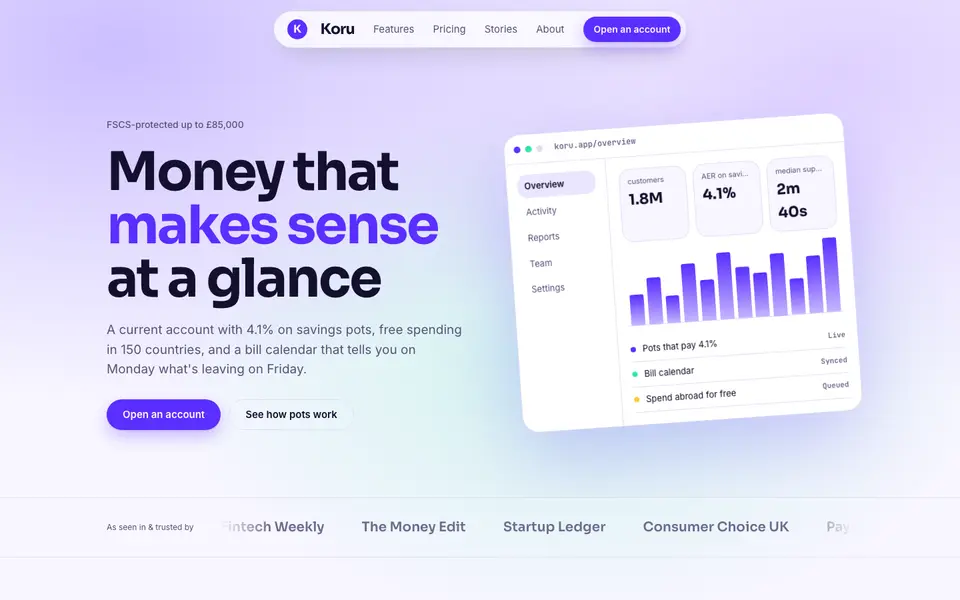
Bright Neobank
No. 050A bank that feels like a good app: electric violet, mint and fat friendly numbers.
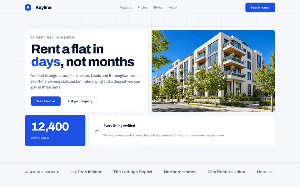
Blue Property
No. 082Cobalt blue, a muscular grotesk and a bento of listings, maps and numbers.
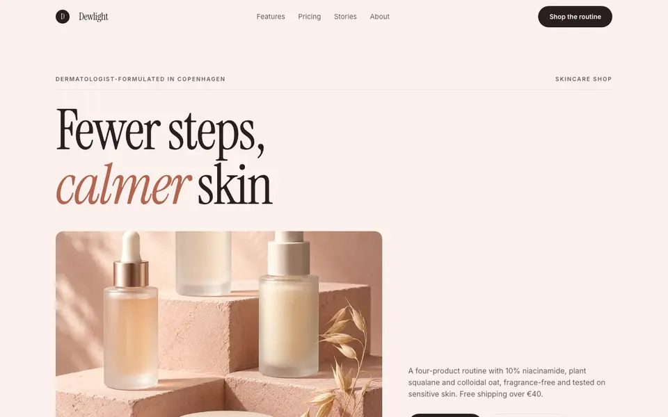
Blush Skincare
No. 083Blush pink, clean white space and an italic serif as soft as a moisturiser.
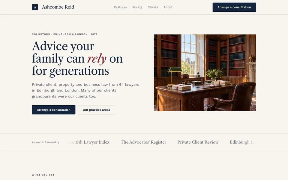
Chambers Heritage
No. 084A heritage law firm: Caslon headings, deep navy, oxblood seals and quiet panelled rooms.
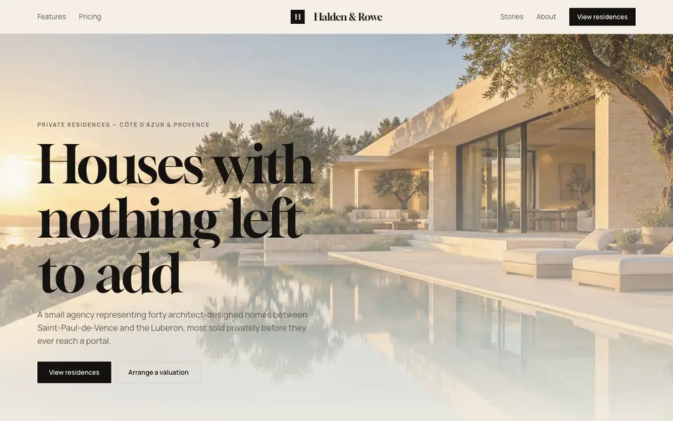
Cream Estate
No. 085Cream paper, black ink and photographs of houses big enough to walk into.
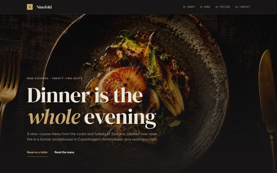
Dark Dining
No. 086Candlelit plates on charcoal, a confident serif and service at a whisper.