Cream Estate
Cream paper, black ink and photographs of houses big enough to walk into.
This style
$9$19
One-time, no subscription · instant download · client use · 7-day refund before download
The idea
A luxury property brochure on the web: warm cream canvas, sharp black type, and full-bleed architectural photography that fills the screen. A dense, characterful display serif gives each listing the weight of a book title. Confident, quiet and expensive.
Cream Estate is a luxury real-estate system in the spirit of a printed architectural monograph. It draws on mid-century architecture magazines, French property brochures and contemporary gallery catalogues: a warm cream canvas, pure black ink, and enormous straight-vertical photography that fills the viewport. A dense, sculptural display serif turns each property name into a book title. Colour beyond cream and black comes only from the photographs themselves. It should feel confident, quiet and very expensive — the house is the star.
Principles
- Photographs fill the screen — never shrink a house into a thumbnail.
- Keep the palette to cream and black; let architecture bring the colour.
- Name every property like a book title.
- Use thin rules and small caps for structure, not boxes.
- Give facts — square metres, hectares, distances — not adjectives.
Motion
Photographs reveal with a vertical wipe from the bottom like a blind going up; the hero image scales from 108% to 100% over 2 seconds as if the camera were settling.
Do & don't
Do
- ✓ Run the hero photograph edge to edge at full viewport height.
- ✓ Correct every vertical in architectural photos.
- ✓ Show size, land and location for every listing.
Don't
- ✕ Don't show listings as small thumbnails in a grid of 12.
- ✕ Don't use rounded corners or shadows.
- ✕ Don't add colour beyond bronze and olive.
+ 3 more of each, and component rules, in the full DESIGN.md.
What's in the DESIGN.md
- 01Overview & principles
- 02Colors (tokens + proportions)
- 03Typography (families + 12-role scale)
- 04Layout & spacing scale
- 05Elevation & depth
- 06Shapes & radii
- 07Motion (easing, durations, signature)
- 08Imagery + generation prompt
- 09Components (button, card, nav, input, badge)
- 10Do's and don'ts
- 11Responsive behaviour
- 12Iteration guide + agent checklist
Plus theme.css (Tailwind v4 @theme), tokens.json (W3C) and the preview page source — 364 lines of DESIGN.md in total.
More like this
All Industry →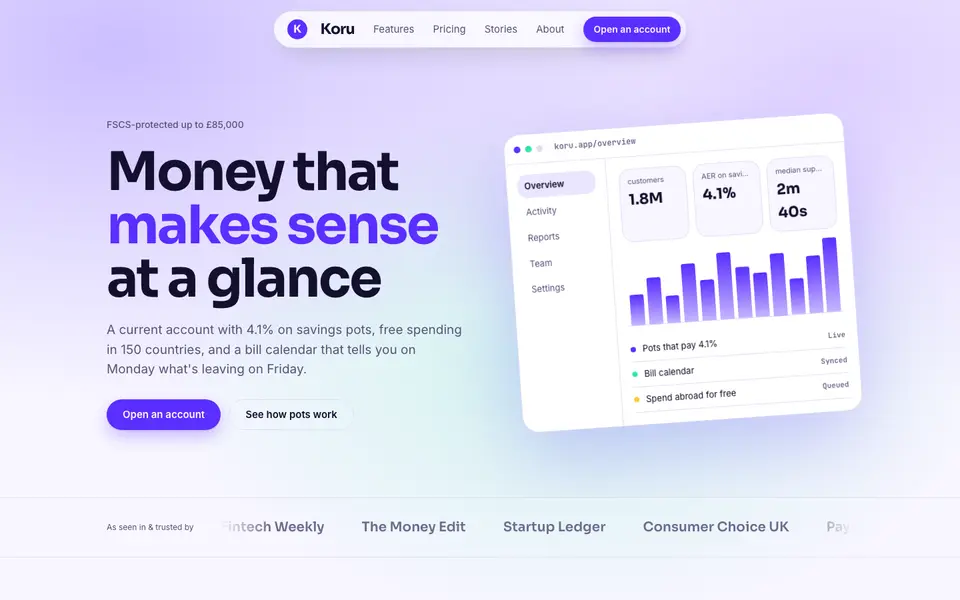
Bright Neobank
No. 050A bank that feels like a good app: electric violet, mint and fat friendly numbers.
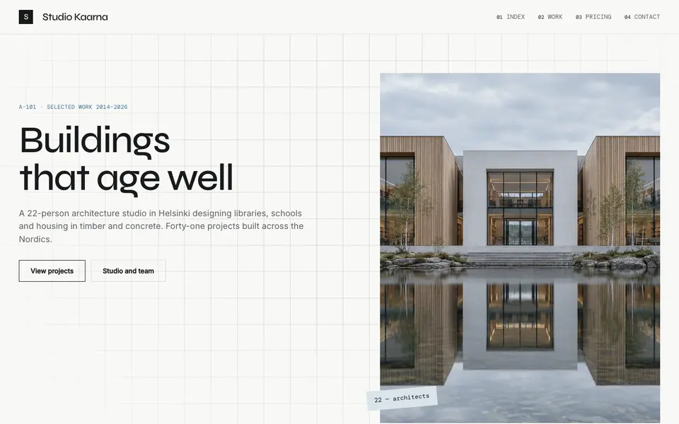
Atelier Plan
No. 081An architecture studio's drawing set: plan-paper white, tracing grid, titleblock captions.
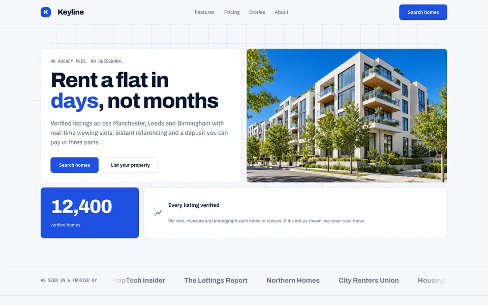
Blue Property
No. 082Cobalt blue, a muscular grotesk and a bento of listings, maps and numbers.
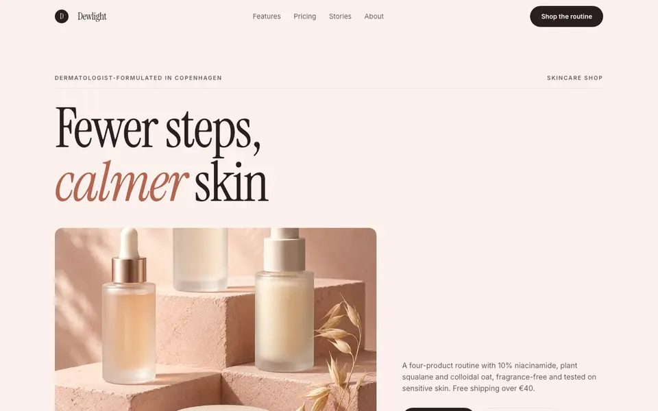
Blush Skincare
No. 083Blush pink, clean white space and an italic serif as soft as a moisturiser.
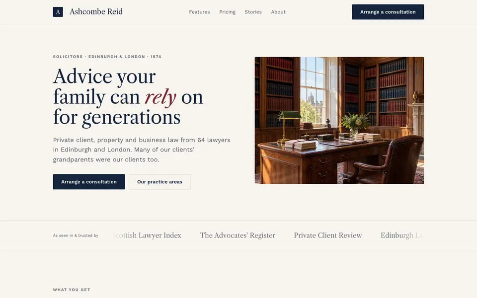
Chambers Heritage
No. 084A heritage law firm: Caslon headings, deep navy, oxblood seals and quiet panelled rooms.
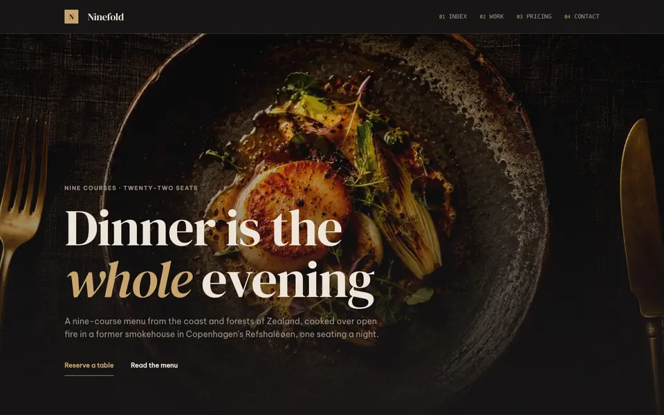
Dark Dining
No. 086Candlelit plates on charcoal, a confident serif and service at a whisper.