Dark Dining
Candlelit plates on charcoal, a confident serif and service at a whisper.
This style
$9$19
One-time, no subscription · instant download · client use · 7-day refund before download
The idea
The website equivalent of a tasting-menu dining room after dark: warm charcoal walls, plates photographed under a single overhead light, and a bold, characterful serif that reads like a printed menu card. Brass details and slow reveals set a deliberate pace. Intimate, assured and sensual.
Dark Dining is a fine-dining system that recreates the atmosphere of a tasting-menu room at night. It draws from letterpress menu cards, mid-century Scandinavian interiors and contemporary low-key food photography: warm charcoal like smoked oak, plates lit by a single overhead spot, a bold high-contrast serif with romantic italics, and brass used as sparingly as a chef uses gold leaf. The page moves slowly, course by course. It should feel intimate, assured and quietly theatrical.
Principles
- Present one dish at a time, lit like a stage.
- Brass is garnish — use it on rules and links, never as a field.
- Let the menu typography carry the luxury, not decoration.
- Pace the scroll like courses: one idea per screen.
- Write with provenance: farms, coasts, distances, woods.
Motion
Each course photograph comes into focus from a soft blur as you scroll, like eyes adjusting to candlelight; brass underlines draw slowly beneath links on hover.
Do & don't
Do
- ✓ Photograph every dish from the same angle and light.
- ✓ Use one italic word in the headline for romance.
- ✓ Separate list rows with thin rules, not cards.
Don't
- ✕ Don't use solid filled buttons in bright colours.
- ✕ Don't show crowded, busy dining-room photos.
- ✕ Don't use stock food imagery.
+ 3 more of each, and component rules, in the full DESIGN.md.
What's in the DESIGN.md
- 01Overview & principles
- 02Colors (tokens + proportions)
- 03Typography (families + 12-role scale)
- 04Layout & spacing scale
- 05Elevation & depth
- 06Shapes & radii
- 07Motion (easing, durations, signature)
- 08Imagery + generation prompt
- 09Components (button, card, nav, input, badge)
- 10Do's and don'ts
- 11Responsive behaviour
- 12Iteration guide + agent checklist
Plus theme.css (Tailwind v4 @theme), tokens.json (W3C) and the preview page source — 363 lines of DESIGN.md in total.
More like this
All Industry →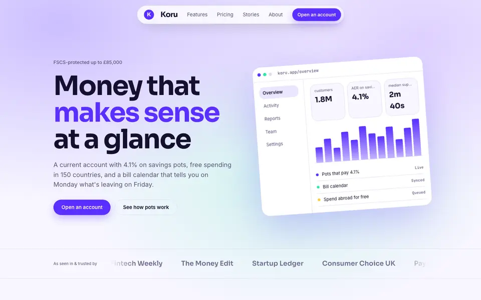
Bright Neobank
No. 050A bank that feels like a good app: electric violet, mint and fat friendly numbers.
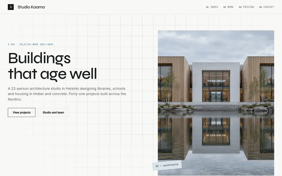
Atelier Plan
No. 081An architecture studio's drawing set: plan-paper white, tracing grid, titleblock captions.
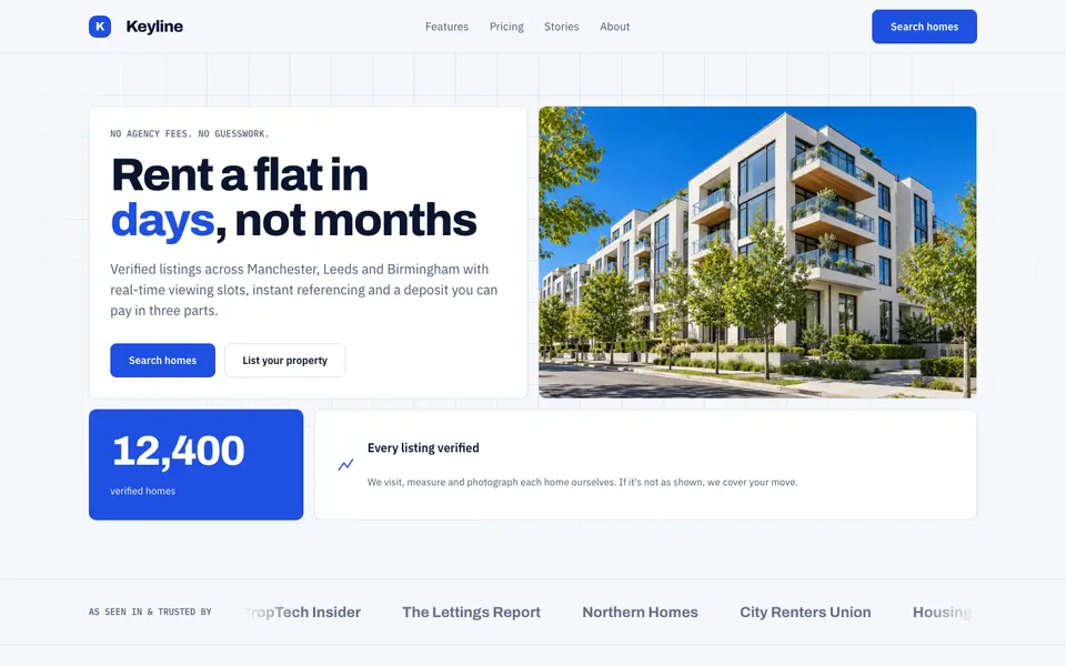
Blue Property
No. 082Cobalt blue, a muscular grotesk and a bento of listings, maps and numbers.
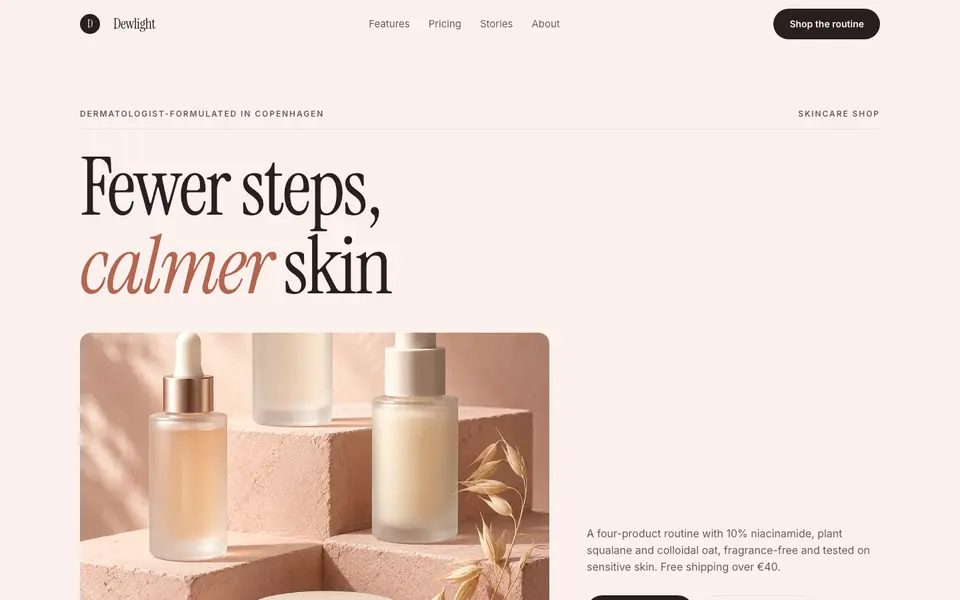
Blush Skincare
No. 083Blush pink, clean white space and an italic serif as soft as a moisturiser.
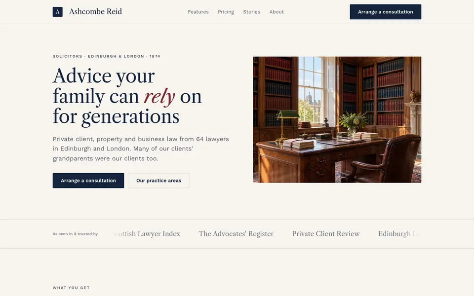
Chambers Heritage
No. 084A heritage law firm: Caslon headings, deep navy, oxblood seals and quiet panelled rooms.
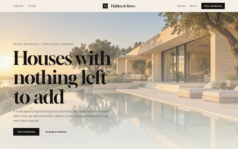
Cream Estate
No. 085Cream paper, black ink and photographs of houses big enough to walk into.