Blush Skincare
Blush pink, clean white space and an italic serif as soft as a moisturiser.
This style
$9$19
One-time, no subscription · instant download · client use · 7-day refund before download
The idea
A clean, shoppable beauty system: pale blush canvas, crisp white product cards, a delicate italic serif for headlines and a neutral sans that makes ingredient lists easy to read. Products sit on blush pedestals in soft daylight. Fresh, gentle and quietly scientific.
Blush Skincare is a clean e-commerce system for beauty brands that sell on gentleness and honesty. It draws on Scandinavian pharmacy packaging, contemporary still-life photography and editorial beauty magazines: a pale blush canvas, crisp white product cards, a delicate italic-friendly serif for headlines and a neutral sans for ingredient lists and prices. Products are photographed on blush plaster pedestals in soft daylight. Ink-dark buttons keep it grounded. It should feel fresh, calm and quietly clinical — trustworthy enough to put on your face.
Principles
- Let product photography be the colour; keep UI neutral and blush.
- Pair a soft italic serif with a precise sans — beauty plus science.
- Show ingredients and percentages upfront.
- Use ink-dark buttons so add-to-bag is unmistakable.
- Keep every product card the same size and crop.
Motion
Product cards rise 4px on hover while the bottle image scales 3% within its frame; a slow marquee of key ingredients — niacinamide, squalane, oat — glides beneath the hero.
Do & don't
Do
- ✓ Show active ingredient percentages on product cards.
- ✓ Keep product photos consistent in angle and ground.
- ✓ Use one italic word per headline.
Don't
- ✕ Don't use bright or hot pink.
- ✕ Don't show before-and-after photos.
- ✕ Don't use drop shadows on product cards.
+ 3 more of each, and component rules, in the full DESIGN.md.
What's in the DESIGN.md
- 01Overview & principles
- 02Colors (tokens + proportions)
- 03Typography (families + 12-role scale)
- 04Layout & spacing scale
- 05Elevation & depth
- 06Shapes & radii
- 07Motion (easing, durations, signature)
- 08Imagery + generation prompt
- 09Components (button, card, nav, input, badge)
- 10Do's and don'ts
- 11Responsive behaviour
- 12Iteration guide + agent checklist
Plus theme.css (Tailwind v4 @theme), tokens.json (W3C) and the preview page source — 365 lines of DESIGN.md in total.
More like this
All Industry →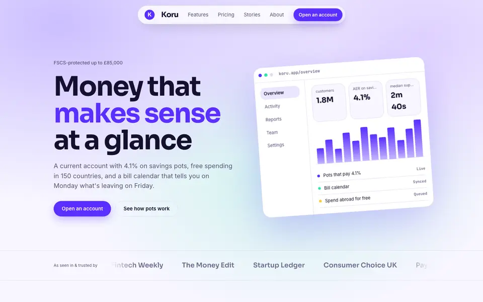
Bright Neobank
No. 050A bank that feels like a good app: electric violet, mint and fat friendly numbers.
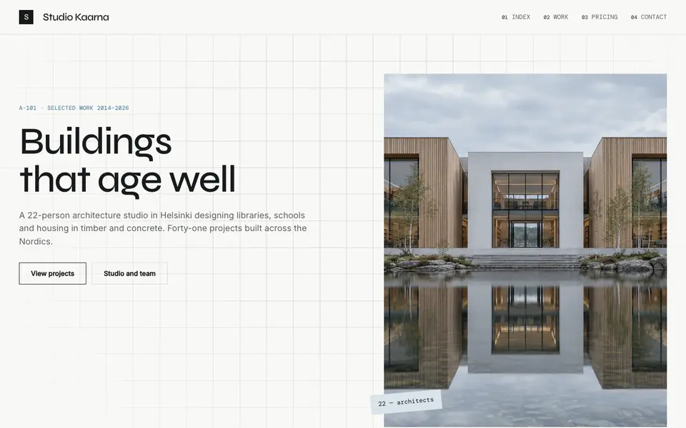
Atelier Plan
No. 081An architecture studio's drawing set: plan-paper white, tracing grid, titleblock captions.
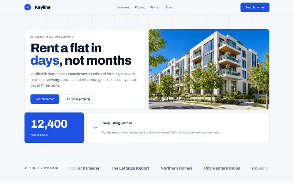
Blue Property
No. 082Cobalt blue, a muscular grotesk and a bento of listings, maps and numbers.
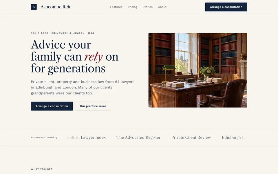
Chambers Heritage
No. 084A heritage law firm: Caslon headings, deep navy, oxblood seals and quiet panelled rooms.
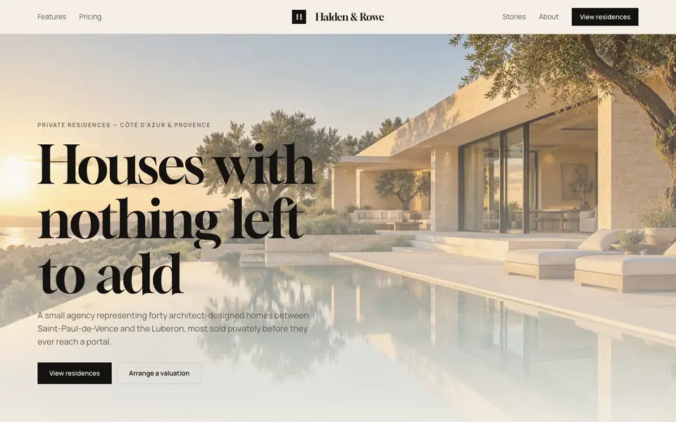
Cream Estate
No. 085Cream paper, black ink and photographs of houses big enough to walk into.
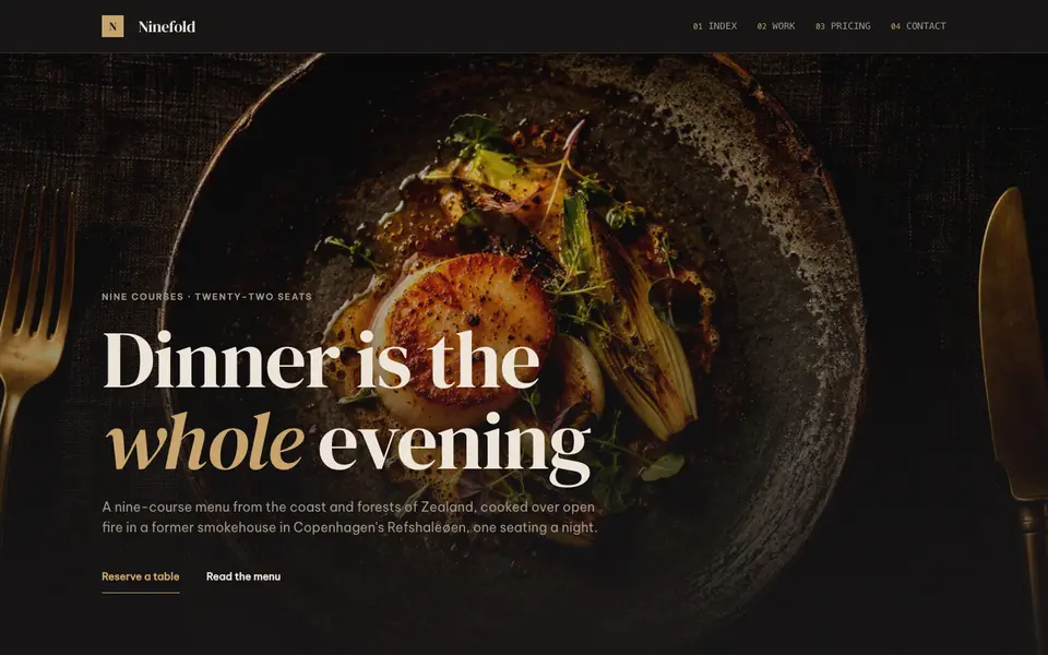
Dark Dining
No. 086Candlelit plates on charcoal, a confident serif and service at a whisper.