Blue Property
Cobalt blue, a muscular grotesk and a bento of listings, maps and numbers.
This style
$9$19
One-time, no subscription · instant download · client use · 7-day refund before download
The idea
A property platform built like a well-run product: cobalt blue that means business, a wide heavy grotesk for headlines, and a bento hero mixing a big photograph with live-looking stats and a map tile. A faint blueprint grid runs underneath. Bold, modern and data-confident.
Blue Property is a bold platform system for modern real estate, closer to a well-designed product than a brochure. It draws on Swiss modernist information design, architectural blueprints and contemporary bento-style dashboards: cobalt blue for confidence, a wide heavy grotesk for headlines, tabular mono numbers for prices and stats, and a faint blueprint grid underneath. The hero mixes one big photograph with stat tiles and a map, so trust comes from data as much as from imagery. It should feel efficient, transparent and modern.
Principles
- Show the data: prices, days, counts — in mono and in tiles.
- One cobalt action per tile; never two blue buttons side by side.
- Use the bento to mix photo, map and numbers in the hero.
- Keep the grid visible but faint, like tracing paper.
- Density is a feature — but every tile needs 24px padding.
Motion
Bento tiles cascade in with a 60ms stagger, the map tile's pins drop in one by one, and the price chart draws its line left to right on first view.
Do & don't
Do
- ✓ Put a real-looking stat tile in the hero.
- ✓ Use tabular mono figures for prices.
- ✓ Keep the blueprint grid at 4% opacity.
Don't
- ✕ Don't use script or serif fonts.
- ✕ Don't use dark, moody photography.
- ✕ Don't hide fees — show £0 proudly.
+ 3 more of each, and component rules, in the full DESIGN.md.
What's in the DESIGN.md
- 01Overview & principles
- 02Colors (tokens + proportions)
- 03Typography (families + 12-role scale)
- 04Layout & spacing scale
- 05Elevation & depth
- 06Shapes & radii
- 07Motion (easing, durations, signature)
- 08Imagery + generation prompt
- 09Components (button, card, nav, input, badge)
- 10Do's and don'ts
- 11Responsive behaviour
- 12Iteration guide + agent checklist
Plus theme.css (Tailwind v4 @theme), tokens.json (W3C) and the preview page source — 365 lines of DESIGN.md in total.
More like this
All Industry →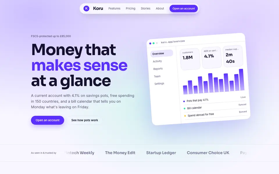
Bright Neobank
No. 050A bank that feels like a good app: electric violet, mint and fat friendly numbers.
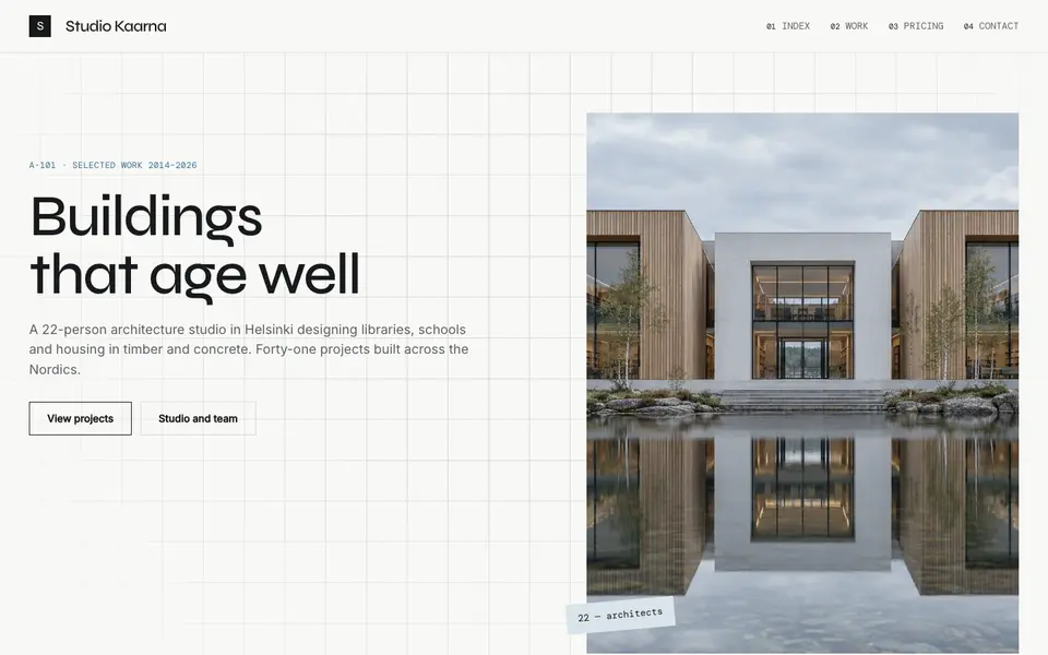
Atelier Plan
No. 081An architecture studio's drawing set: plan-paper white, tracing grid, titleblock captions.
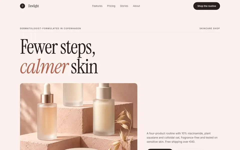
Blush Skincare
No. 083Blush pink, clean white space and an italic serif as soft as a moisturiser.
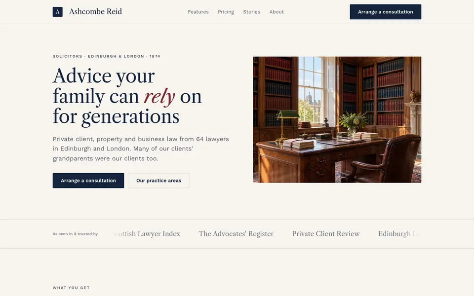
Chambers Heritage
No. 084A heritage law firm: Caslon headings, deep navy, oxblood seals and quiet panelled rooms.
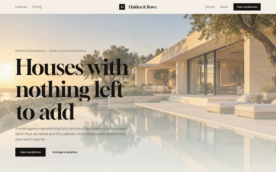
Cream Estate
No. 085Cream paper, black ink and photographs of houses big enough to walk into.
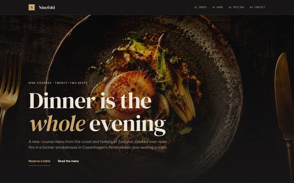
Dark Dining
No. 086Candlelit plates on charcoal, a confident serif and service at a whisper.