Bright Neobank
A bank that feels like a good app: electric violet, mint and fat friendly numbers.
This style
$9$19
One-time, no subscription · instant download · client use · 7-day refund before download
The idea
Optimistic consumer finance in electric violet and fresh mint, with a geometric sans that makes balances look approachable instead of scary. Floating phone mock-ups and chunky rounded cards do the selling. Clear, quick and trustworthy without the navy suit.
Bright Neobank is a consumer-finance system that replaces the navy suit with an optimistic, app-first personality. It draws on late-2010s challenger-bank design, friendly geometric type and product-led landing pages: electric violet for action, mint for money-going-up, a soft violet mesh behind everything, and big rounded cards that look like they could be tapped. Phone mock-ups are the hero imagery — show the product, not stock photos of people smiling at laptops. It should feel clear, fast and safe.
Principles
- Show the app — phone and card mock-ups beat lifestyle photography.
- Make numbers big and friendly; balances are headlines.
- Mint means money in, violet means action — never swap them.
- Round generously: 24px cards, pill buttons.
- Put regulation and protection details in plain view, not small print.
Motion
The phone mock-up scales in from 92% with a light spring and its balance ticks up from zero; cards lift 4px with a deepening violet shadow on hover.
Do & don't
Do
- ✓ Lead with a real product screen in the hero.
- ✓ Use tabular figures for every amount.
- ✓ Place regulatory reassurance near every CTA.
Don't
- ✕ Don't use stock photos of people with laptops.
- ✕ Don't use navy or corporate blues.
- ✕ Don't hide fees in footnotes.
+ 3 more of each, and component rules, in the full DESIGN.md.
What's in the DESIGN.md
- 01Overview & principles
- 02Colors (tokens + proportions)
- 03Typography (families + 12-role scale)
- 04Layout & spacing scale
- 05Elevation & depth
- 06Shapes & radii
- 07Motion (easing, durations, signature)
- 08Imagery + generation prompt
- 09Components (button, card, nav, input, badge)
- 10Do's and don'ts
- 11Responsive behaviour
- 12Iteration guide + agent checklist
Plus theme.css (Tailwind v4 @theme), tokens.json (W3C) and the preview page source — 366 lines of DESIGN.md in total.
More like this
All Industry →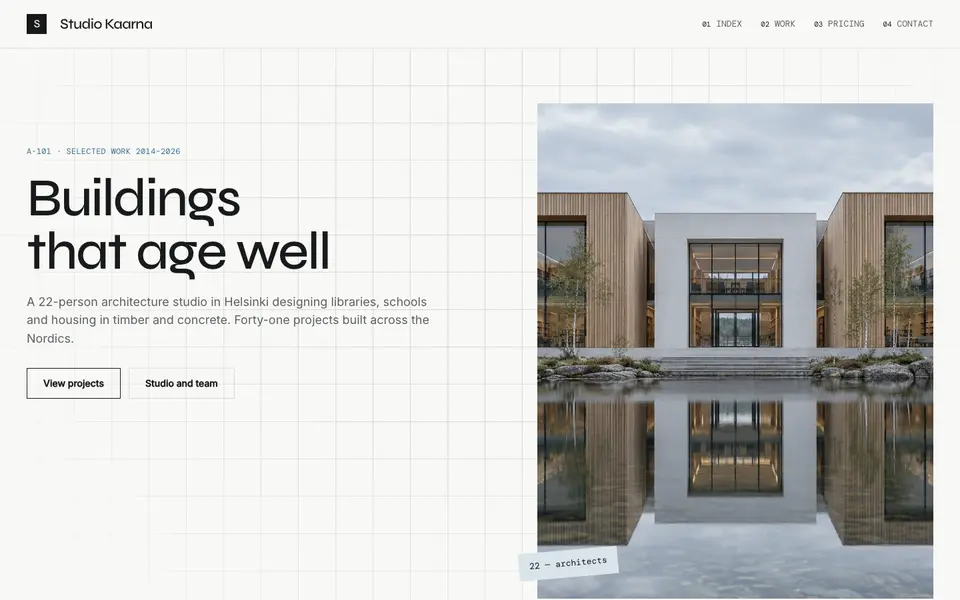
Atelier Plan
No. 081An architecture studio's drawing set: plan-paper white, tracing grid, titleblock captions.
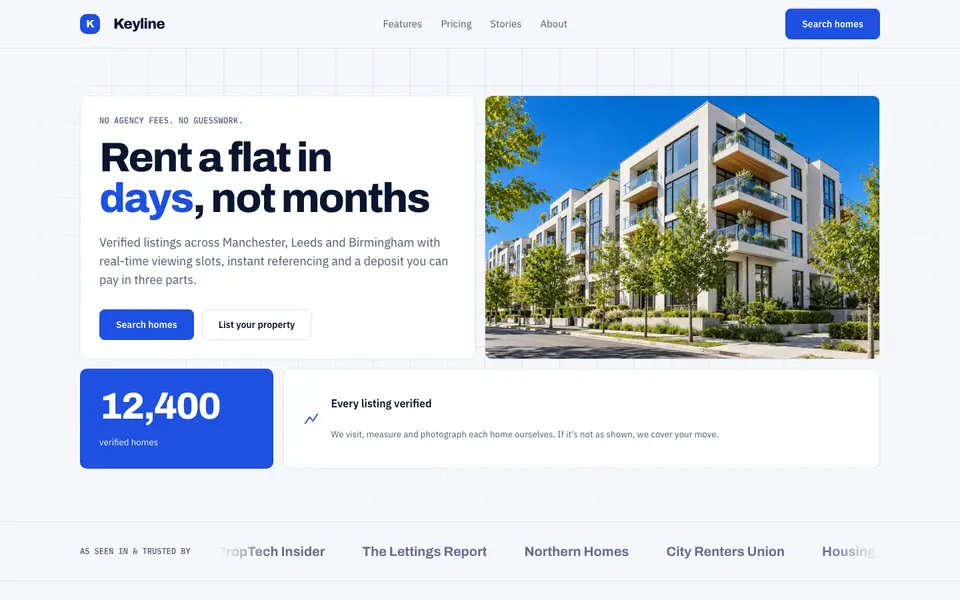
Blue Property
No. 082Cobalt blue, a muscular grotesk and a bento of listings, maps and numbers.
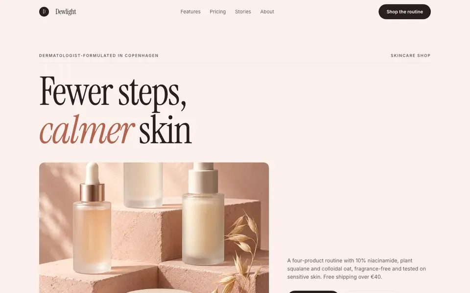
Blush Skincare
No. 083Blush pink, clean white space and an italic serif as soft as a moisturiser.
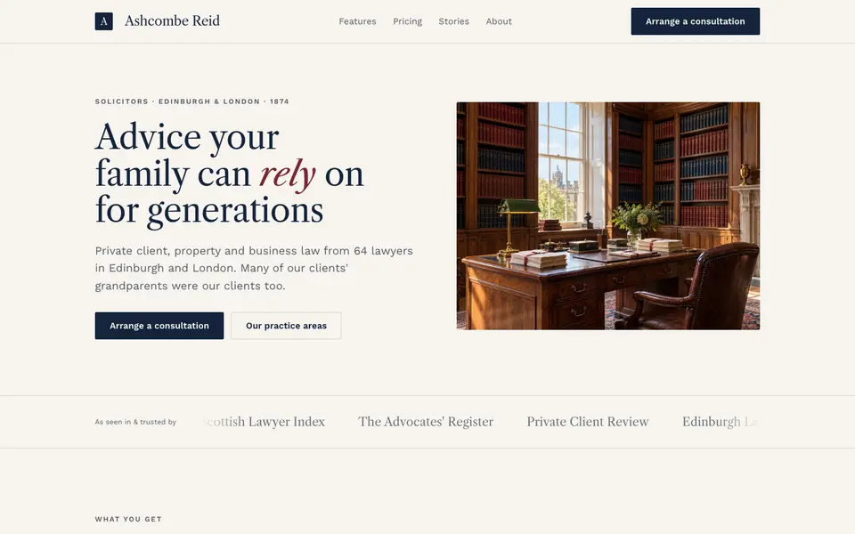
Chambers Heritage
No. 084A heritage law firm: Caslon headings, deep navy, oxblood seals and quiet panelled rooms.
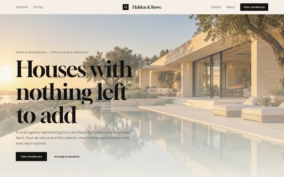
Cream Estate
No. 085Cream paper, black ink and photographs of houses big enough to walk into.
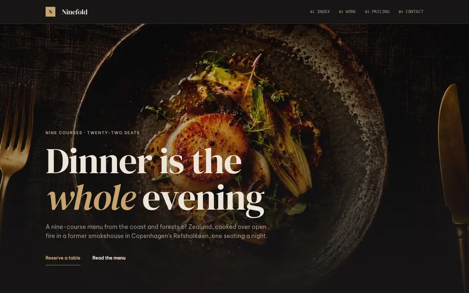
Dark Dining
No. 086Candlelit plates on charcoal, a confident serif and service at a whisper.