Cellar Burgundy
A wine house label come to life: deep burgundy, engraved gold capitals, candlelit cellars.
This style
$9$19
One-time, no subscription · instant download · client use · 7-day refund before download
The idea
The label of an old wine estate, scaled up into a website. Deep burgundy pages, inscriptional Roman capitals in engraved gold, fine double rules like an étiquette border, and candlelit photographs of barrels and stone cellars. Formal, generous and patient.
Cellar Burgundy is a wine label made into an environment. It draws on 19th-century French étiquettes, engraved banknote borders and Roman inscriptional capitals cut in stone. The page is the colour of a glass of old Pinot held to candlelight; type is warm parchment; ornament is engraved gold used as fine double rules and outlines. Everything is formal, symmetrical and slow — the brand behaves like a sommelier who has all evening.
Principles
- Symmetry and formality: centre titles, frame content in double rules.
- Gold is engraving, not paint — lines and outlines, never large fills.
- Inscriptional capitals for titles, a classical serif for prose.
- Let candlelit photography supply the warmth.
- Speak in vintages, hectares, months in oak — facts of the craft.
Motion
The hero cellar photograph fades up from black over 1.3s as if a candle has been lit; gold outlines warm to a soft champagne glow on hover.
Do & don't
Do
- ✓ Frame cards and price boxes with double gold rules.
- ✓ Centre all titles and the hero copy.
- ✓ Use vintages and climats as labels (Volnay 1er Cru · 2023).
Don't
- ✕ Don't fill buttons or panels with gold at rest.
- ✕ Don't set Cinzel in lowercase or for body text.
- ✕ Don't use bright daylight vineyard stock.
+ 3 more of each, and component rules, in the full DESIGN.md.
What's in the DESIGN.md
- 01Overview & principles
- 02Colors (tokens + proportions)
- 03Typography (families + 12-role scale)
- 04Layout & spacing scale
- 05Elevation & depth
- 06Shapes & radii
- 07Motion (easing, durations, signature)
- 08Imagery + generation prompt
- 09Components (button, card, nav, input, badge)
- 10Do's and don'ts
- 11Responsive behaviour
- 12Iteration guide + agent checklist
Plus theme.css (Tailwind v4 @theme), tokens.json (W3C) and the preview page source — 364 lines of DESIGN.md in total.
More like this
All Editorial & Luxury →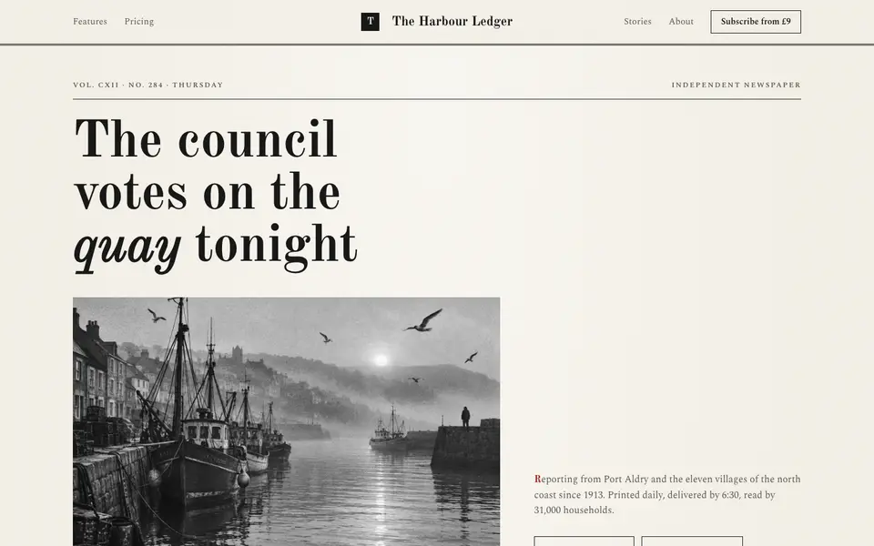
Broadsheet Press
No. 001A morning broadsheet: masthead, column rules, datelines and a grey halftone photograph.
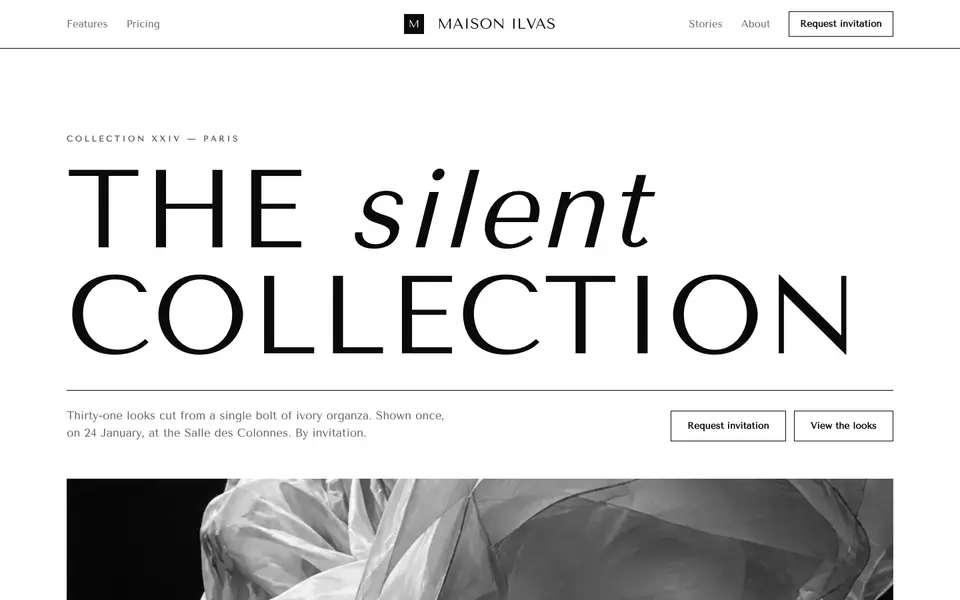
Didone Couture
No. 002Haute couture in two inks: a hairline Didone, paper white and absolute black.
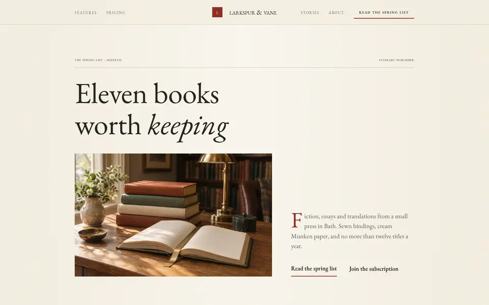
Folio Press
No. 003A literary publisher's catalogue: Garamond, small caps, cream paper and a printer's red.
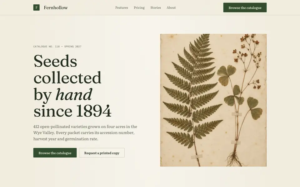
Herbarium Journal
No. 004A naturalist's field journal: specimen plates, Latin names, moss green and foxed paper.
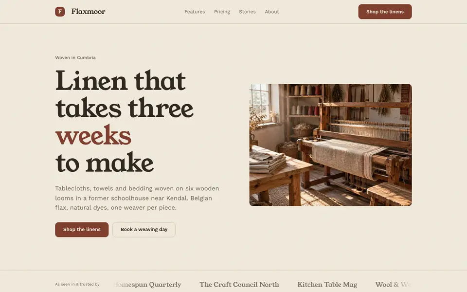
Linen Atelier
No. 005An artisan workshop journal: flax tones, soft serif, stitched details and daylight.
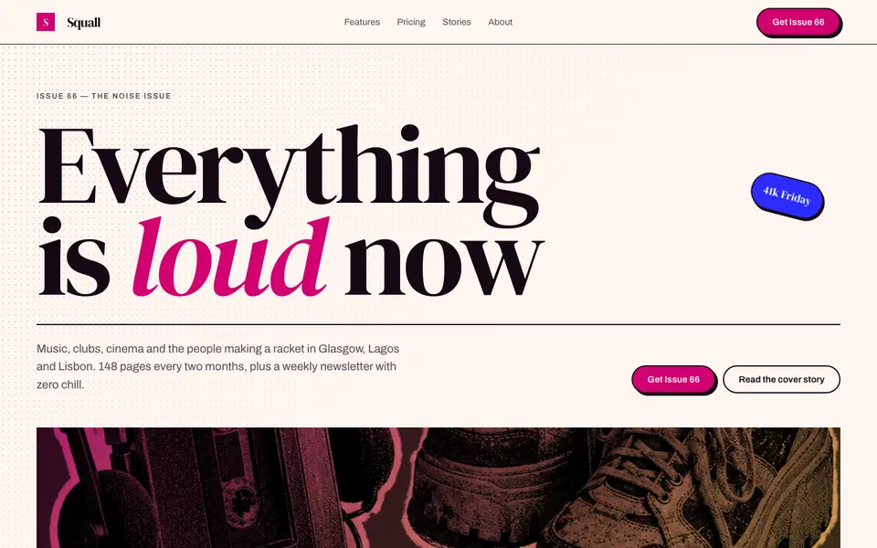
Magenta Shout
No. 006A pop-culture magazine at full volume: towering italics, hot magenta, cut-out photos.