Friendly Courses
Bright notebook colours, chunky rounded type and progress you can see.
This style
$9$19
One-time, no subscription · instant download · client use · 7-day refund before download
The idea
An online-learning system that feels like a good teacher's classroom: warm off-white paper dotted like a notebook, a bold rounded geometric sans, and lesson cards in coral, sky and grass that look like stickers on a binder. Encouraging without being childish, organised without being corporate.
Friendly Courses is a learning system that makes adults feel capable rather than lectured. It draws on Swiss school notebooks, mid-century educational posters and contemporary flat illustration: a warm off-white canvas dotted like graph paper, a bold rounded geometric sans, and course cards colour-coded like binder tabs in coral, sky and grass. Indigo is the single action colour so the next step is always obvious. Progress is visualised everywhere. It should feel encouraging, organised and quietly joyful.
Principles
- Make progress visible — bars, steps and checkmarks on every course.
- One action colour (indigo); subject colours are for wayfinding only.
- Use time and outcome numbers: minutes a day, weeks, projects.
- Illustrate, don't stock-photo — flat, warm scenes of study.
- Celebrate small wins with stars, not confetti explosions.
Motion
Course stickers pop up with a cheerful little overshoot; progress bars fill from zero to their value as they scroll into view, with a star that sparkles at 100%.
Do & don't
Do
- ✓ Show a progress bar on every enrolled course card.
- ✓ Colour-code subjects consistently across the site.
- ✓ Use stars as the only celebration ornament.
Don't
- ✕ Don't use stock photos of students.
- ✕ Don't use coral or grass for buttons.
- ✕ Don't use all-caps labels.
+ 3 more of each, and component rules, in the full DESIGN.md.
What's in the DESIGN.md
- 01Overview & principles
- 02Colors (tokens + proportions)
- 03Typography (families + 12-role scale)
- 04Layout & spacing scale
- 05Elevation & depth
- 06Shapes & radii
- 07Motion (easing, durations, signature)
- 08Imagery + generation prompt
- 09Components (button, card, nav, input, badge)
- 10Do's and don'ts
- 11Responsive behaviour
- 12Iteration guide + agent checklist
Plus theme.css (Tailwind v4 @theme), tokens.json (W3C) and the preview page source — 364 lines of DESIGN.md in total.
More like this
All Industry →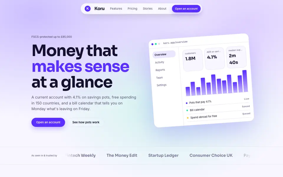
Bright Neobank
No. 050A bank that feels like a good app: electric violet, mint and fat friendly numbers.
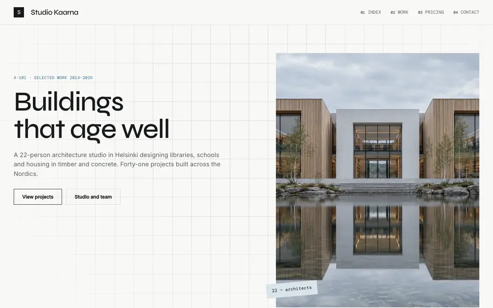
Atelier Plan
No. 081An architecture studio's drawing set: plan-paper white, tracing grid, titleblock captions.
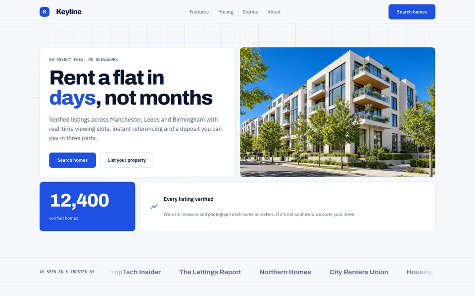
Blue Property
No. 082Cobalt blue, a muscular grotesk and a bento of listings, maps and numbers.
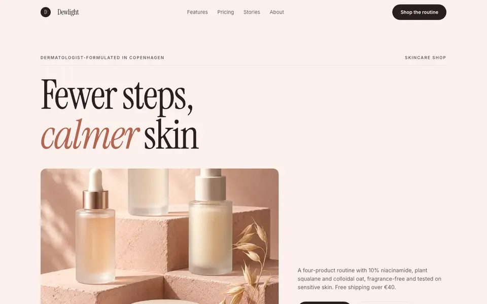
Blush Skincare
No. 083Blush pink, clean white space and an italic serif as soft as a moisturiser.
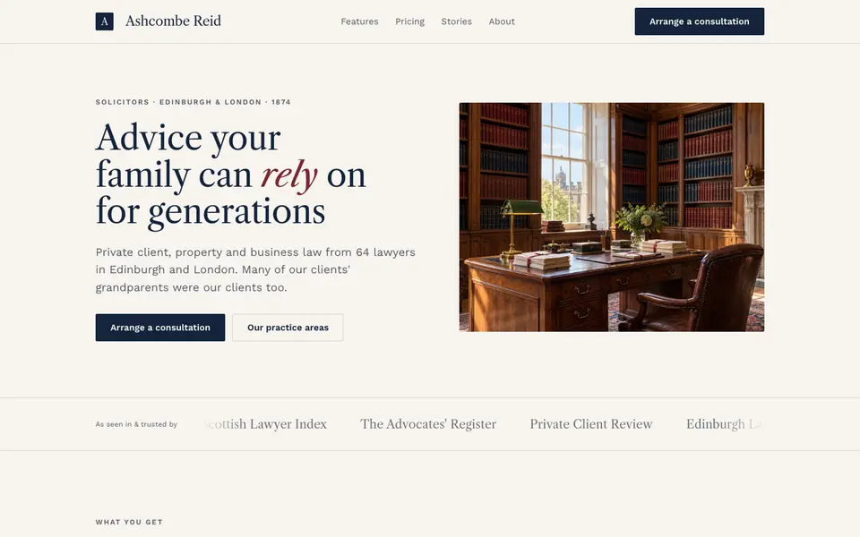
Chambers Heritage
No. 084A heritage law firm: Caslon headings, deep navy, oxblood seals and quiet panelled rooms.
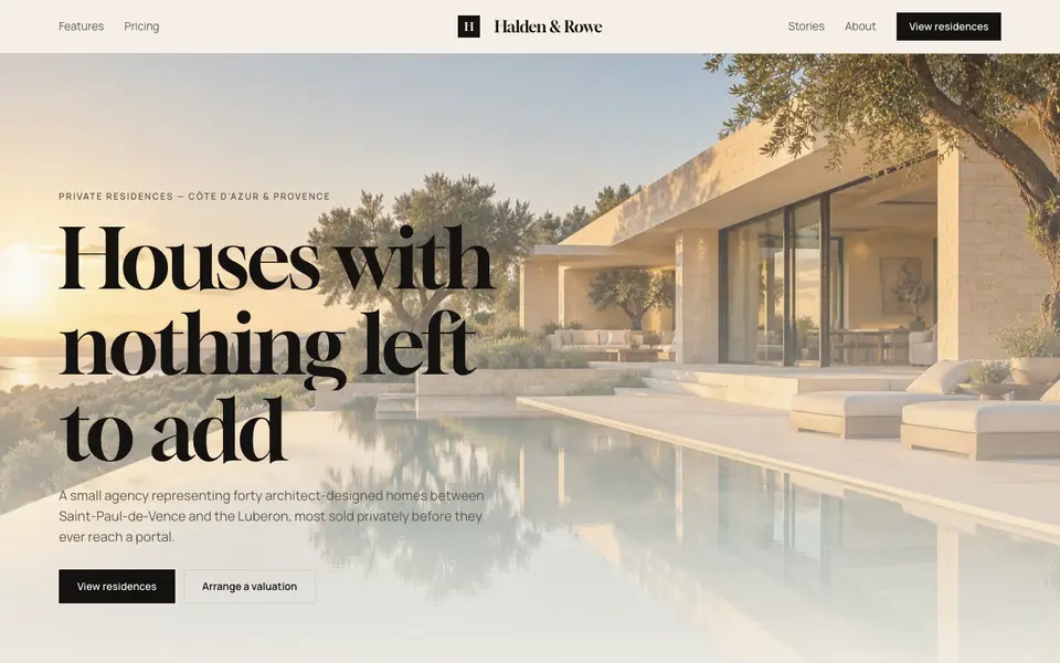
Cream Estate
No. 085Cream paper, black ink and photographs of houses big enough to walk into.