Hopeful Nonprofit
Sunrise yellow, deep river blue and honest numbers that show where every pound goes.
This style
$9$19
One-time, no subscription · instant download · client use · 7-day refund before download
The idea
A charity system that leads with hope instead of guilt: warm cream canvas, a deep river blue for trust, sunrise yellow for action, and a friendly grotesk paired with a bookish serif for storytelling. Real-feeling photography of work in progress and plain impact numbers do the persuading. Optimistic, transparent and human.
Hopeful Nonprofit is a charity system that persuades through optimism and transparency rather than guilt. It draws on 1960s public-information posters, documentary photojournalism and modern impact reports: a warm cream canvas, a deep river blue for trust, a sunrise yellow for the one thing you should do, a confident humanist grotesk for headlines and a warm, readable serif for stories. Photography shows progress — water flowing, things being built — never suffering. Numbers are honest and prominent. It should feel hopeful, credible and human.
Principles
- Show progress, not pity — photograph solutions and work in motion.
- Make the money trail visible: what each amount does, in plain numbers.
- Yellow means give; nothing else is yellow.
- Tell stories in the serif; state facts in the grotesk.
- Credit the people on the ground by name and role.
Motion
Impact numbers count up from zero as they enter view, and a thin sunrise-yellow progress bar fills toward the campaign target; cards nudge 4px up-right on hover, like a hand being raised.
Do & don't
Do
- ✓ Show what each amount achieves, in numbers.
- ✓ Credit every photograph with a place.
- ✓ Use the serif italic for quotes from the people you serve.
Don't
- ✕ Don't use images of suffering or pleading.
- ✕ Don't show close-up faces of children.
- ✕ Don't use red or emergency-style urgency.
+ 3 more of each, and component rules, in the full DESIGN.md.
What's in the DESIGN.md
- 01Overview & principles
- 02Colors (tokens + proportions)
- 03Typography (families + 12-role scale)
- 04Layout & spacing scale
- 05Elevation & depth
- 06Shapes & radii
- 07Motion (easing, durations, signature)
- 08Imagery + generation prompt
- 09Components (button, card, nav, input, badge)
- 10Do's and don'ts
- 11Responsive behaviour
- 12Iteration guide + agent checklist
Plus theme.css (Tailwind v4 @theme), tokens.json (W3C) and the preview page source — 364 lines of DESIGN.md in total.
More like this
All Industry →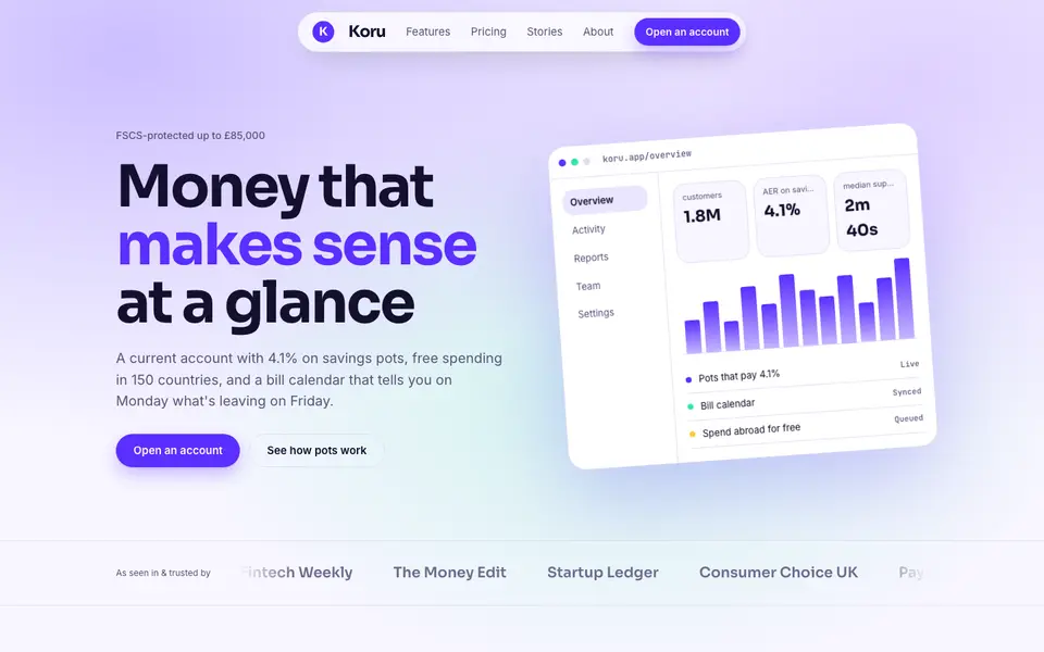
Bright Neobank
No. 050A bank that feels like a good app: electric violet, mint and fat friendly numbers.
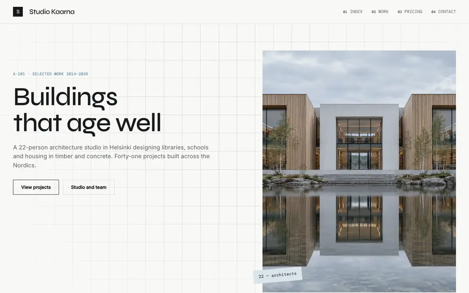
Atelier Plan
No. 081An architecture studio's drawing set: plan-paper white, tracing grid, titleblock captions.
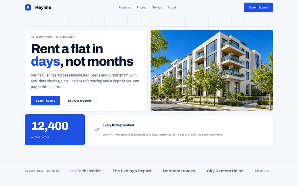
Blue Property
No. 082Cobalt blue, a muscular grotesk and a bento of listings, maps and numbers.
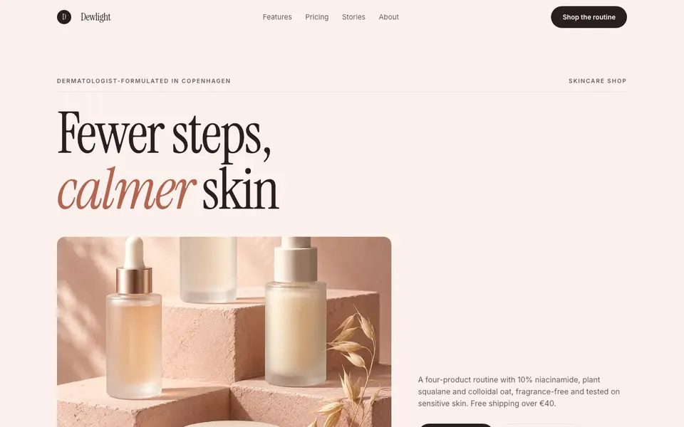
Blush Skincare
No. 083Blush pink, clean white space and an italic serif as soft as a moisturiser.
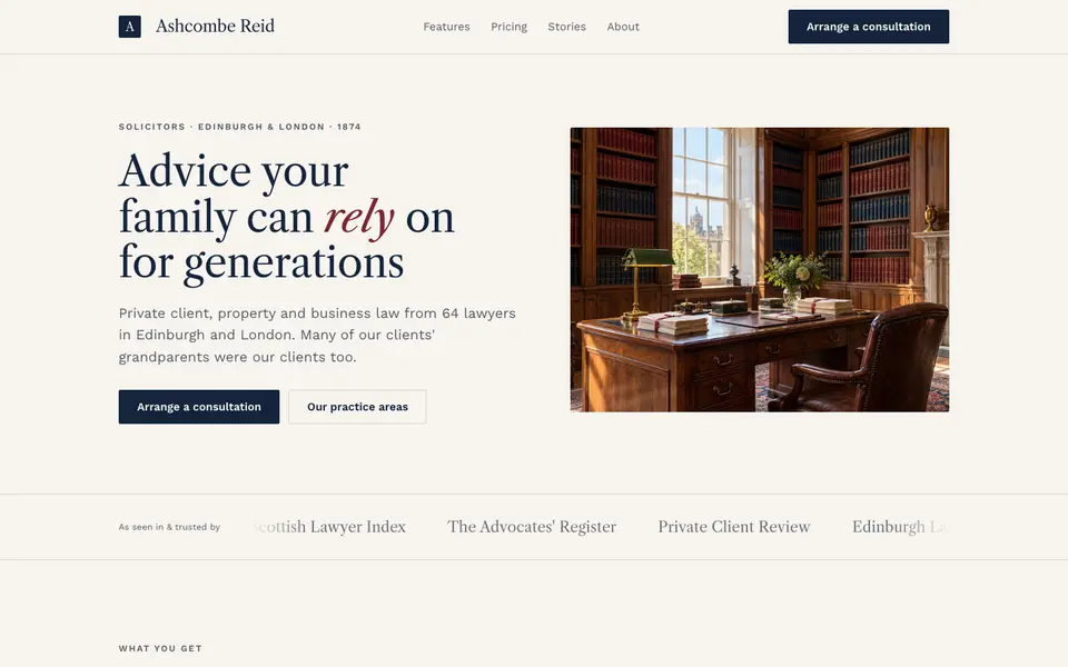
Chambers Heritage
No. 084A heritage law firm: Caslon headings, deep navy, oxblood seals and quiet panelled rooms.
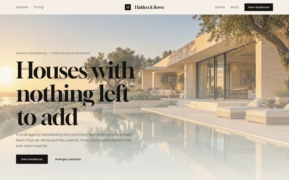
Cream Estate
No. 085Cream paper, black ink and photographs of houses big enough to walk into.