Loud Pizzeria
Tomato red, tall shouty capitals and stickers slapped on like a takeaway menu.
This style
$9$19
One-time, no subscription · instant download · client use · 7-day refund before download
The idea
A neighbourhood slice shop turned up to eleven: tomato-red bands, cream like pizza-box cardboard, towering condensed capitals and price stickers stuck at angles. Thick black outlines and hard shadows make everything feel printed and greasy-fingered in the best way. Loud, hungry and fun.
Loud Pizzeria is a casual-food system built to make people hungry and get them ordering. It borrows from 1970s takeaway menus, New York street signage and hand-pasted gig posters: tomato red, pizza-box cream, mustard yellow and black, with tall condensed capitals stacked like a menu board and price stickers stuck on at angles. Everything is outlined in thick 3px black with hard offset shadows, so the page feels printed and physical. It should feel loud, fun and a little bit greasy.
Principles
- Shout the headline — condensed caps at poster size, tight leading.
- Stick prices on like stickers: rotated, outlined, yellow.
- Outline everything in 3px black with a hard shadow.
- Use red as a band or button, never for small body text.
- Make 'order' the easiest thing on every screen.
Motion
Stickers slam in from 140% scale and settle with a wobble; a red marquee of toppings scrolls across the page, and menu cards tilt 2° on hover like they were flicked.
Do & don't
Do
- ✓ Keep the order button visible in the nav at all times.
- ✓ Rotate stickers and cards a few degrees.
- ✓ Use 3px outlines and hard shadows everywhere.
Don't
- ✕ Don't use soft or blurred shadows.
- ✕ Don't use thin weights or serifs.
- ✕ Don't use low-light 'fine dining' photography.
+ 3 more of each, and component rules, in the full DESIGN.md.
What's in the DESIGN.md
- 01Overview & principles
- 02Colors (tokens + proportions)
- 03Typography (families + 12-role scale)
- 04Layout & spacing scale
- 05Elevation & depth
- 06Shapes & radii
- 07Motion (easing, durations, signature)
- 08Imagery + generation prompt
- 09Components (button, card, nav, input, badge)
- 10Do's and don'ts
- 11Responsive behaviour
- 12Iteration guide + agent checklist
Plus theme.css (Tailwind v4 @theme), tokens.json (W3C) and the preview page source — 365 lines of DESIGN.md in total.
More like this
All Industry →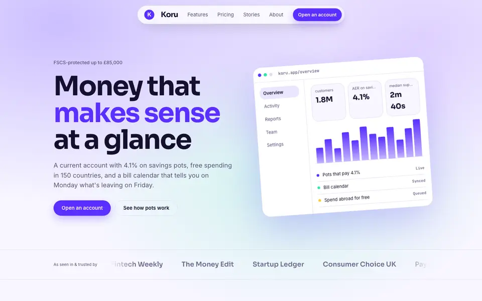
Bright Neobank
No. 050A bank that feels like a good app: electric violet, mint and fat friendly numbers.
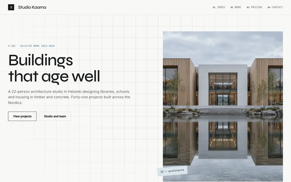
Atelier Plan
No. 081An architecture studio's drawing set: plan-paper white, tracing grid, titleblock captions.
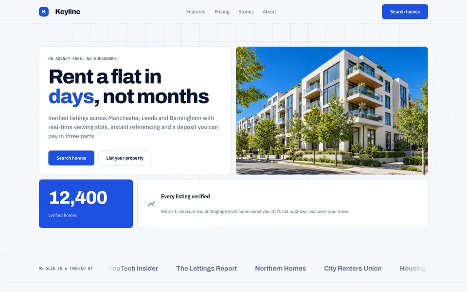
Blue Property
No. 082Cobalt blue, a muscular grotesk and a bento of listings, maps and numbers.
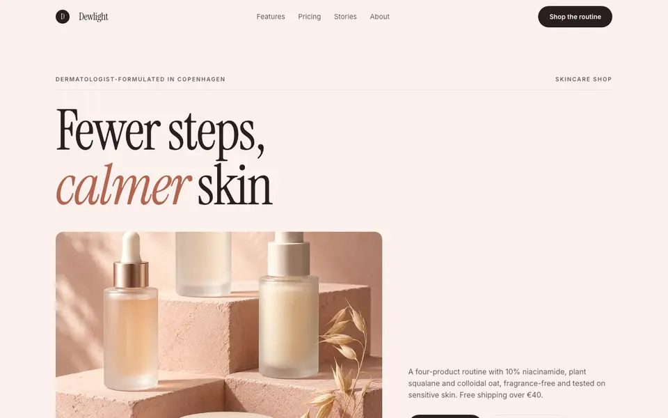
Blush Skincare
No. 083Blush pink, clean white space and an italic serif as soft as a moisturiser.
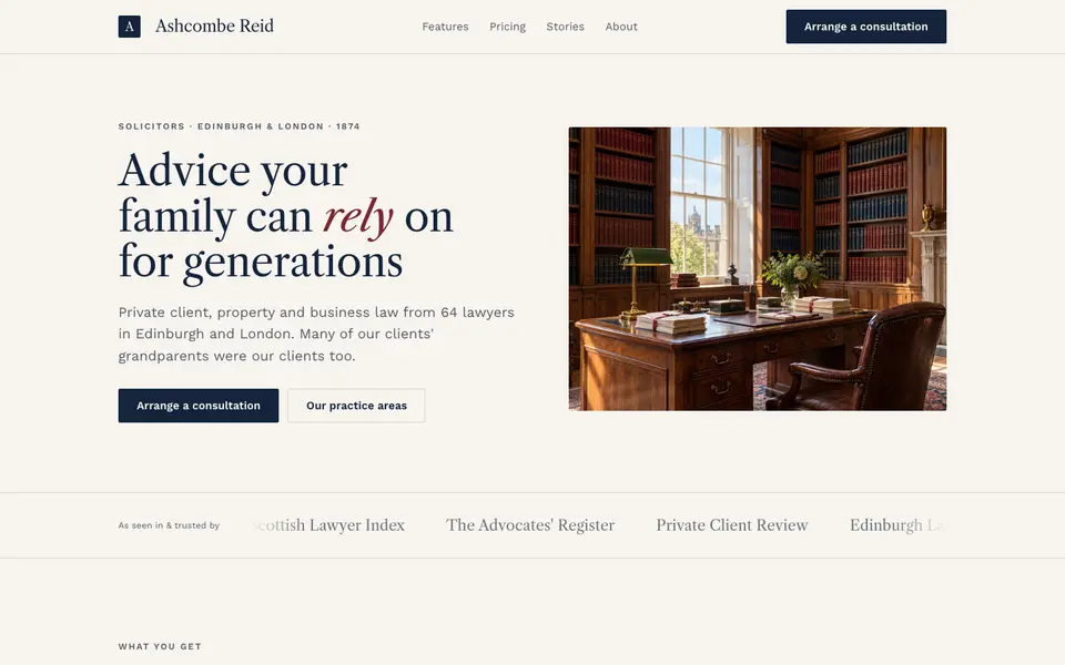
Chambers Heritage
No. 084A heritage law firm: Caslon headings, deep navy, oxblood seals and quiet panelled rooms.
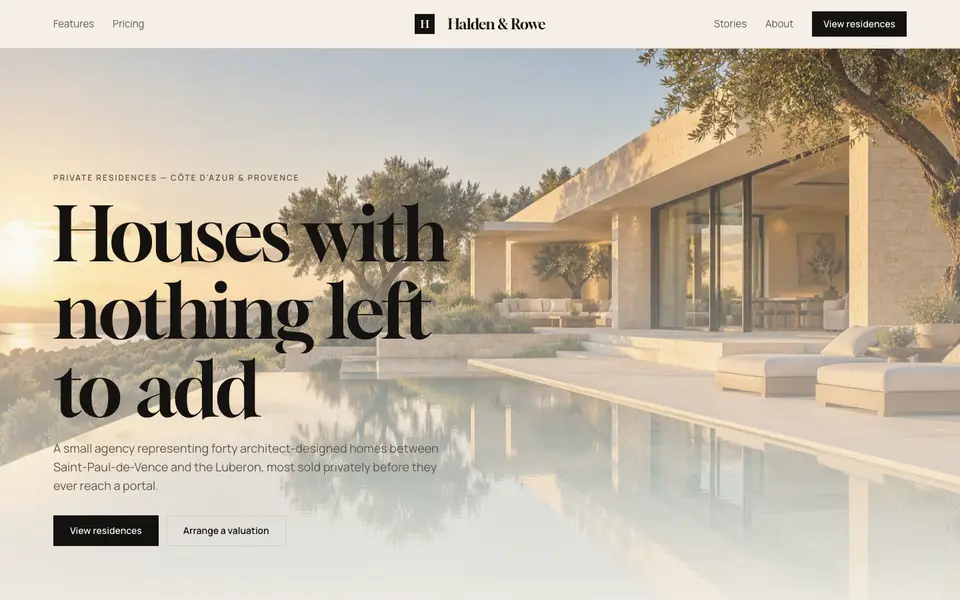
Cream Estate
No. 085Cream paper, black ink and photographs of houses big enough to walk into.