Outdoor Adventure
Big mountains, blaze orange and condensed capitals stencilled like trail signs.
This style
$9$19
One-time, no subscription · instant download · client use · 7-day refund before download
The idea
Rugged travel design that smells of wet granite and campfire: stone-grey canvas, blaze-orange for every call to action, and tall condensed capitals stencilled like trail markers. Full-bleed landscapes do the persuading; route numbers and altitudes do the convincing. Adventurous, practical and honest.
Outdoor Adventure is a rugged travel system built to make people book the trip they've been dreaming about. It draws on national-park signage, vintage expedition maps and contemporary outdoor-gear catalogues: a stone-grey canvas, forest green for depth, blaze orange for every call to action, and tall condensed capitals that look stencilled on a trail post. Full-bleed landscape photography sells the dream; mono route stats — days, grades, altitudes — sell the reality. It should feel adventurous, capable and honest.
Principles
- Landscapes go full-bleed — mountains don't fit in thumbnails.
- Blaze orange is the only call to action, like a trail marker.
- Back the dream with data: days, grade, ascent, altitude.
- Use condensed caps for headlines, mono for stats.
- Number trips and stages like waypoints.
Motion
Headline words slide in from the left like a trail unfolding ahead; a dotted route line draws itself across the bento tiles as you scroll, connecting each trip like waypoints.
Do & don't
Do
- ✓ Show days, grade and max altitude on every trip.
- ✓ Use a dashed orange route line to connect sections.
- ✓ Keep figures small in landscapes, seen from behind.
Don't
- ✕ Don't use orange for paragraphs.
- ✕ Don't use stock photos of people smiling at camera.
- ✕ Don't round corners beyond 4px.
+ 3 more of each, and component rules, in the full DESIGN.md.
What's in the DESIGN.md
- 01Overview & principles
- 02Colors (tokens + proportions)
- 03Typography (families + 12-role scale)
- 04Layout & spacing scale
- 05Elevation & depth
- 06Shapes & radii
- 07Motion (easing, durations, signature)
- 08Imagery + generation prompt
- 09Components (button, card, nav, input, badge)
- 10Do's and don'ts
- 11Responsive behaviour
- 12Iteration guide + agent checklist
Plus theme.css (Tailwind v4 @theme), tokens.json (W3C) and the preview page source — 365 lines of DESIGN.md in total.
More like this
All Industry →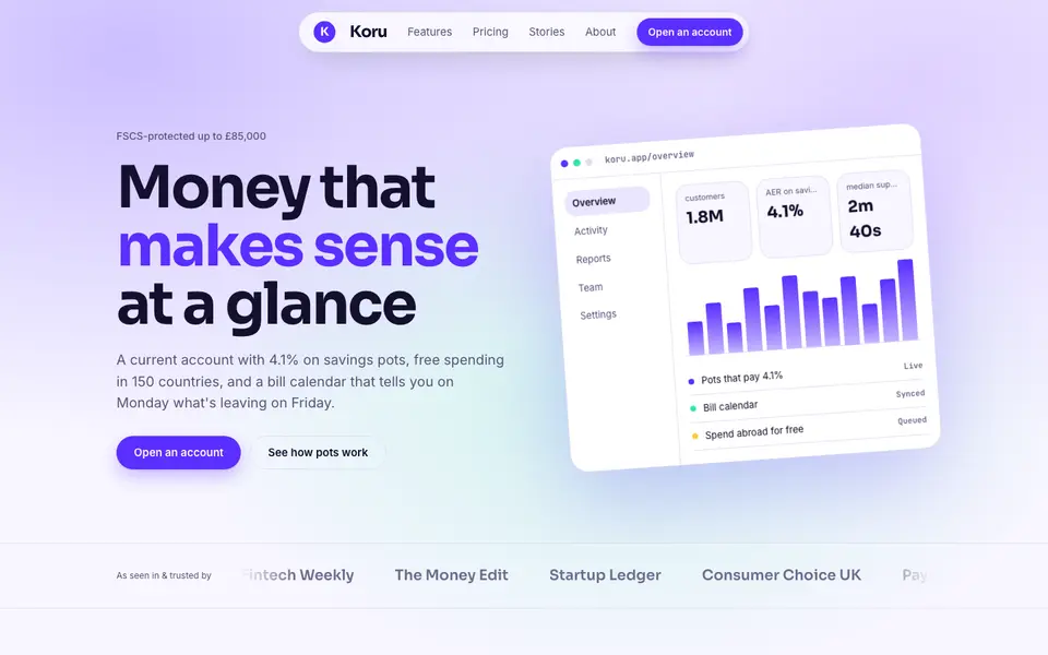
Bright Neobank
No. 050A bank that feels like a good app: electric violet, mint and fat friendly numbers.
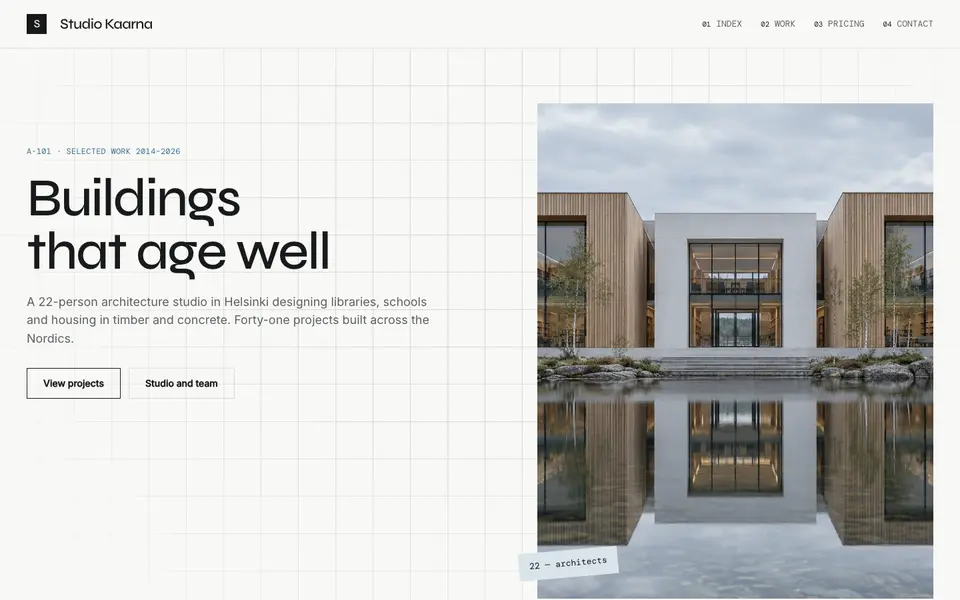
Atelier Plan
No. 081An architecture studio's drawing set: plan-paper white, tracing grid, titleblock captions.
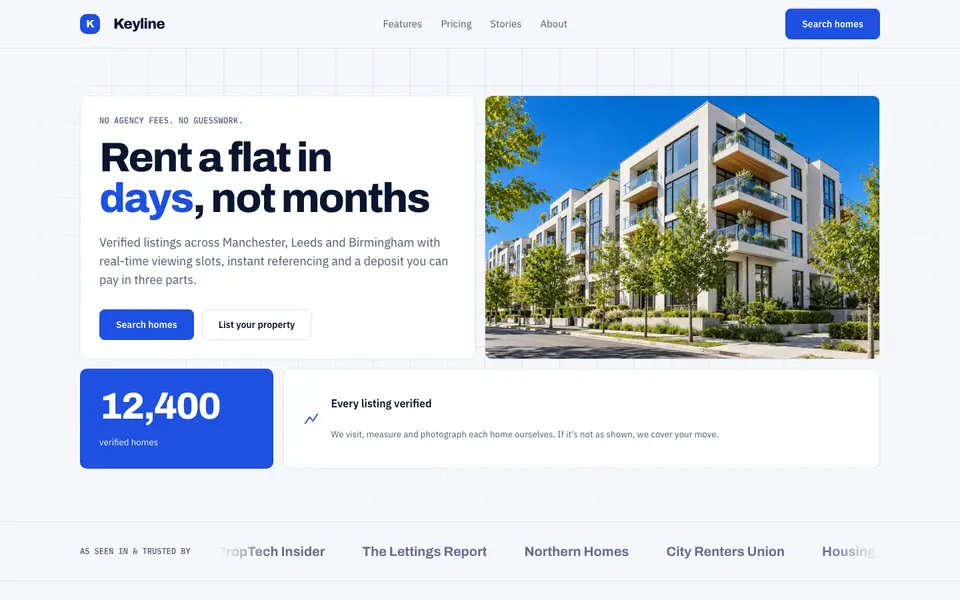
Blue Property
No. 082Cobalt blue, a muscular grotesk and a bento of listings, maps and numbers.
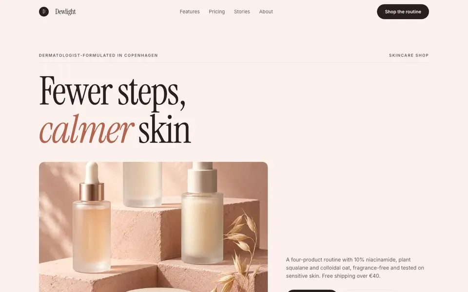
Blush Skincare
No. 083Blush pink, clean white space and an italic serif as soft as a moisturiser.
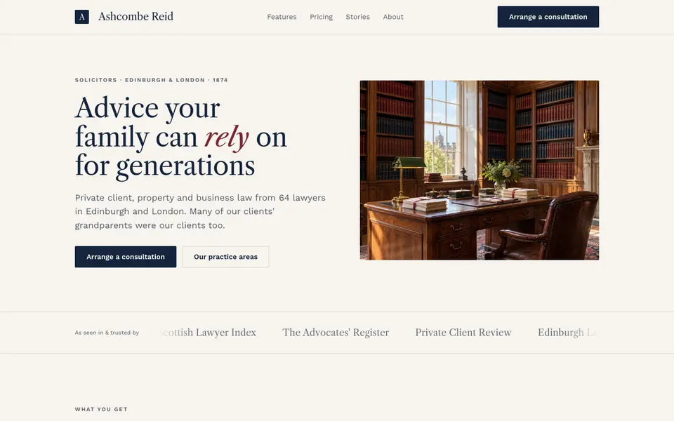
Chambers Heritage
No. 084A heritage law firm: Caslon headings, deep navy, oxblood seals and quiet panelled rooms.
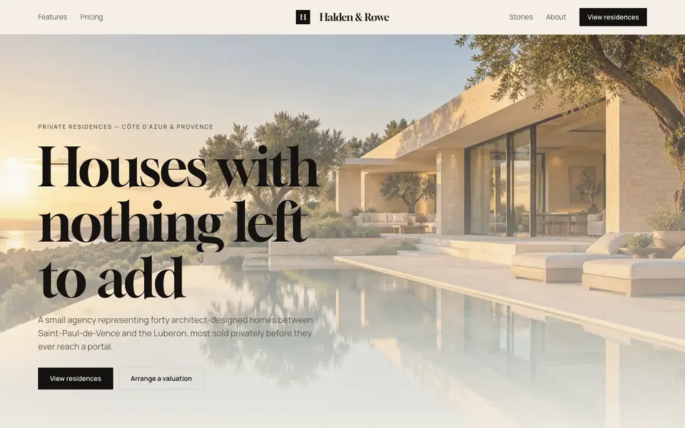
Cream Estate
No. 085Cream paper, black ink and photographs of houses big enough to walk into.