Teal Clinic
Calm teal, clean daylight and type that reads clearly at 7am in a waiting room.
Free style · full files
Includes DESIGN.md, theme.css, tokens.json and the preview page. Want the other 99? All-Access $19
The idea
A medical system that lowers the pulse: soft sea-glass canvas, a deep teal for anything you can press, and a crisp humanist sans set at generous sizes. Bright interiors photographed in daylight show a clinic you'd actually want to walk into. Clear, kind and competent.
Teal Clinic is a healthcare system designed around one job: making anxious people feel looked after. It draws on Scandinavian healthcare architecture, wayfinding signage and calm contemporary product design — a soft sea-glass canvas, a single deep teal for every action, a warm apricot that adds humanity, and a clear humanist sans set large enough to read without glasses. Imagery shows bright, empty, real-feeling spaces rather than stock doctors. Nothing decorative competes with information. It should feel calm, competent and warm.
Principles
- Clarity first: every screen should answer 'what do I do next?'.
- One action colour — teal — so patients never hunt for the button.
- Use real numbers: wait times, prices, appointment lengths.
- Prefer bright interiors to people in white coats.
- Keep motion subtle and fast; health is not a show.
Motion
Content fades up a modest 8px in under half a second — nothing theatrical in a clinic; cards lift 2px with a slightly deeper shadow so tap targets feel responsive.
Do & don't
Do
- ✓ Show the phone number in the nav.
- ✓ Use 18px body copy as a minimum.
- ✓ Put appointment length and price on every service.
- ✓ Use real-space interior photography.
- ✓ Keep one primary action per section.
- ✓ Label every form field above the input.
Don't
- ✕ Don't use stock photos of doctors or patients' faces.
- ✕ Don't use red for anything except warnings.
- ✕ Don't use oversized display headlines.
- ✕ Don't use apricot for buttons or text.
- ✕ Don't animate for longer than 500ms.
- ✕ Don't use medical jargon without an explanation.
What's in the DESIGN.md
- 01Overview & principles
- 02Colors (tokens + proportions)
- 03Typography (families + 12-role scale)
- 04Layout & spacing scale
- 05Elevation & depth
- 06Shapes & radii
- 07Motion (easing, durations, signature)
- 08Imagery + generation prompt
- 09Components (button, card, nav, input, badge)
- 10Do's and don'ts
- 11Responsive behaviour
- 12Iteration guide + agent checklist
Plus theme.css (Tailwind v4 @theme), tokens.json (W3C) and the preview page source — 364 lines of DESIGN.md in total.
More like this
All Industry →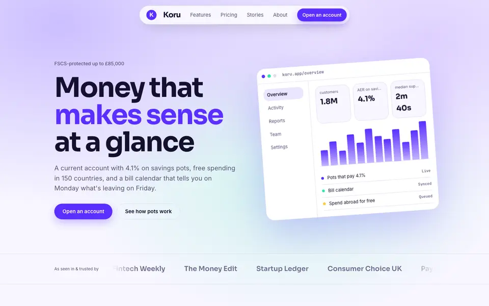
Bright Neobank
No. 050A bank that feels like a good app: electric violet, mint and fat friendly numbers.
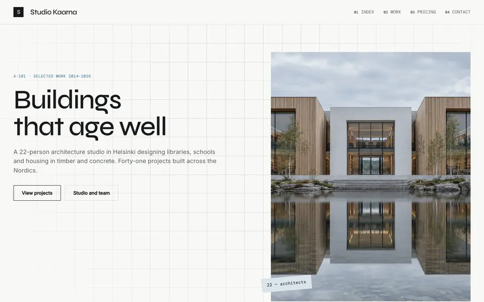
Atelier Plan
No. 081An architecture studio's drawing set: plan-paper white, tracing grid, titleblock captions.
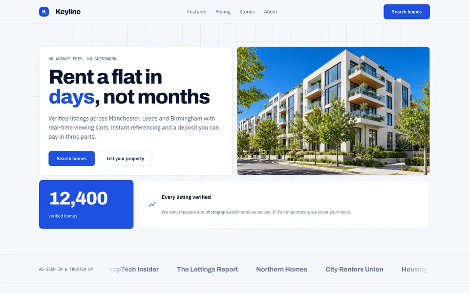
Blue Property
No. 082Cobalt blue, a muscular grotesk and a bento of listings, maps and numbers.
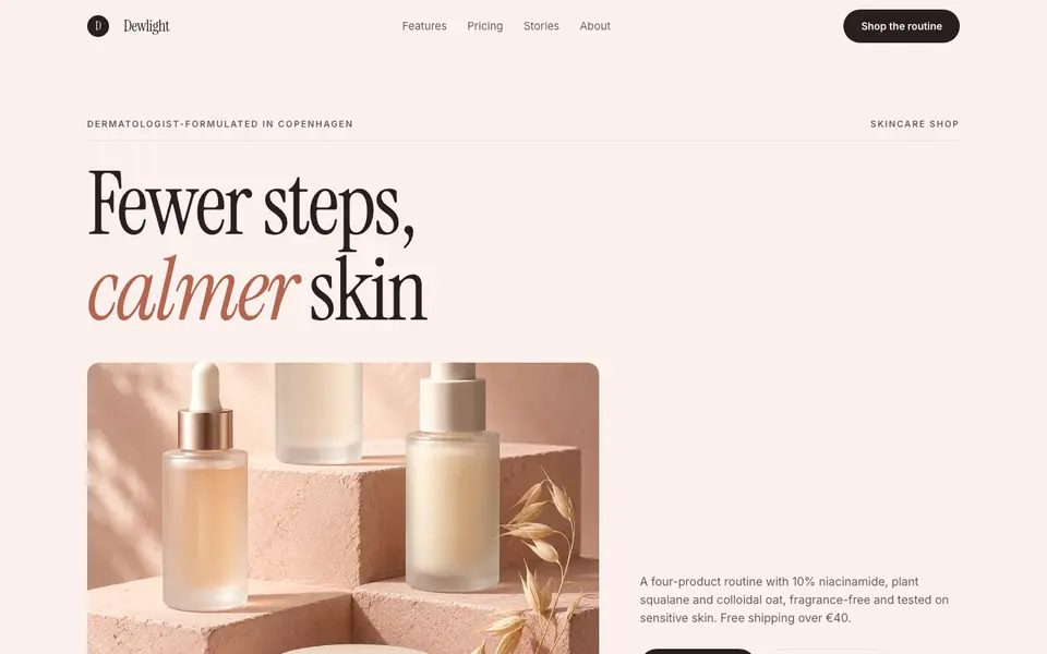
Blush Skincare
No. 083Blush pink, clean white space and an italic serif as soft as a moisturiser.
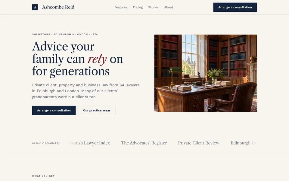
Chambers Heritage
No. 084A heritage law firm: Caslon headings, deep navy, oxblood seals and quiet panelled rooms.
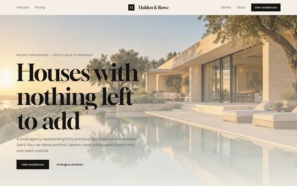
Cream Estate
No. 085Cream paper, black ink and photographs of houses big enough to walk into.