Warm Therapy
Terracotta warmth, a soft literary serif and rooms that feel safe to sit in.
This style
$9$19
One-time, no subscription · instant download · client use · 7-day refund before download
The idea
A therapy practice that feels like a friend's front room: clay and oat tones on a paper-textured canvas, a gentle bookish serif with calm italics, and organic blob shapes in place of icons. Every word is set with care and space. Kind, unhurried and non-clinical.
Warm Therapy is a system for mental-health and wellbeing practices that should feel nothing like a hospital. It draws on 1970s Scandinavian interiors, small-press poetry books and the calm materials of a lived-in room: oat paper canvas, terracotta and clay, a soft bookish serif with gentle italics, and slow-moving organic shapes in place of icons. Generous space and a slow pace give the reader room to breathe. Language is kind and specific. It should feel safe, warm and human.
Principles
- Speak gently — headlines invite, they never instruct.
- Use organic blob shapes instead of icons or illustrations of brains.
- Give every paragraph room; anxiety reads dense text as pressure.
- Keep the palette earthy and warm with no clinical whites.
- Always show the crisis line and the free first step.
Motion
Text eases in over a slow 1.1 seconds with only an 8px rise, like a long exhale; the organic blobs behind sections morph their outline very slowly over 20 seconds.
Do & don't
Do
- ✓ Show the crisis line in the footer of every page.
- ✓ Offer the free first call above the fold.
- ✓ Write in second person, softly: 'you can', 'if you'd like'.
Don't
- ✕ Don't use clinical blue, white or grey.
- ✕ Don't use stock photos of distressed people.
- ✕ Don't use urgent language or countdowns.
+ 3 more of each, and component rules, in the full DESIGN.md.
What's in the DESIGN.md
- 01Overview & principles
- 02Colors (tokens + proportions)
- 03Typography (families + 12-role scale)
- 04Layout & spacing scale
- 05Elevation & depth
- 06Shapes & radii
- 07Motion (easing, durations, signature)
- 08Imagery + generation prompt
- 09Components (button, card, nav, input, badge)
- 10Do's and don'ts
- 11Responsive behaviour
- 12Iteration guide + agent checklist
Plus theme.css (Tailwind v4 @theme), tokens.json (W3C) and the preview page source — 363 lines of DESIGN.md in total.
More like this
All Industry →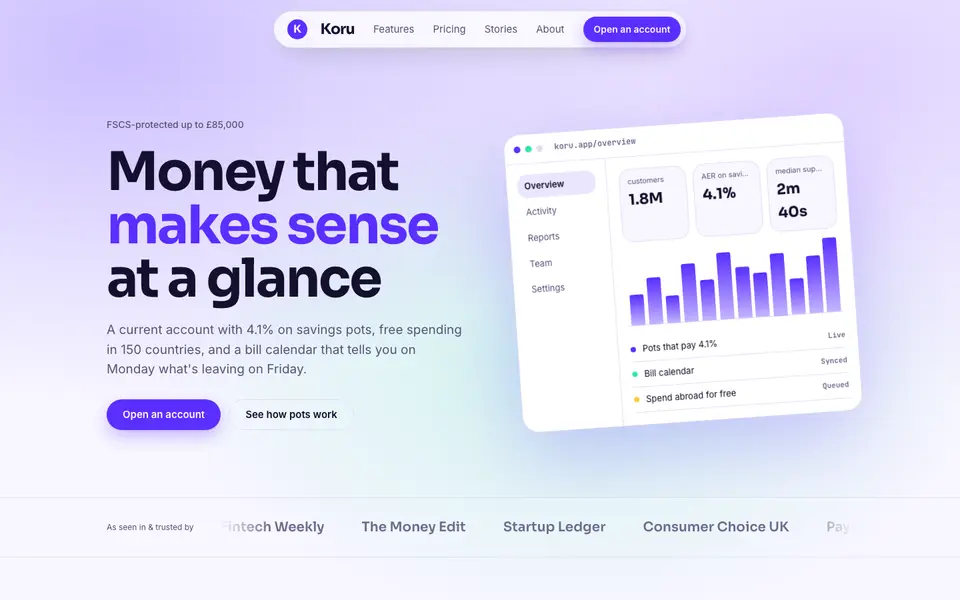
Bright Neobank
No. 050A bank that feels like a good app: electric violet, mint and fat friendly numbers.
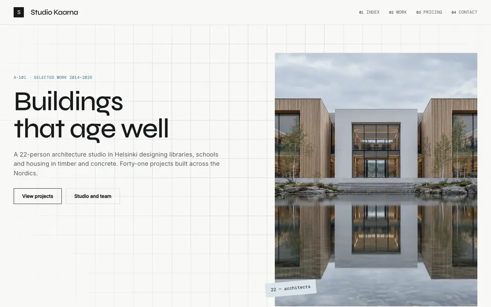
Atelier Plan
No. 081An architecture studio's drawing set: plan-paper white, tracing grid, titleblock captions.
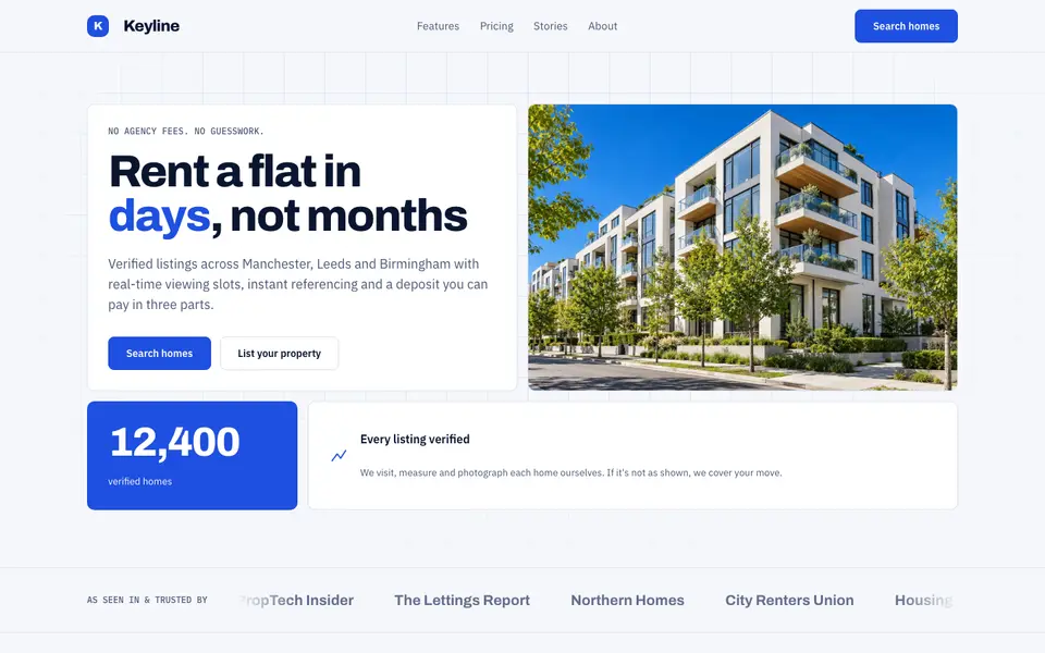
Blue Property
No. 082Cobalt blue, a muscular grotesk and a bento of listings, maps and numbers.
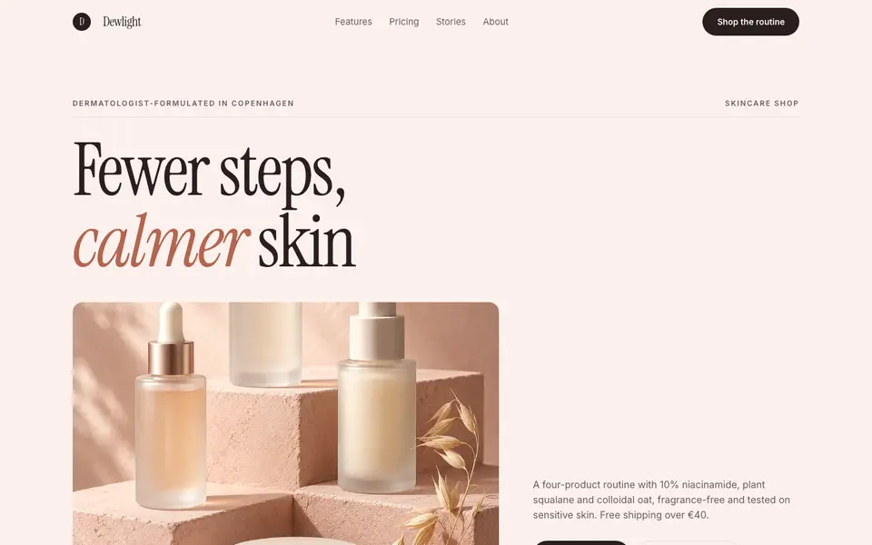
Blush Skincare
No. 083Blush pink, clean white space and an italic serif as soft as a moisturiser.
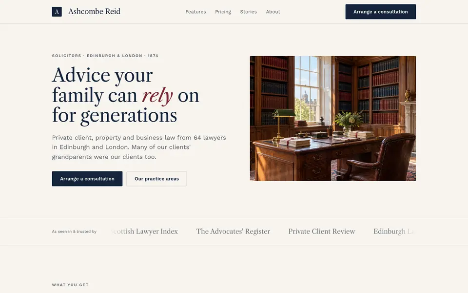
Chambers Heritage
No. 084A heritage law firm: Caslon headings, deep navy, oxblood seals and quiet panelled rooms.
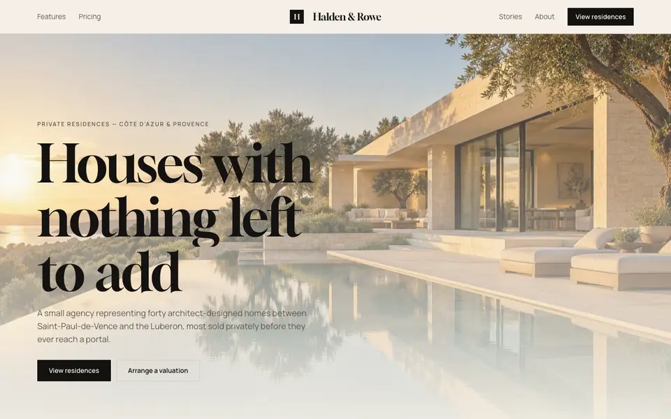
Cream Estate
No. 085Cream paper, black ink and photographs of houses big enough to walk into.