White Cube
A contemporary gallery wall: white space, one work, a quiet caption in the corner.
This style
$9$19
One-time, no subscription · instant download · client use · 7-day refund before download
The idea
The page behaves like a freshly painted exhibition room. One artwork hangs off-centre with a sea of white around it, the type is a small neutral grotesk that never raises its voice, and the only colour comes from the work itself. Visitors slow down because nothing asks them to hurry.
White Cube is the web as an exhibition room. It follows the conventions of the modernist gallery — white walls, even light, a single work given space, a small caption at eye level — and refuses everything decorative. Type is a light grotesk at modest sizes; the largest element on any page should be an image of the work, not a headline. The aim is concentration: the visitor should feel the hush of a room where the only sound is footsteps on concrete.
Principles
- The work is the loudest thing on the page; type stays quiet.
- Place one image per viewport, off-centre, with at least 30% empty wall around it.
- Captions follow gallery convention: artist, title, year, medium, dimensions.
- No colour in the interface; colour belongs to the art.
- Remove anything that can be removed, then remove one more thing.
Motion
Everything fades in over 1.4 seconds with only 8px of travel, like the house lights coming up. Nothing moves on hover except a 1px underline under links.
Do & don't
Do
- ✓ Write captions in full: Lena Hartwig, Sturmflut II, 2025, oil on linen, 240 × 180 cm.
- ✓ Leave a full viewport of white around the hero work on desktop.
- ✓ Use mono tabular figures for all dates and dimensions.
Don't
- ✕ Don't use colour in UI elements; ever.
- ✕ Don't stack two images side by side in the hero.
- ✕ Don't use uppercase, bold display or italic for emphasis.
+ 3 more of each, and component rules, in the full DESIGN.md.
What's in the DESIGN.md
- 01Overview & principles
- 02Colors (tokens + proportions)
- 03Typography (families + 12-role scale)
- 04Layout & spacing scale
- 05Elevation & depth
- 06Shapes & radii
- 07Motion (easing, durations, signature)
- 08Imagery + generation prompt
- 09Components (button, card, nav, input, badge)
- 10Do's and don'ts
- 11Responsive behaviour
- 12Iteration guide + agent checklist
Plus theme.css (Tailwind v4 @theme), tokens.json (W3C) and the preview page source — 363 lines of DESIGN.md in total.
More like this
All Editorial & Luxury →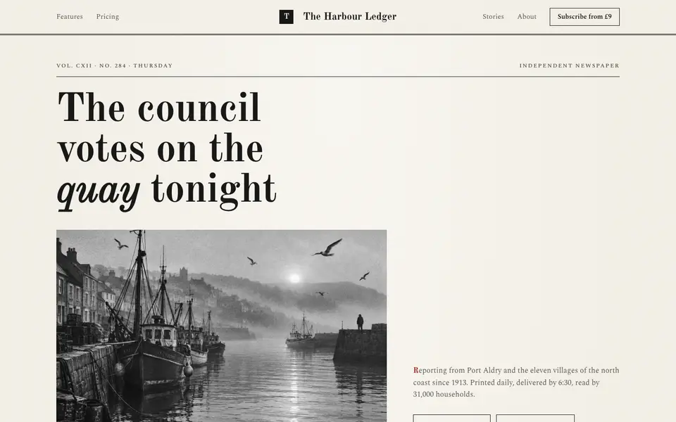
Broadsheet Press
No. 001A morning broadsheet: masthead, column rules, datelines and a grey halftone photograph.
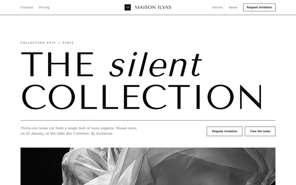
Didone Couture
No. 002Haute couture in two inks: a hairline Didone, paper white and absolute black.
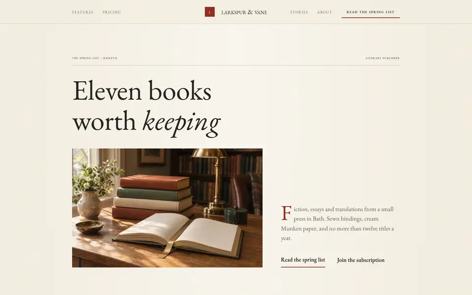
Folio Press
No. 003A literary publisher's catalogue: Garamond, small caps, cream paper and a printer's red.
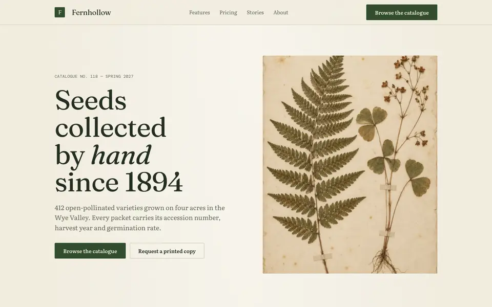
Herbarium Journal
No. 004A naturalist's field journal: specimen plates, Latin names, moss green and foxed paper.
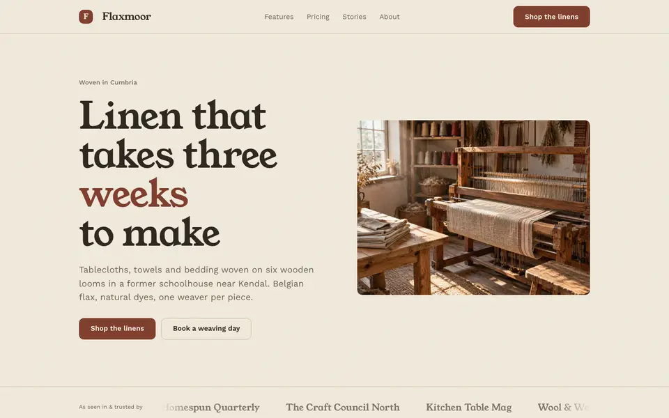
Linen Atelier
No. 005An artisan workshop journal: flax tones, soft serif, stitched details and daylight.
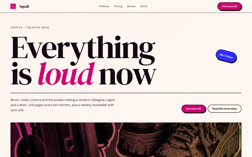
Magenta Shout
No. 006A pop-culture magazine at full volume: towering italics, hot magenta, cut-out photos.